Quick text summary
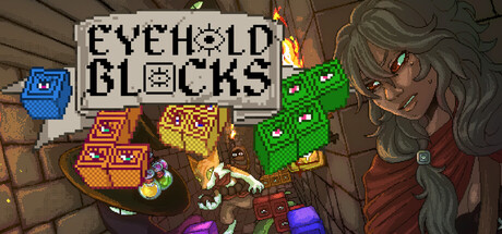
Eyehold Blocks scored 65/100 on Steam Analyzer — Solid for a Action capsule. Top priority fix: [uniqueness_polish] Design a distinctive visual hook such as an iconic character expression, signature block arrangement, or unique color palette treatment that differentiates this from standard puzzle roguelikes and signals premium craft.
Capsule scores by dimension
- Genre Clarity: 7/10 — Puzzle roguelike with dungeon combat. The capsule clearly communicates a puzzle-strategy game through the prominent block pieces (Tetris-style colored shapes) in the center and the dungeon setting with a character on the right. The green blocks and vibrant colored pieces immediately signal puzzle mechanics. At TINY size, the block silhouettes remain readable and the fantasy dungeon character is recognizable, though the exact roguelike nature requires the title text to fully land.
- Title Readability: 6/10 — Title readable but compressed styling. The 'EYEHOLD BLOCKS' title uses a bold, pixelated font with clear white letterforms against a dark background positioned in the upper left. At FULL size it reads cleanly. At SMALL and TINY sizes, the font remains legible but the compressed, blocky letterforms lack elegance and the small block icon between words adds visual noise. The title placement is safe from crop but the font style itself feels utilitarian rather than distinctive.
- Contrast & Color: 7/10 — Good value separation, vibrant accents. The composition uses strong light-dark contrast with the dark dungeon background, tan stone walls, and bright neon-colored block pieces (green, blue, orange, yellow, purple) that pop clearly against the #1b2838 Steam background. The character's warm brown tones and red vest provide secondary contrast. The bright block pieces create excellent silhouette clarity even at TINY size, though the overall palette feels slightly busy with multiple competing hues.
- Uniqueness & Polish: 6/10 — Competent but generic indie presentation. The capsule combines puzzle game blocks with a fantasy dungeon character in a straightforward way that communicates the core mechanic but lacks a distinctive visual hook. The pixel art character and blocky aesthetic are competent but common in indie games. While the composition is functional, there is no signature art style, memorable motif, or visual storytelling that sets this apart from comparable puzzle roguelikes—it reads as a solid execution of familiar elements rather than a standout premium presentation.
- Brand Consistency: 6/10 — Functional palette, modest identity signals. The capsule uses a consistent pixel art rendering style and muted dungeon color palette (browns, grays, greens) with bright block accent colors that likely recur in gameplay. The character design is coherent with the dungeon aesthetic. However, there are no distinctive brand identity cues—no iconic character pose, signature symbol, or memorable color motif that would make this capsule instantly recognizable in future marketing or genre browsing. The design feels generic within the indie puzzle game space.
- Composition: 7/10 — Clear focal hierarchy with balanced layout. The composition uses effective depth layering: background stone dungeon, midground scattered block pieces creating visual interest, and a character anchor on the right. The title sits in the upper left with breathing room, and the bright blocks naturally draw the eye as the primary focal point at all sizes. At TINY size, the block cluster and character silhouette remain distinct focal elements. The layout avoids dead center void and uses the right side space well, though the scattered block pieces at different scales could feel slightly cluttered in grayscale.
What works
- Block clarity at all sizes. The bright Tetris-style piece colors (green, blue, orange, purple) maintain excellent silhouette separation and remain instantly readable even at TINY thumbnail size, communicating the puzzle core mechanic immediately.
- Strong dungeon atmosphere. The stone wall background, warm lighting, and fantasy character create cohesive dungeon roguelike context that supports the game's premise without being generic.
- Safe title placement and margins. The title sits in a protected upper-left zone with adequate breathing room and avoids overlap with primary visual elements, surviving cropping well across Steam's various display formats.
What hurts the capsule
- Generic indie pixel art aesthetic. The character and art style, while competent, rely heavily on familiar pixel art conventions and lack a distinctive visual signature that would make the capsule memorable in a crowded genre.
- Utilitarian title font lacks polish. The blocky, compressed typeface feels functional rather than premium and the small block icon between words adds visual noise rather than enhancing brand recognition.
- Scattered block composition feels busy. The multiple puzzle pieces at varying angles and scales across the center create visual clutter that reduces focus and doesn't establish a single dominant composition anchor at SMALL size.
Priority fixes
- [uniqueness_polish] Design a distinctive visual hook such as an iconic character expression, signature block arrangement, or unique color palette treatment that differentiates this from standard puzzle roguelikes and signals premium craft.
- [title_readability] Consider a more stylized, memorable typeface that balances legibility at TINY size with stronger brand personality—remove the small block icon and increase letter spacing for clarity.
- [composition] Consolidate the scattered block pieces into a more deliberate focal arrangement or reduce visual density to create a clearer primary focal point that guides attention at SMALL and TINY sizes.
Store copy priority fixes
- [hook_strength] Replace 'brand new puzzle roguelike' opening with a verb-forward hook: 'Stack blocks to survive monster attacks and claw your way up a 20-floor dungeon' or similar action-focused framing.
- [feature_communication] Add 1–2 sentences explaining the core feedback loop: specifically describe how clearing rows deals damage, what happens when the board fills, and how loot changes your strategy.
- [uniqueness] Insert a sentence that articulates the specific appeal of the tetris-roguelike hybrid: e.g., 'Each run forces you to adapt your block placement strategy to counter different enemy abilities' or a comparable differentiator.
- [audience_targeting] Add a brief signal about run length or difficulty tone—either 'punishing tactical challenges' or 'accessible strategy fun'—to help the right player self-identify.
Related guides
Steam app ID: 3938940 · Tags: Action, Puzzle, Strategy, Roguelike, Singleplayer