Quick text summary
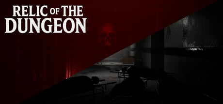
Relic of The Dungeon scored 67/100 on Steam Analyzer — Solid for a Mystery Dungeon capsule. Top priority fix: [uniqueness_polish] Introduce a character silhouette, artifact, or visual motif in the center that conveys the 'relic' theme and becomes a recognizable brand symbol
Capsule scores by dimension
- Genre Clarity: 7/10 — Dark adventure dungeon exploration clear. The capsule effectively communicates a dungeon-crawler adventure through moody underground architecture, red warning lighting, and shadowy industrial corridors. At tiny size, the dark environment and structural elements read as a contained, mysterious dungeon setting. However, the silhouette lacks a character or creature focal point that would push genre clarity to 8+, relying instead on environmental mood alone.
- Title Readability: 8/10 — Large clean title strong contrast. The title 'RELIC OF THE DUNGEON' uses a bold, all-caps sans-serif font positioned at top left with excellent white-on-dark contrast that remains fully legible at small and tiny sizes. The letterforms are clean and spaced generously, avoiding decorative flourishes that would collapse at reduced scale. Strategic placement above the visual noise ensures the title never competes with background elements.
- Contrast & Color: 7/10 — Strong red accent against dark palette. The composition uses deep burgundy-black background with bright red accent lighting in the middle ground, creating clear value separation that pops against Steam's dark theme. The warm red glows and industrial gray structures have distinct silhouettes in grayscale. At tiny size the red accents still read, though the overall darkness means the capsule doesn't leap off the shelf compared to lighter competitors like Dredge or Lethal Company.
- Uniqueness & Polish: 6/10 — Competent mood but generic presentation. The moody dungeon aesthetic is professionally executed with layered depth, atmospheric lighting, and clean composition, but the visual approach—dark corridors with red warning lights—reads as a familiar indie horror-adventure template rather than a distinctive hook. The capsule communicates 'dark dungeon game' effectively but lacks a memorable icon, character, or unique mechanic signature that would differentiate it from other atmospheric indie titles.
- Brand Consistency: 5/10 — Atmospheric style without recognizable symbol. The capsule establishes internal consistency through cohesive warm-lit industrial architecture and a unified desaturated-red-and-dark palette that feels intentional. However, there is no iconic character, object, or visual motif visible that would serve as a recognizable brand identity across marketing materials. The mood is consistent but generic—a player could not easily recall this specific game's visual identity from memory.
- Composition: 7/10 — Balanced layering with clear depth. The composition uses effective foreground-midground-background layering with industrial structures receding into shadow, creating visual depth and guiding the eye naturally through the scene. The title sits safely at top left, clear of critical edges, and red accent lighting draws focus to the center without overwhelming the frame. At small size the layering remains readable, though the dark palette means some background detail becomes lost in shadow.
What works
- Title legibility at all sizes. Bold, high-contrast white title remains fully readable from full header down to tiny thumbnail without any letterform collapse or spacing issues.
- Atmospheric depth and layering. Multiple depth planes from foreground structures through lit midground to shadowed background create visual interest and guide composition naturally.
- Red accent focus point. Warm red lighting in the center creates a natural focal point that stands out from the dark palette and draws the viewer's eye without harsh competition.
What hurts the capsule
- Generic dark dungeon aesthetic. The moody underground corridor with red warning lights is a familiar indie horror template that lacks a unique visual hook or distinctive art direction.
- No character or iconic visual. The composition features only architecture and lighting with no visible character, creature, or memorable object that could serve as brand identity.
- Limited palette impact on shelf presence. The predominantly dark composition with subtle red accents does not pop as strongly as competitors on the Steam dark background, particularly at small scrolling speeds.
Priority fixes
- [uniqueness_polish] Introduce a character silhouette, artifact, or visual motif in the center that conveys the 'relic' theme and becomes a recognizable brand symbol
- [contrast_color] Increase saturation of the red accent lighting or add a brighter complementary highlight to improve shelf presence and stand-out at thumbnail size
- [brand_consistency] Ensure the character or central visual icon appears consistently across store screenshots to establish a memorable visual identity
Store copy priority fixes
- [feature_communication] Add a sentence describing the core gameplay loop (e.g., 'Navigate traps and solve environmental puzzles to progress deeper into the dungeon') and clarify the primary interaction type (platforming, puzzle-solving, or exploration).
- [hook_strength] Rewrite the short description to lead with a specific, consequence-driven hook: instead of 'Or.. you may face an entirely different ending,' specify the stakes or unique mechanic that determines outcomes.
- [uniqueness] Insert one concrete differentiator into the detailed description that explains what makes this dungeon or its horror approach distinct (e.g., persistent consequences, a specific trap mechanic, or an unusual memory-loss narrative twist).
- [feature_communication] Add a brief bullet-point or sentence list of core features (e.g., 'Discover traps through trial and error, solve context-based puzzles, uncover branching story paths') to replace or supplement the current narrative-only approach.
Related guides
Steam app ID: 3939350 · Tags: Mystery Dungeon, Medieval, Exploration, Psychological Horror, Realistic