Scoring genre clarity...

The Cursed Hotel capsule

The Cursed Hotel

A short game inspired by 90s horror games where you must escape a zombies infested hotel by using the elevator

Free to PlayMostly Positive(24)
ActionShooterFPS
Team TeraBitesOct 31, 2025

The Cursed Hotel scores 68/100 — better than 17% of Action capsules (n=8,534).

Mostly Positive (24 reviews) · Free to Play · Released Oct 31, 2025 · By Team TeraBites

Quick text summary

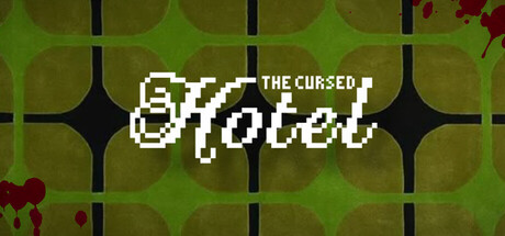
The Cursed Hotel scored 68/100 on Steam Analyzer — Solid for a Action capsule. Top priority fix: [uniqueness_polish] Introduce a distinctive visual element such as a recognizable character silhouette, zombie variant, or signature color accent (e.g., warm orange lighting or eerie purple glow) that differentiates from generic retro-horror capsules.

Capsule scores by dimension

  • Genre Clarity: 7/10 — 90s horror vibes readable. The pixel art aesthetic and 'cursed' title immediately signal retro horror-game inspiration, and the grid-based hotel floor pattern with blood splatters reinforces the zombie-infested setting clearly. At tiny size, the pixelated style and dark red splatter elements remain recognizable as horror, though the specific elevator-escape mechanic is not visually obvious from the capsule alone.
  • Title Readability: 8/10 — Pixel font clear at small. The white pixelated 'Hotel' text with 'THE CURSED' above in crisp block letters reads cleanly against the green background at both full and small sizes, maintaining legibility through strong value contrast. The italic styling adds character without sacrificing clarity, and at tiny size the main word 'Hotel' remains distinctly readable, though the subtitle becomes less prominent but not illegible.
  • Contrast & Color: 7/10 — Green-white contrast effective. The bright white pixel text pops strongly against the muted olive-green tiled background, creating clear silhouette separation that holds at tiny size. The dark grid lines and scattered crimson blood splatter add depth and visual interest, though the overall palette feels somewhat monochromatic in the green range which limits dynamic punch.
  • Uniqueness & Polish: 6/10 — Competent retro homage. The 90s pixel-art aesthetic is executed cleanly with consistent pixelation and a deliberate grid-floor composition that supports the hotel setting, but the visual approach feels more nostalgic reference than distinctive identity. The blood splatter and grid pattern are predictable horror-game tropes without a unique stylistic or mechanical hook that separates it from other retro-horror entries.
  • Brand Consistency: 6/10 — Generic retro-horror treatment. The capsule uses standard 90s horror iconography (pixels, blood, dark tones) that could apply to many similar indie horror games, with no memorable character, symbol, or signature palette element that would make the brand instantly recognizable. Without access to the six store screenshots, it appears the capsule does not establish a unique visual identity distinct from the broader retro-horror category.
  • Composition: 7/10 — Centered title, clean layout. The title is well-centered and anchored in a safe region free from edge clipping, with the grid floor providing a clear background layer that supports hierarchy without clutter. The composition holds at small and tiny sizes, though the grid pattern is quite dense and could read as busier than necessary, potentially competing slightly with text clarity during quick scrolls.

What works

  • Strong pixel-art execution. The pixelated typography and grid-floor pattern are rendered consistently with clean edges and appropriate detail level that reads at all sizes.
  • High contrast white text. The white italic 'Hotel' lettering stands out clearly against the green background, ensuring title legibility at small and tiny viewing scales.
  • Clear horror-game signaling. The combination of 'cursed' title, blood splatter, and retro aesthetic immediately communicates the horror-game genre without ambiguity.

What hurts the capsule

  • Generic retro-horror visual language. The capsule relies on familiar 90s tropes (pixels, blood, grid floors) without establishing a distinctive brand identity that differentiates from similar indie-horror titles.
  • Limited color palette depth. The predominantly olive-green and white composition lacks visual dynamism and warmth compared to top-tier genre competitors, making it feel somewhat muted.
  • No unique mechanical hint. The elevator-escape core mechanic is not visually communicated in the capsule, missing an opportunity to highlight what makes this game specifically different.

Priority fixes

  1. [uniqueness_polish] Introduce a distinctive visual element such as a recognizable character silhouette, zombie variant, or signature color accent (e.g., warm orange lighting or eerie purple glow) that differentiates from generic retro-horror capsules.
  2. [contrast_color] Add a warm accent color (amber, crimson, or sickly green) to the grid or background to increase visual pop and reduce the monochromatic green-dominated feel.
  3. [composition] Simplify or reduce the grid pattern density to ensure the text remains the clear focal point and the overall design reads crisper at small size during quick scrolls.

Store copy priority fixes

  1. [hook_strength] Rewrite the short description to lead with a verb and sensory hook: 'Shoot your way up a haunted hotel, floor by floor. Each visit is different—can you reach the elevator and escape?' This conveys active combat and procedural replay.
  2. [feature_communication] Expand the detailed description to 150+ words and add: (1) enemy variety or behaviour hints, (2) how ammo scarcity affects combat decisions, (3) what 'different in each game' means mechanically, and (4) one line on how the elevator functions as a safe zone or checkpoint.
  3. [uniqueness] Add a single sentence differentiating the elevator mechanic: e.g., 'The elevator is your sanctuary—use each trip to regroup, plan your route, and face the next floor' or clarify how it creates tactical depth versus linear shooters.
  4. [tone_match] Inject one or two atmospheric details: replace 'strange hotel' with a more visceral image (e.g., 'decaying 1990s hotel') and add a verb that conveys dread (e.g., 'claw your way through' instead of 'escape').

Related guides

Steam app ID: 3940230 · Tags: Action, Shooter, FPS, First-Person, 1990's