Scoring genre clarity...

Varmint capsule

Varmint

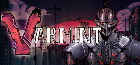
Varmint is an atmospheric anthology set in a world of mechanical terrors. Precision platforming gameplay and larger than life bossfights combine for a thrilling test of skill, wit and memory. Play as one of three pests, useless in a world of machines, and outmaneuver the metallic gods of this world.

$6.994 user reviews
ActionPlatformerAtmospheric
DirtyOnionJan 13, 2026

Varmint scores 78/100 — better than 85% of Action capsules (n=8,535).

4 user reviews · $6.99 · Released Jan 13, 2026 · By DirtyOnion

Quick text summary

Varmint scored 78/100 on Steam Analyzer — Good for a Action capsule. Top priority fix: [composition] Shift the armored figure slightly left to ensure full silhouette clarity within safe margins and reduce cropping risk on edge displays.

Capsule scores by dimension

  • Genre Clarity: 8/10 — Strong action-platformer with boss combat cues. The armored mechanical antagonist on the right immediately signals boss-fight action gameplay, while the pink neon palette and industrial setting establish a stylized, challenging tone. At tiny size, the imposing silhouette and weaponized armor clearly read as a formidable opponent, effectively communicating action-platformer genre expectations without ambiguity.
  • Title Readability: 8/10 — Bold serif lettering reads clearly at all sizes. The title 'VARMINT' uses strong cream-colored serif letters with black outlines positioned centrally against a controlled background, maintaining excellent legibility at full, small, and tiny sizes. The outline stroke prevents color bleed on dark backgrounds and the large letterforms don't collapse under compression, though the tagline text below (if present) would be unreadable at tiny size.
  • Contrast & Color: 8/10 — High-contrast neon pink against dark background. The vibrant magenta/pink tones of the left side and accent elements create strong value separation from the dark sky and muted grays of the mechanical structure, popping distinctly against Steam's #1b2838 background. The armored figure's metallic grays and whites provide additional silhouette clarity; a grayscale test shows robust contrast that survives squinting at tiny sizes.
  • Uniqueness & Polish: 8/10 — Distinctive neon-industrial aesthetic with personality. The color palette—vibrant pink, dark industrial architecture, and metal—creates a memorable visual identity that feels intentional and premium, distinct from generic action game templates. The composition balances atmospheric worldbuilding (towers, crosses, industrial clutter) with a striking focal point, avoiding the copycat look common in the action platformer space.
  • Brand Consistency: 7/10 — Cohesive neon-punk industrial art direction. The palette (hot pink, dark grays, metallic accents) and visual language (mechanical world, ominous silhouettes, atmospheric decay) appear consistent with the game's 'mechanical terrors' premise and should align well with in-game imagery from the 9 store screenshots. The iconic color treatment and armored antagonist could serve as recognizable identity anchors, though without reference to actual screenshots, the internal consistency appears strong but not absolutely verified.
  • Composition: 8/10 — Well-balanced focal point with strong hierarchy. The armored figure anchors the right side as the primary subject while the neon 'V' and title occupy the left-center, creating natural visual flow without dead space or clutter. At small and tiny sizes, the composition remains readable with clear separation between foreground (large letters and figure silhouette) and background (industrial architecture and sky), though the figure's edge positioning could risk minor cropping on some display proportions.

What works

  • Striking color palette. Vibrant magenta and neon pink create immediate visual interest and strong pop against the dark Steam background, making the capsule memorable in quick scrolls.
  • Clear genre communication. The menacing armored antagonist and industrial setting instantly signal action platformer gameplay with boss-fight emphasis without genre ambiguity.
  • Legible title design. Large serif letters with black outlines maintain readability across all viewing sizes, from full header to tiny thumbnail.
  • Cohesive atmospheric worldbuilding. The industrial towers, crosses, and mechanical decay reinforce the 'mechanical terrors' narrative and create visual depth that supports the premium feel.

What hurts the capsule

  • Figure positioning near edge. The armored antagonist on the far right approaches the edge margin, risking loss of detail or partial cropping on certain Steam display ratios or cropping scenarios.
  • Limited character personality visibility. The three playable 'pests' mentioned in the description are absent from the capsule, missing an opportunity to communicate the unique protagonist hook that differentiates this from generic mechanical-world games.
  • Potential tagline illegibility. Any secondary text or tagline below the title would be unreadable at tiny size, reducing the capsule's ability to communicate key selling points at thumbnail scale.

Priority fixes

  1. [composition] Shift the armored figure slightly left to ensure full silhouette clarity within safe margins and reduce cropping risk on edge displays.
  2. [genre_clarity] Add a small visual hint of one of the three pest protagonists (e.g., a silhouette or distinctive shape in the mid-ground) to differentiate from generic mechanical-world action and communicate the core 'useless pests vs. gods' premise.
  3. [title_readability] Remove or condense any tagline text below the title, or ensure it is large enough to remain legible at small capsule sizes if it communicates a key differentiator.

Store copy priority fixes

  1. [feature_communication] Add one sentence describing the three characters and their unique movement abilities: 'Play as a [Name] with [ability], a [Name] with [ability], and a [Name] with [ability]—each rewarding different platforming styles.'
  2. [audience_targeting] Add a line in the Features section highlighting accessibility: 'Adjustable difficulty and playable without timed input make this challenging platformer accessible to a wider range of skills.'
  3. [uniqueness] Replace 'larger than life bossfights' with a concrete differentiator: 'Face each mechanical god in single-phase or multi-phase gauntlets designed to test pattern recognition and adaptation.'
  4. [hook_strength] Consider adding a single sentence at the end of the short description that hints at the meta-narrative or visual style to increase intrigue: 'Uncover the tragedy of a world abandoned by gods.'

Related guides

Steam app ID: 3940450 · Tags: Action, Platformer, Atmospheric, Precision Platformer, Cinematic