Scoring genre clarity...

Space Vomit capsule

Space Vomit

Survive an alien invasion, wipe out your enemies with powerful weapons, and collect perk cards and upgrades for your character!

$0.87Positive(19)
ActionAction RoguelikeRoguelike
TENTACLES INTERACTIVESep 29, 2025

Space Vomit scores 68/100 — better than 17% of Action capsules (n=8,534).

Positive (19 reviews) · $0.87 · Released Sep 29, 2025 · By TENTACLES INTERACTIVE

Quick text summary

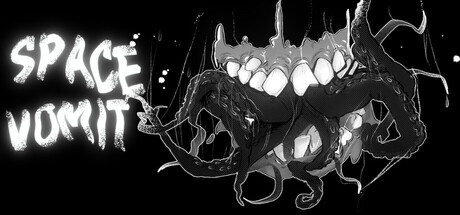
Space Vomit scored 68/100 on Steam Analyzer — Solid for a Action capsule. Top priority fix: [uniqueness_polish] Integrate a weapon or combat visual element into the composition to communicate the action gameplay loop and differentiate from static creature displays.

Capsule scores by dimension

  • Genre Clarity: 7/10 — Alien threat clear, action ambiguous. The grotesque alien creature with glowing pustules and tentacles immediately signals sci-fi horror combat, matching the alien invasion premise. At tiny size, the creature silhouette remains recognizable and conveys threat, though the specific action-arcade gameplay loop is not visually obvious from the creature alone. The title 'SPACE VOMIT' reinforces the gross-out sci-fi tone rather than gameplay mechanics.
  • Title Readability: 8/10 — Title legible, strong outline strategy. The white outlined 'SPACE VOMIT' text uses bold sans-serif letterforms with thick white stroke that create excellent separation from the dark background and alien graphic. At small and tiny sizes, the title remains readable due to the high-contrast outline approach and clear spacing. The placement on the left side keeps it away from the busy creature detail, supporting legibility across all viewing scales.
  • Contrast & Color: 8/10 — High value separation, strong silhouette. The white outlined title and pale glowing creature elements contrast sharply against the pure black background, creating a striking value gradient that reads well in quick scroll. The glowing pustules and creature outline have clear edge definition that survives squinting and grayscale conversion. The monochromatic approach with strategic white highlights maximizes readability on Steam's dark interface without color distraction.
  • Uniqueness & Polish: 6/10 — Effective creature design, generic execution. The alien creature artwork shows intentional grotesque design with purposeful tentacle and pustule detail that communicates the game's gross-out tone and alienness. However, the overall capsule composition relies heavily on a single creature illustration without additional visual storytelling about weapons, combat mechanics, or perk system mentioned in the game description. The approach is competent but does not differentiate from standard 'show the monster' indie game capsule templates.
  • Brand Consistency: 5/10 — Alien visual established, no icon system. The grotesque pale creature with glowing pustules establishes a consistent gross-out sci-fi aesthetic that could be recognized as Space Vomit's signature look. However, there are no recurring symbols, color palette cues, or UI elements visible that create a larger brand identity system across multiple marketing materials. The monochromatic treatment is functional but does not build memorable brand recognition beyond 'gross alien game.'
  • Composition: 7/10 — Creature centered, title well-placed. The alien creature anchors the right and center space with strong focal hierarchy, while the title occupies the safe left margin without edge-hugging issues. At small size, the composition maintains clarity with title and creature as distinct readable regions. The relatively sparse negative space around the creature works well for quick identification, though the composition lacks depth layering or environmental context that might suggest setting or gameplay beyond the creature threat.

What works

  • Title contrast and outline clarity. White stroke-outlined text reads cleanly at all sizes against black background and survives tiny thumbnail scaling without collapse.
  • Creature silhouette strength. The alien design has clear recognizable shape with high value separation that communicates threat and gross-out tone immediately.
  • Safe layout margins. Title placement on left margin avoids Steam cropping issues and maintains readability without competing with central creature artwork.

What hurts the capsule

  • Generic monster-focus template. The capsule relies solely on creature display without visual hints about gameplay mechanics, weapons, or the perk/upgrade systems that differentiate the game.
  • Monochromatic palette limits brand recall. The black-and-white treatment is effective for contrast but provides no distinctive color identity or visual hook for brand recognition.
  • Lack of environmental or action context. The creature floats in void with no setting, weapons, or combat visual that suggests the action-arcade gameplay promised in the description.

Priority fixes

  1. [uniqueness_polish] Integrate a weapon or combat visual element into the composition to communicate the action gameplay loop and differentiate from static creature displays.
  2. [brand_consistency] Introduce a subtle secondary color accent or recurring visual motif that could serve as a recognizable brand identity across marketing materials.
  3. [genre_clarity] Add environmental or UI context clues such as alien landscape, weapon silhouettes, or upgrade card elements to clarify the full game experience beyond creature threat.

Store copy priority fixes

  1. [uniqueness] Add a specific mechanical hook or art/gameplay distinction—e.g., 'combines [X mechanic] with [Y system]' or 'the only bullet hell where [specific feature]' to differentiate from similar roguelikes.
  2. [feature_communication] Replace 'amazing shots' and 'unique characteristics' with concrete mechanics—explain what perk cards do, how the upgrade book functions, and what weapon variety means in practice.
  3. [hook_strength] Rewrite 'Bosses big, huge, giants and powerful!' to use proper grammar and add a specific threat or challenge—e.g., 'Face towering boss encounters with evolving attack patterns' to excite rather than confuse.
  4. [audience_targeting] Add a single sentence clarifying ideal player type—e.g., 'Perfect for arcade fans seeking quick, replayable runs' or 'Hardcore bullet hell veterans will appreciate [specific challenge element]' to signal who this is for.

Related guides

Steam app ID: 3940800 · Tags: Action, Action Roguelike, Roguelike, Bullet Hell, Shooter