Scoring genre clarity...

Nocturne Maze: Shadows in the Hedge capsule

Nocturne Maze: Shadows in the Hedge

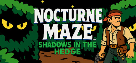
Trapped in a sprawling hedge maze, Simon Rhodes must survive for as long as possible while being chased by ghoulish monsters. A tribute to top-down maze shooters of the early '80s, defeat as many enemies and go for the high score!

$0.99
ActionSingleplayerArcade
XaybaOct 1, 2025

Nocturne Maze: Shadows in the Hedge scores 75/100 — better than 70% of Action capsules (n=8,534).

$0.99 · Released Oct 1, 2025 · By Xayba

Quick text summary

Nocturne Maze: Shadows in the Hedge scored 75/100 on Steam Analyzer — Good for a Action capsule. Top priority fix: [uniqueness_polish] Introduce a subtle visual signature or standout detail—such as a distinctive maze pattern, unique monster design, or character-specific badge—that elevates the design beyond generic retro-game conventions and aids later brand recall.

Capsule scores by dimension

  • Genre Clarity: 7/10 — Clear action-maze gameplay signals. The capsule effectively communicates a retro arcade action game through the top-down perspective character, glowing monster eyes in the hedge, and yellow stars suggesting danger or scoring. The protagonist's khaki outfit and confident pose read as an adventurer in peril. At TINY size, the glowing eyes and character silhouette still register as action-oriented, though the maze-specific context softens slightly.
  • Title Readability: 8/10 — Bold, clean, legible text hierarchy. NOCTURNE MAZE is rendered in large white sans-serif with strong contrast against the dark background, maintaining full readability at all sizes including TINY. The green subtitle SHADOWS IN THE HEDGE sits below in smaller type but remains clear. The text placement on a controlled dark region avoids competing with the busy hedge texture, and the hierarchy between title and subtitle is well-managed and does not collapse at small sizes.
  • Contrast & Color: 8/10 — Strong value separation and saturation. The bright green hedge foliage and yellow glowing eyes create excellent pop against the dark #1b2838 background, while the white title provides maximum contrast. The character's tan and red outfit breaks up the green-yellow palette effectively. In grayscale, the silhouette separation remains clear—the hedges read as bright midtones, eyes as highlights, and background as deep shadow—ensuring legibility even at TINY size.
  • Uniqueness & Polish: 7/10 — Nostalgic retro aesthetic well-executed. The capsule leans into early '80s arcade styling with purpose: the glowing monster eyes, yellow star accents, and chunky foliage convey a cohesive tribute aesthetic. The character illustration is charming and distinct, though the overall visual approach aligns closely with retro-game conventions rather than introducing a surprising hook. The craft is clean and intentional, elevating it above generic, but it does not push visual boundaries in ways that would distinguish it from other retro indie titles.
  • Brand Consistency: 7/10 — Coherent retro-game identity signals. The palette—forest green, golden yellow, tan character, dark background—is consistent and reinforces the '80s maze-game aesthetic. The character illustration style is cartoonish and recognizable. The glowing-eye monster motif establishes a visual signature suitable for later brand recognition. Internal visual language is unified, though there are no iconic symbols or unique motifs that go beyond the retro-game genre expectations.
  • Composition: 8/10 — Well-balanced focal hierarchy. The layout balances the character on the right, the menacing glowing eyes upper-left, and the title center-left, creating clear depth and diagonal tension. The character anchors attention in the right third, the hedges frame the scene, and the monster eyes draw secondary focus. At SMALL and TINY sizes, the character silhouette and title remain the primary anchors with the eyes as supporting threat cues. Safe margins are respected, and cropping resilience is strong across all viewing sizes.

What works

  • Readable title hierarchy. Large white title maintains legibility at TINY size with strong contrast and clean sans-serif letterforms against dark background.
  • Strong contrast and silhouette clarity. Bright greens, yellows, and whites pop distinctly against the dark background, ensuring the design does not fade in quick scroll or at reduced sizes.
  • Balanced composition with clear focal points. Character, monster eyes, and title form a coherent diagonal composition that guides the eye without scattering attention across the frame.
  • Nostalgic visual consistency. Palette, character style, and retro-game cues reinforce a unified '80s arcade identity that communicates the game's homage clearly.

What hurts the capsule

  • Generic retro-arcade execution. While well-crafted, the visual approach relies heavily on familiar retro-game tropes without introducing a distinctive or surprising visual hook that sets it apart from other indie tributes.
  • Limited brand-distinct symbolism. There are no unique iconic characters, symbols, or motifs that would make this capsule immediately recognizable as *this specific game* rather than a general '80s arcade aesthetic.

Priority fixes

  1. [uniqueness_polish] Introduce a subtle visual signature or standout detail—such as a distinctive maze pattern, unique monster design, or character-specific badge—that elevates the design beyond generic retro-game conventions and aids later brand recall.
  2. [brand_consistency] Consider adding a small repeating motif or icon (e.g., a hedge maze icon, Simon's signature item, or a distinctive star style) that appears consistently across store screenshots and marketing to strengthen brand identity.

Store copy priority fixes

  1. [uniqueness] Add a sentence explaining what makes the hedge maze setting or enemy AI unique compared to other early-'80s arcade homages, e.g., 'Invisible ghosts require sound cues, werewolves hunt in packs'.
  2. [feature_communication] Expand the 'each foe behaves uniquely' bullet point with 1-2 concrete examples: how do ghosts differ from werewolves in movement or attack patterns?
  3. [audience_targeting] Add a line after 'Two difficulty modes' acknowledging that Normal Play welcomes newcomers alongside arcade veterans, broadening audience appeal without diluting the retro focus.

Related guides

Steam app ID: 3947280 · Tags: Action, Singleplayer, Arcade, Top-Down Shooter, Pixel Graphics