Scoring genre clarity...

Beat Paws Odyssey capsule

Beat Paws Odyssey

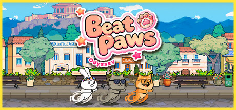
Beat Paws Odyssey isn’t a game that takes your time— it stays with you while time passes. Every keystroke and mouse click breathes life into these adorable little creatures, fueling their journey around the world. They wander far to bring a touch of warmth and tenderness to your screen.

$6.99Positive(26)
TypingIncrementalCollectathon
mindora gamesJan 22, 2026

Beat Paws Odyssey scores 85/100 — better than 96% of Typing capsules (n=214).

Positive (26 reviews) · $6.99 · Released Jan 22, 2026 · By mindora games

Quick text summary

Beat Paws Odyssey scored 85/100 on Steam Analyzer — Excellent for a Typing capsule. Top priority fix: [genre_clarity] Consider adding a subtle UI element or activity hint (e.g., small food/item icon) to reinforce the interactive/clicking mechanic mentioned in description.

Capsule scores by dimension

  • Genre Clarity: 8/10 — Casual adventure with cute creatures. The presence of three adorable anthropomorphic animals (white rabbit, gray cat, orange cat) in a colorful neighborhood setting immediately signals a cozy casual game. The bright, whimsical art style with pastel houses and cheerful sky clearly indicates a lighthearted indie experience. At TINY size, the character silhouettes remain distinct enough to read as cute mascots, though fine details blur.
  • Title Readability: 9/10 — Bold, legible, perfectly positioned. The 'Beat Paws' title uses a thick, rounded pink-orange font with a strong black outline, placed prominently in the center-upper area against a relatively clean blue sky background. The outline and weight ensure it remains readable even at TINY thumbnail size where it maintains clear letterforms. Tagline 'Odyssey' or additional text is not competing for attention, keeping focus clean.
  • Contrast & Color: 9/10 — Vibrant palette pops against dark UI. The bright yellow border, pastel blue sky, and warm coral-pink title create strong value separation against Steam's dark #1b2838 background. The three character animals use high-saturation orange and white that stand out clearly even in a quick scroll. Grayscale silhouette test shows excellent edge definition—the characters and buildings maintain distinct shapes with no muddy mid-tone blending.
  • Uniqueness & Polish: 8/10 — Distinctive cozy aesthetic, polished craft. The hand-drawn illustration style with detailed neighborhood scene, consistent character design, and intentional color harmony feel premium and purpose-built rather than templated. The visual storytelling of peaceful animals in a residential setting directly communicates the 'warmth and tenderness' core appeal. The work shows strong craft with clean linework and coherent lighting, standing well above generic casual game templates.
  • Brand Consistency: 8/10 — Strong character identity, cohesive world. The three distinct animal mascots (white rabbit, gray and orange cats) form a recognizable icon trio that communicates identity clearly. The consistent warm pastel palette, hand-drawn illustration style, and peaceful residential setting create a cohesive art direction that would be identifiable across marketing materials. The illustrated neighborhood aesthetic and character proportions suggest strong internal brand guidelines.
  • Composition: 9/10 — Clear focal point, balanced layers. The three animals are positioned in a strong foreground line at the bottom, creating immediate focal interest while the colorful neighborhood buildings and sky provide depth layering without clutter. The title placement in the upper-center is secondary to the character group, establishing clear hierarchy. Safe margins are observed; no critical elements hug edges, and the composition remains readable and balanced at all sizes from FULL to TINY.

What works

  • Title legibility at all sizes. The outlined pink-orange 'Beat Paws' font with generous weight maintains perfect readability from full header down to tiny thumbnail due to strong outline and clean placement on sky.
  • Vibrant color contrast. Bright yellow border, pastel blue, warm coral, and high-saturation character colors create excellent value separation against dark Steam background without feeling garish.
  • Clear visual hierarchy. The three mascot animals command foreground attention while supporting buildings and sky provide context depth, guiding eye naturally without scattered emphasis.
  • Premium illustration craft. Hand-drawn style with consistent linework, intentional lighting, and detailed neighborhood scene feel polished and purpose-built rather than asset-based or template-derived.

What hurts the capsule

  • Moderate detail loss at TINY. While main elements survive, fine details of individual buildings and some background trees blur slightly when squeezed to 120×45 pixels, though silhouettes remain clear.
  • Genre subtype slightly ambiguous. The casual cozy aesthetic is clear, but whether this is a clicker, adventure, or life sim is not immediately obvious from the capsule alone without reading description.

Priority fixes

  1. [genre_clarity] Consider adding a subtle UI element or activity hint (e.g., small food/item icon) to reinforce the interactive/clicking mechanic mentioned in description.
  2. [composition] Ensure all building details remain distinguishable down to 120×45 by slightly increasing contrast between mid-ground structures and sky gradient if rescaling occurs.

Store copy priority fixes

  1. [feature_communication] Replace the repeated final sentence with a concrete detail about progression pacing (e.g., 'Watch your companions level up and unlock new regions over days and weeks') to answer how long gameplay spans.
  2. [genre_clarity] Add a single sentence explicitly naming the game type (e.g., 'Beat Paws Odyssey is an idle game that runs passively in the background') early in the detailed description for players unfamiliar with the genre.
  3. [feature_communication] Expand the 'Online companion mode with friends' bullet into 1-2 sentences explaining whether friends must be online together or if progress syncs asynchronously.
  4. [feature_communication] Replace 'charming accessories' with a concrete example (e.g., 'hats, outfits, and toys') to help players visualize the customization loop.

Related guides

Steam app ID: 3947470 · Tags: Typing, Incremental, Collectathon, Idler, Exploration