Scoring genre clarity...

Age of Damnation capsule

Age of Damnation

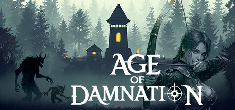
Age of Damnation — a fantasy medieval strategy with a top-down view. By day, you explore the forest and build your settlement. By night, you defend against waves of monsters born from damnation mist. Gather resources, develop your settlement, research technologies, build defenses, destroy monsters.

$6.996 user reviews
StrategyBase Building3D
WukaStudioOct 27, 2025

Age of Damnation scores 70/100 — better than 28% of Strategy capsules (n=5,103).

6 user reviews · $6.99 · Released Oct 27, 2025 · By WukaStudio

Quick text summary

Age of Damnation scored 70/100 on Steam Analyzer — Good for a Strategy capsule. Top priority fix: [genre_clarity] Introduce a subtle visual cue of the 'damnation mist' or monster waves (e.g., glowing red fog, corrupted creatures) to clarify the defensive/survival strategy angle and differentiate from generic dark fantasy.

Capsule scores by dimension

  • Genre Clarity: 7/10 — Medieval fantasy strategy clear. The tower, forest silhouettes, and nighttime monster (left creature) establish a fantasy medieval setting with defensive/survival overtones. At TINY size, the tower and forest read clearly as a strategic settlement context, though the dual-phase day/night mechanic is not immediately apparent without text. The genre signals are present but could be stronger—it reads more as generic dark fantasy than distinctly strategic.
  • Title Readability: 8/10 — Strong readable title placement. Title is centered, bold white sans-serif with good contrast against the dark background and positioned over a controlled misty region. The text maintains legibility at SMALL size with clean letterforms and spacing. At TINY size it remains readable, though the ornamental symbol in DAMNATION adds slight visual complexity that does not impact comprehension.
  • Contrast & Color: 8/10 — Strong value separation clear. White title and castle tower pop clearly against dark forest and mist. The creature silhouette on the left and the tower on the right create distinct light-dark layering. In grayscale, the tower and title maintain sharp separation from midtone forest elements, and the overall composition avoids muddy mid-tone collapse at all sizes.
  • Uniqueness & Polish: 6/10 — Competent but generic dark fantasy. The composition is well-crafted with strong atmospheric mist and layered forests, but the visual presentation is a familiar dark fantasy/horror aesthetic without distinctive character or unique mechanical hook visible. There is no memorable symbol, character icon, or signature visual that screams 'Age of Damnation' uniquely—it could fit many other dark strategy games. Polish is solid but the concept reads as stock dark fantasy rather than a standout title.
  • Brand Consistency: 6/10 — Cohesive but generic identity. The palette (dark blue-grey forest, golden tower lights, white text, creature silhouette) is internally consistent and matches a dark medieval strategy tone. However, there are no iconic symbols, signature character designs, or memorable motifs that would anchor brand recognition across other marketing materials. The tower and tower icon in the text are functional but not distinctive enough to become a recognizable brand anchor.
  • Composition: 7/10 — Balanced layering with clear focal tower. The tower anchors the center with good foreground-midground-background depth. The creature on the left and human figure on the right frame the composition, guiding the eye inward. At SMALL and TINY sizes, the tower remains the clear focal point. The title placement is safe and readable, though the composition relies on atmospheric subtlety rather than bold visual hierarchy—at quick scroll the elements may not punch as hard as top-tier competitor capsules.

What works

  • Title legibility and placement. Bold centered white text reads clearly at all sizes with strong contrast against the dark background and positioned over a stable mist region.
  • Atmospheric depth layering. Forest silhouettes, mist, tower, and creature create clear foreground-midground-background separation that maintains composition integrity at small sizes.
  • Color-to-background contrast. The tower's golden windows and white title pop distinctly against #1b2838 in grayscale and color, ensuring visibility during quick scrolling.

What hurts the capsule

  • Generic dark fantasy aesthetic. The visual language lacks distinctive elements or signature iconography that would make Age of Damnation memorable versus other dark medieval strategy games.
  • Unclear core mechanic communication. The day-night defense loop and settlement-building strategy are not visually apparent; the capsule reads more as atmospheric dark fantasy than as a distinct gameplay hook.
  • Limited brand anchor identity. No iconic character, symbol, or color palette that would be immediately recognizable as belonging to this specific game if seen elsewhere.

Priority fixes

  1. [genre_clarity] Introduce a subtle visual cue of the 'damnation mist' or monster waves (e.g., glowing red fog, corrupted creatures) to clarify the defensive/survival strategy angle and differentiate from generic dark fantasy.
  2. [uniqueness_polish] Add a distinctive brand element such as a signature character portrait, unique tower design detail, or memorable symbol (e.g., corrupted rune, settlement icon) that anchors visual identity across marketing.
  3. [contrast_color] Consider adding a warm accent color (deep amber or blood-red) to the creature or mist to create additional visual interest and ensure the capsule stands out in genre competitor rows.

Store copy priority fixes

  1. [hook_strength] Revise the opening line to lead with the day/night cycle hook instead of abstract flavor: 'Build by day, survive by night—a 100-day race against damnation.' This is more punchy and immediately communicates the core tension.
  2. [uniqueness] Add 1-2 sentences in the short description or early in the detailed description that explicitly differentiate this game from other tower defense or city builders, such as: 'The more you expand, the stronger the enemy becomes—every choice has a cost.'
  3. [feature_communication] Expand the resource management and building strategy section with concrete examples, such as: 'Balance food production against housing and defense to keep settlers happy and combat-ready.'
  4. [audience_targeting] Include a sentence in the detailed description targeting intended audience, such as: 'For strategy players who enjoy tactical resource management and tower defense—plan carefully, or the damnation will consume you.'

Related guides

  • Steam page optimisationCapsule, copy, screenshots, tags — the full Steam page conversion stack.
  • Steam tags guideTag selection, ordering, and how it shapes Steam's recommendation rails.

Steam app ID: 3948980 · Tags: Strategy, Base Building, 3D, Top-Down, Survival