Quick text summary
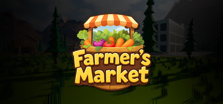
Farmer's Market scored 78/100 on Steam Analyzer — Good for a Casual capsule. Top priority fix: [brand_consistency] Introduce an iconic character mascot or distinctive symbol (e.g., a signature farmer, animal companion, or visual motif) that appears in future marketing to build memorable brand identity
Capsule scores by dimension
- Genre Clarity: 9/10 — Farming sim instantly recognizable. The striped market stall, vibrant produce (pumpkins, carrots, vegetables), and cheerful low-poly art style immediately signal a cozy farming/merchant game. At tiny size, the orange-and-white awning and crop imagery remain legible and genre-specific. The pastoral background with silhouetted trees and buildings reinforces the rural farming setting without ambiguity.
- Title Readability: 8/10 — Bold yellow text reads clearly. The title 'Farmer's Market' is rendered in large, golden-yellow serif typeface with strong black outline, positioned directly under the market stall graphic. The contrast against the darker background holds at small size, though at tiny size the serifs may soften slightly. Letterforms remain distinguishable throughout all viewing conditions.
- Contrast & Color: 8/10 — Warm palette pops against dark. The warm orange, yellow, and green hues of the market stall and produce create strong value separation from the dark forest background and Steam's #1b2838 color. The bright yellow title and vibrant crop colors maintain clear silhouettes in grayscale, with good edge definition. At tiny size, the color blocking still reads as distinct primary focal point.
- Uniqueness & Polish: 7/10 — Polished cozy aesthetic, slight familiarity. The low-poly render quality and color harmony show intentional craft, with clean geometry and cohesive lighting that avoids a templated feel. The market stall design is charming and well-executed, though the overall composition follows familiar cozy-game visual patterns seen in comparable titles like Tiny Glade and Moonstone Island. The execution is premium, but the core concept is not particularly distinctive within the casual farming niche.
- Brand Consistency: 7/10 — Coherent style, limited iconic hook. The low-poly 3D rendering, warm earth-tone palette, and pastoral setting create internal visual consistency and a recognizable cozy farming identity. However, there are no strong iconic character, symbol, or signature motif that would make this capsule memorable on repeat viewings or standalone without context. The style aligns well with genre expectations but does not have a unique brand anchor.
- Composition: 8/10 — Clear hierarchy, well-balanced layout. The market stall is the obvious primary focal point in the center-upper third, with the title anchored below in prime real estate and a supporting forest backdrop that does not compete. The vertical arrangement maintains hierarchy across all sizes, and no critical elements sit dangerously close to crop zones. At tiny size, the composition compresses effectively with the stall and title remaining the dominant read.
What works
- Genre immediately clear at glance. The market stall, produce, and farming aesthetic communicate cozy farming sim genre without ambiguity even at thumbnail size.
- Strong warm-color contrast. Golden yellow and vibrant orange hues create excellent separation from dark background and maintain silhouette clarity in grayscale.
- Intentional polish and craft. Low-poly render, clean typography, and coherent lighting demonstrate professional execution rather than asset-flip or template-based work.
- Balanced composition hierarchy. Market stall and title occupy prime focal zones without clutter, and supporting elements guide the eye without competing for attention.
What hurts the capsule
- Limited brand distinctiveness. The visual presentation, while polished, follows established cozy-game visual language without a unique icon, character, or signature motif to differentiate recall.
- Generic cozy-game formula. The composition and art style align closely with other successful titles in the category (Tiny Glade, Moonstone Island), reducing originality in concept execution.
- Serif typeface softens slightly at tiny size. While still readable, the decorative serifs on the title font lose some crispness at thumbnail scales, impacting precision legibility.
Priority fixes
- [brand_consistency] Introduce an iconic character mascot or distinctive symbol (e.g., a signature farmer, animal companion, or visual motif) that appears in future marketing to build memorable brand identity
- [uniqueness_polish] Add a subtle unique visual storytelling element—such as a specific farming mechanic hint (weather effect, tool detail, or harvest-specific visual cue)—to differentiate from generic cozy-game templates
- [title_readability] Strengthen the title outline weight or add a subtle drop shadow to ensure serif letterforms maintain full crispness at tiny thumbnail scale without softening
Store copy priority fixes
- [uniqueness] Add a sentence that explains what makes Farmer's Market different (e.g., specific aesthetic choices, unique crop mechanics, or exclusive features) compared to other farming sims.
- [feature_communication] Expand the detailed description with one concrete example of how crop combinations or farm decoration affects gameplay or profit.
- [feature_communication] Clarify progression: How many seed types? How long does a typical play session or farm lifecycle last? What do decorations do beyond aesthetics?
Related guides
Steam app ID: 3949430 · Tags: Casual, Simulation, Farming Sim, Life Sim, Time Management