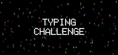
Typing Challenge scores 72/100 — better than 43% of Casual capsules (n=10,153).

Quick text summary

Typing Challenge scored 72/100 on Steam Analyzer — Good for a Casual capsule. Top priority fix: [uniqueness_polish] Introduce a distinctive art style or visual motif (e.g., iconic character, signature color gradient, or stylized UI element) that signals premium craft and brand identity.

Capsule scores by dimension

  • Genre Clarity: 8/10 — Typing game clearly communicated. The scattered colorful letters across the background immediately signal a word or typing game, with the central white text 'TYPING CHALLENGE' making the genre explicit. At tiny size, the letter scatter pattern and text remain readable enough to convey 'typing game' without ambiguity, though individual letter colors blur into texture.
  • Title Readability: 9/10 — Bold title stands out reliably. White sans-serif text with strong letter spacing and clean geometric letterforms sits centered on a dark background with excellent contrast. The title maintains legibility from full size down to tiny thumbnail, with no decorative collapse or readability loss even at 120x45px.
  • Contrast & Color: 8/10 — Strong white-dark separation achieved. Pure white title text contrasts sharply against the dark navy-black background, creating clear silhouette separation. Scattered colorful letters (magenta, cyan, green, yellow) add visual interest and pop without muddying the hierarchy; in grayscale the white title maintains dominance and the letter scatter provides mid-tone texture that supports rather than competes.
  • Uniqueness & Polish: 6/10 — Competent execution, generic approach. The letter-scatter concept is thematically appropriate for a typing game but relies on a familiar visual trope without distinctive art direction or premium craft signaling. The design is clean and functional but lacks a unique hook, memorable character, or stylistic signature that would elevate it above competent baseline for the indie casual tier.
  • Brand Consistency: 5/10 — No memorable identity established. The capsule uses only scattered letters and neutral typography with no recognizable icon, character, or signature palette that could anchor brand recall across marketing. Without access to in-game screenshots, the visual language appears generic and does not signal a distinctive creative voice or visual identity unique to this title.
  • Composition: 7/10 — Clear hierarchy, balanced layout. The centered white title acts as the dominant focal point with the letter scatter framing it as supporting texture, creating effective depth layering and visual breathing room. At small and tiny sizes the composition holds; no critical elements sit at dangerous crop edges and the title remains safely positioned in the center safe zone.

What works

  • Excellent title contrast and readability. Pure white sans-serif text maintains perfect legibility from full header down to 120x45px thumbnail against dark background.
  • Thematic visual support with letter scatter. Colored letters reinforce the typing game genre theme while providing visual texture that enhances rather than clutters the composition.
  • Strong focal point hierarchy. Centered title commands attention clearly with adequate white space, avoiding visual noise that would harm quick-scroll discoverability.

What hurts the capsule

  • Generic concept lacks distinctive polish. The letter-scatter background is a familiar typing-game visual trope that does not establish a unique or premium art direction.
  • No brand identity signals present. The capsule uses only neutral typography and generic texture with no recognizable character, icon, or signature palette to build brand recall.
  • Limited visual storytelling or mechanic clarity. While the genre is clear, the capsule does not communicate gameplay hooks, difficulty tiers, or unique selling points that differentiate from competitors.

Priority fixes

  1. [uniqueness_polish] Introduce a distinctive art style or visual motif (e.g., iconic character, signature color gradient, or stylized UI element) that signals premium craft and brand identity.
  2. [brand_consistency] Add a recognizable logo, mascot, or symbol that can anchor long-term brand recall across promotional materials and community presence.
  3. [composition] Layer a subtle gameplay mechanic visual (e.g., speed lines, progress bar, or score indicator) to hint at the competitive typing challenge core loop.

Store copy priority fixes

  1. [hook_strength] Replace 'addictive arcade typing challenge' with a verb-forward hook that shows immediate player action or emotional payoff, e.g., 'Race against two lanes simultaneously or maintain an endless typing flow—test your limits.'
  2. [uniqueness] Add a single sentence that articulates what is distinct about Typing Challenge, e.g., 'The dual-lane system forces you to type left-hand and right-hand sequences simultaneously, a challenge no other typing game offers.'
  3. [audience_targeting] Clarify the primary audience in the opening paragraph by adding a sentence like 'Perfect for competitive speedrunners chasing global leaderboards and casual players sharpening their reflexes.'
  4. [tone_match] Remove or replace overused marketing words ('ultimate,' 'addictive') with specific descriptions of player experience; e.g., instead of 'The Ultimate Test,' say 'See how long you can sustain both precision and speed under mounting character density.'

Related guides

Steam app ID: 3949860 · Tags: Casual, Education, Typing, Singleplayer, Word Game