Scoring genre clarity...

Feed the Greed capsule

Feed the Greed

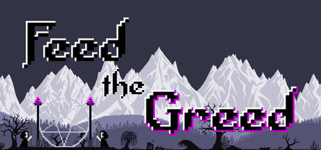
A short active incremental game. Send skeleton villagers with sacrificial offerings to a growing space rift. Feed the rift in exchange for essence, unlock different offerings and their upgrades - all for the sake of more essence.

$2.99Mostly Positive(61)
CasualIdlerIncremental
ElifamSep 15, 2025

Feed the Greed scores 62/100 — better than 3% of Casual capsules (n=10,153).

Mostly Positive (61 reviews) · $2.99 · Released Sep 15, 2025 · By Elifam

Quick text summary

Feed the Greed scored 62/100 on Steam Analyzer — Solid for a Casual capsule. Top priority fix: [title_readability] Consolidate 'Feed the Greed' into a single unified line with consistent magenta coloring and add a thin white or dark outline to improve contrast against the sky at TINY size.

Capsule scores by dimension

  • Genre Clarity: 7/10 — Indie casual with dark tone. The pixel art mountains, glowing rift, skeleton villagers, and sacrificial stakes clearly signal a quirky indie game with supernatural/dark humor themes. At TINY size, the silhouette of mountains and the purple rift glow still read as a stylized fantasy/casual game, though the specific incremental mechanic is not visually obvious without context.
  • Title Readability: 6/10 — Readable but not optimized small. The title 'Feed the Greed' uses a crisp pixelated font in magenta/purple that contrasts adequately against the light mountain backdrop in the center. At SMALL size it remains legible, but at TINY size the letterforms lose clarity and the magenta color begins to bleed into the dark sky background, reducing immediate recognition.
  • Contrast & Color: 7/10 — Good value separation with minor issues. The light gray/white mountains pop well against the dark blue-gray sky, and the bright magenta 'Greed' text provides distinct color contrast. However, the foreground skeleton silhouettes and purple glow elements muddy slightly into the mid-tone background at TINY size, and the 'Feed the' text in black/dark gray lacks clear separation from the sky.
  • Uniqueness & Polish: 6/10 — Competent pixel art, generic layout. The art style is cleanly executed with consistent pixel rendering, and the dark sacrificial theme with glowing rift is thematically cohesive and unusual for an incremental game. However, the composition of text floating over a landscape is a familiar capsule template, and there is no distinctive visual hook that communicates the core incremental/farming mechanic beyond the generic dark fantasy premise.
  • Brand Consistency: 5/10 — Minimal identity cues present. The purple rift and skeleton elements are consistent with the game's core aesthetic, but there are no iconic symbols, character mascots, or signature visual motifs that would make this capsule immediately recognizable on repeat viewings. The pixel art style is the main cohesive element, but it does not establish a strong distinctive brand identity compared to other indie pixel games.
  • Composition: 6/10 — Centered layout, moderate hierarchy. The composition uses a clear layered depth: dark sky, light mountains in midground, foreground skeleton silhouettes and ritual elements. The title is split between upper-left 'Feed' and center-right 'Greed', creating a visual flow across the canvas. At SMALL and TINY sizes the split title reads awkwardly, and the composition relies on symmetry rather than a strong focal point that guides attention efficiently.

What works

  • Mountain silhouette clarity. The white/light gray mountain range creates strong value contrast and reads cleanly as a cohesive landscape element even at TINY size.
  • Thematic pixel art execution. Consistent pixel rendering and dark sacrificial motifs (skeleton villagers, glowing rift) establish a distinctive supernatural tone that fits the incremental premise well.
  • Color palette coherence. The cool blue-gray sky paired with magenta accents and pale mountains creates a visually unified color scheme.

What hurts the capsule

  • Split title legibility at small sizes. The 'Feed the' text is small and dark-on-dark, making it hard to read at SMALL size and nearly illegible at TINY, breaking up what should be a unified brand name.
  • Generic landscape template. Floating text over a mountain scene is a common casual game capsule pattern that does not distinguish this game from many competitors in the genre.
  • Weak core mechanic communication. The visual does not clearly hint at the incremental/farming gameplay loop; the ritual setting and skeleton elements suggest narrative-driven game rather than active progression mechanics.
  • Foreground clutter blends into background. The skeleton and ritual elements in the foreground lack sufficient contrast separation from the mid-tone mountain silhouettes, reducing readability at smaller scales.

Priority fixes

  1. [title_readability] Consolidate 'Feed the Greed' into a single unified line with consistent magenta coloring and add a thin white or dark outline to improve contrast against the sky at TINY size.
  2. [composition] Strengthen focal hierarchy by enlarging the central rift element and repositioning title to top of capsule with clear safe margins, reducing visual competition between text layers.
  3. [contrast_color] Add subtle dark outline or shadow beneath foreground skeleton elements to separate them from the mountain midground and improve TINY size silhouette clarity.
  4. [uniqueness_polish] Introduce a recognizable UI element or iconic visual motif (e.g., glowing essence particle, unique offering icon) that hints at the incremental mechanic and creates a memorable identity cue.

Store copy priority fixes

  1. [hook_strength] Rewrite the opening line to lead with the dark thematic hook, e.g., 'Watch tiny skeleton villagers feed their insatiable greed by sacrificing creatures to a mysterious space rift—and decide whether their hunger should be satisfied or stopped.' This moves from genre statement to emotional premise.
  2. [uniqueness] Add one concrete example of upgrade synergy or 'unique effect' in the detailed description, e.g., 'Sacrifice a fire-touched offering to a frost-blessed rift for explosive essence gains,' to demonstrate the emergent gameplay that separates this from standard incrementals.
  3. [audience_targeting] Insert a sentence explicitly positioning the game for active casual play, e.g., 'Designed for players who enjoy hands-on incremental strategy without the grind—designed to be engaged with actively, not left idle,' to differentiate from pure idle/AFK games.
  4. [feature_communication] Restructure the mechanic descriptions as a bulleted list (Assign Villagers → Generate Offerings → Sacrifice for Essence → Build and Upgrade) to improve scannability and clarity.

Related guides

Steam app ID: 3950280 · Tags: Casual, Idler, Incremental, 2D, Pixel Graphics