Scoring genre clarity...

Paid By Blood capsule

Paid By Blood

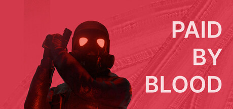
'Paid By Blood' is a linear 3D visual novel with a top-down and fixed camera perspective, decorated by a few battles. Play as Scout No.3, venturing deep into dangerous zone to find the path leading to Ground Zero. Search and find everything interactable for clues.

$0.99
AdventureRPGInteractive Fiction
HU JIA XISep 30, 2025

Paid By Blood scores 70/100 — better than 33% of Adventure capsules (n=7,922).

$0.99 · Released Sep 30, 2025 · By HU JIA XI

Quick text summary

Paid By Blood scored 70/100 on Steam Analyzer — Good for a Adventure capsule. Top priority fix: [genre_clarity] Incorporate a visual element that hints at the investigation or visual novel aspect—such as a close-up eye detail, UI-style frame, or document/clue imagery—to better align the capsule with the actual gameplay loop and set clearer expectations.

Capsule scores by dimension

  • Genre Clarity: 7/10 — Clear mystery action vibe. The silhouette of an armed figure in tactical gear against a red background with industrial/sci-fi texturing clearly signals action-adventure gameplay. At tiny size, the character pose and gear are still readable, though the specific subgenre (visual novel with RPG elements) is not obvious from visuals alone—it reads more as pure action-adventure than narrative-focused indie.
  • Title Readability: 8/10 — Clean sans-serif, good contrast. The title 'PAID BY BLOOD' is rendered in large, bold white sans-serif text positioned on the right side of the image with strong contrast against the red background. At small and tiny sizes, the text remains legible and maintains clarity; the stacked layout is efficient and reads quickly without ambiguity.
  • Contrast & Color: 8/10 — Strong red-to-white separation. The warm red background provides excellent value separation from the white typography and the darker silhouetted figure in maroon/dark red tones. At tiny size, the figure reads as a distinct dark form against the bright red, and the white text pops clearly; the grayscale conversion shows solid luminosity separation across all key elements.
  • Uniqueness & Polish: 6/10 — Solid execution, somewhat generic. The design is clean and well-composed with a clear thematic cohesion around a tactical operative in a danger zone. However, the aesthetic is relatively common in action-adventure and spy-thriller indie games; there are no distinctive art style cues, signature motifs, or visual storytelling hooks that uniquely communicate the visual novel or investigation mechanics at the core of the game.
  • Brand Consistency: 6/10 — Coherent but not distinctive. The color palette (red, white, dark maroon) and figure pose are internally consistent and create a recognizable mood. Without access to the 10 store screenshots, it is difficult to assess whether this capsule reinforces a signature visual identity; the style does not immediately suggest a memorable character, symbol, or iconic motif that would aid later recognition.
  • Composition: 7/10 — Balanced focal point, safe layout. The character silhouette occupies the left-center as the primary focal point, while the title anchors the right side in a clean vertical stack. At small and tiny sizes, this hierarchy holds; the composition is balanced with no dead center void and respects safe margins. The character pose is dynamic and draws the eye without competing with the text.

What works

  • Strong title contrast and readability. White sans-serif text is large, well-spaced, and maintains clarity across all sizes from full to tiny, ensuring the game title is immediately recognizable in quick scroll.
  • Clear character silhouette and pose. The armed figure in tactical gear is easily read as a distinct dark form, signaling action and danger without ambiguity at any size.
  • Balanced composition with safe margins. The left-center character and right-side stacked title create a natural hierarchy that feels intentional and leaves no awkward empty gaps or edge-hugging risks.

What hurts the capsule

  • Genre mismatch between visuals and mechanics. The tactical action silhouette and red danger aesthetic do not clearly communicate that this is a visual novel with investigation-focused gameplay; players expecting pure action may be misled.
  • Limited visual storytelling and personality. The capsule is thematically coherent but lacks distinctive art direction, character personality, or core mechanic cues that would make the game memorable or stand out against similar indie titles.
  • Generic sci-fi action aesthetic. The industrial texturing, red color grade, and tactical figure silhouette follow familiar spy-thriller and action-adventure conventions without a unique visual hook or brand signature.

Priority fixes

  1. [genre_clarity] Incorporate a visual element that hints at the investigation or visual novel aspect—such as a close-up eye detail, UI-style frame, or document/clue imagery—to better align the capsule with the actual gameplay loop and set clearer expectations.
  2. [uniqueness_polish] Introduce a distinctive color accent, character detail, or motif that could serve as a recognizable brand identity across marketing materials and storefront presence.
  3. [title_readability] Consider adding a subtle tagline or descriptor below the main title (e.g. 'A Visual Novel Thriller') to clarify genre for players scanning at small size.

Store copy priority fixes

  1. [hook_strength] Rewrite the opening line to lead with a story hook or thematic question—e.g., 'Uncover the truth behind Ground Zero as Scout No. 3, a soldier sent into a forbidden zone where everything is a clue and nothing is what it seems.' This shifts focus from mechanics to intrigue.
  2. [audience_targeting] Add a sentence explicitly positioning the game: 'For fans of narrative-driven exploration and sci-fi mystery' or 'Not a choice-driven story, but a mystery to uncover through text and environment,' so the right player finds it.
  3. [feature_communication] Expand on 'search and find clues' with concrete gameplay examples—e.g., 'Examine abandoned facilities, discover journal entries and recordings, piece together a 50,000-word narrative spanning multiple environments.'
  4. [uniqueness] Include a specific angle or statement that sets Paid By Blood apart, such as 'A heavily text-driven experience with minimal combat, designed for players who prize narrative density over action' or reference the setting/conflict that makes this story irreplaceable.

Related guides

Steam app ID: 3950640 · Tags: Adventure, RPG, Interactive Fiction, Walking Simulator, Visual Novel