Scoring genre clarity...
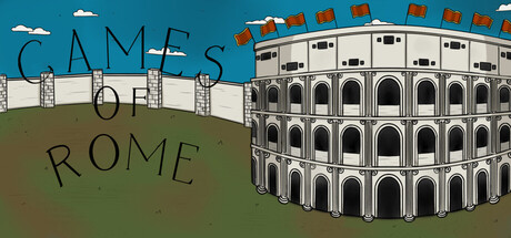
Games of Rome is a 2D top down boss rush game taking place in the Colosseum during the time of the Roman Empire. The player will fight foes all based on Roman history and myth, for the entertainment of the people of Rome.
$3.991 user reviews
ActionArcadeHistorical
Restless GamesFeb 19, 2026