Bozimer's Rage Game scores 63/100 — better than 7% of Singleplayer capsules (n=16,133).

Quick text summary

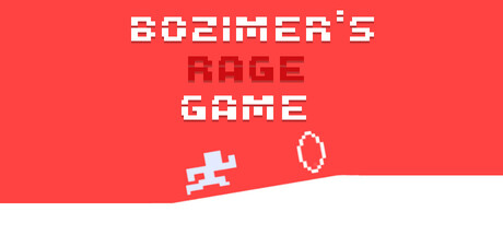
Bozimer's Rage Game scored 63/100 on Steam Analyzer — Solid for a Singleplayer capsule. Top priority fix: [uniqueness_polish] Add a visual representation of the color-coded world system (eg. gradient zones or distinct palette shift) to communicate the game's core progression mechanic.

Capsule scores by dimension

  • Genre Clarity: 7/10 — Platformer identity clear but minimal. The pixelated character sprite in mid-jump pose and simple geometric shapes (circle obstacle) immediately signal a 2D platformer. At tiny size, the jumping figure and minimalist aesthetic read as precision platformer gameplay. However, 'RAGE' text may overshadow the game feel, slightly muddying whether this is action-focused or frustration-focused as the primary hook.
  • Title Readability: 6/10 — Strong at full size, legible tiny. The title uses bold pixelated typography with excellent letter spacing and clean white outlines that separate from the red background at all sizes. At tiny size, the stacked layout (BOZIMER'S / RAGE / GAME) remains readable due to clear hierarchy and outline weight. The white stroke holds up reasonably well but RAGE's secondary placement at small size creates slight secondary focus confusion.
  • Contrast & Color: 8/10 — Strong value separation and saturation. Bright coral-red background (#FF5555 range) contrasts sharply against white typography and light blue pixel sprite, creating excellent value separation on Steam's dark background. The white-outlined letters pop distinctly even in grayscale interpretation. The angled white shape at bottom-right provides secondary contrast relief and compositional framing without diluting focal clarity.
  • Uniqueness & Polish: 5/10 — Minimalist but generic platformer aesthetic. The retro pixel art style is clean and intentional, but feels familiar in the crowded indie platformer space without a distinctive visual hook that sets it apart from dozens of similar minimalist games. The color-coded world concept mentioned in the description is not visually communicated in this capsule. Lacks memorable character design, environmental storytelling, or visual mechanic hints that would signal what makes this rage platformer unique.
  • Brand Consistency: 5/10 — Consistent style but no iconic identity. The capsule maintains coherent retro pixel aesthetic and consistent red palette throughout, showing solid internal craft. However, there are no recognizable brand identity cues—no mascot character arc, no signature motif, no color-coded world visual that would make this capsule memorable on repeat viewing. The design is competent but generic enough that it would not trigger immediate game recognition in a Steam carousel.
  • Composition: 7/10 — Clear focal point with strong framing. The jumping pixel sprite sits in the left-center area with the circle obstacle to its right, creating natural left-to-right eye flow and a clear primary subject. The angled white shape at bottom creates dynamic framing and prevents the composition from feeling static. At small size the focal area remains tight and readable. Safe margins on title prevent crop issues, though the sprite position near the bottom-right corner could be slightly higher for more balanced breathing room.

What works

  • Bold readable typography. White pixelated letters with strong outline contrast read clearly even at tiny size with excellent hierarchy.
  • High color contrast. Vibrant coral-red background separates sharply from white and light blue elements, maintaining visual pop in quick scroll.
  • Clean minimalist craft. Pixel art is intentional and well-executed without visual noise or cheap asset feel.

What hurts the capsule

  • Generic platformer identity. No visual mechanic or distinctive hook differentiates this from dozens of other retro pixel platformers in the indie space.
  • Unexpressed unique selling point. The color-coded worlds and difficulty escalation mentioned in description are not visually communicated or hinted at.
  • No brand recognition elements. Lacks iconic character, signature motif, or memorable symbol that would trigger recall in carousel browsing.

Priority fixes

  1. [uniqueness_polish] Add a visual representation of the color-coded world system (eg. gradient zones or distinct palette shift) to communicate the game's core progression mechanic.
  2. [genre_clarity] Consider a visual or compositional cue that emphasizes the 'precision' or 'challenge' nature beyond generic platformer pose—perhaps environmental hazard clarity or a sense of danger.
  3. [brand_consistency] Develop a signature character pose, color accent, or motif that would become recognizable across multiple capsule variations.

Store copy priority fixes

  1. [uniqueness] Add specific mechanic examples for each world color (e.g., 'Red world: reverse gravity; Blue world: ice sliding; Green world: moving platforms') to show what makes progression distinct and memorable.
  2. [audience_targeting] Rewrite the opening marketing copy to lead with 'Accessible precision platformer for players of all skill levels' or add a sentence like 'Practice mode and save-anywhere flexibility mean you control the challenge,' bridging difficulty with accessibility for wider appeal.
  3. [feature_communication] Expand 'Color-coded worlds' bullet to specify mechanic examples or the theme/feel of 1–2 worlds, so players visualize progression rather than assuming generic level design.

Related guides

Steam app ID: 3957270 · Tags: Singleplayer, 2D, 2D Platformer, Precision Platformer, Platformer