Bloodless Heart scores 72/100 — better than 44% of Strategy capsules (n=5,103).

Quick text summary

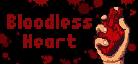
Bloodless Heart scored 72/100 on Steam Analyzer — Good for a Strategy capsule. Top priority fix: [composition] Shift critical blood particles inward from top and right edges to ensure no important visual elements are lost in Steam thumbnail cropping at 231×87 or 120×45 sizes.

Capsule scores by dimension

  • Genre Clarity: 7/10 — Body horror incremental, clear weird premise. The pixelated hand squeezing a red organ immediately signals an unusual, grotesque mechanic. The scattered blood particles and dark aesthetic suggest a horror or dark comedy indie game. At TINY size, the silhouette of the hand and organ still reads as 'something macabre happening,' though the incremental/strategy layer is not visually apparent without context.
  • Title Readability: 8/10 — Bold blocky text, reads at all sizes. "Bloodless Heart" uses large, chunky pixel-style lettering in dark red against black background with strong value separation. The title remains readable even at TINY size due to its weight and spacing. The all-caps treatment and consistent letter height avoid collapse issues common in decorative fonts.
  • Contrast & Color: 8/10 — Red and skin tones pop on black. The dark red title and blood particles contrast sharply against the #1b2838 background, and the peach-tone hand silhouette stands out clearly through warm-cool separation. At SMALL and TINY sizes, the red remains legible and the hand outline holds definition. Grayscale test confirms strong value differentiation between subject and background.
  • Uniqueness & Polish: 7/10 — Memorable concept, pixel art craft solid. The hand-squeezing-organ mechanic is visually distinctive and communicates the core incremental/synthesis gameplay loop at a glance. Pixel art style is clean and intentional, not cheap-looking. The concept-driven visuals avoid generic scene territory, though the execution is straightforward rather than exceptional; it reads more as 'competent indie horror' than 'standout premium craft.'
  • Brand Consistency: 6/10 — Dark horror palette, limited identity signals. The red and black color palette and pixel art style are internally coherent and fit an indie horror game. However, without access to the 8 store screenshots, the capsule shows no distinctive motif, symbol, or signature visual language that would make 'Bloodless Heart' instantly recognizable on a crowded store page. The aesthetic is functional but not uniquely branded.
  • Composition: 7/10 — Clear focal point, title and image balance. The left-aligned title and right-positioned hand create natural reading flow and focal hierarchy. The scattered blood particles fill space without cluttering the core message. At SMALL size, the hand-organ combo remains the primary subject. The composition avoids dead-center voids and respects safe margins, though the pixel particles near the top-right edge risk slight cropping on some Steam layouts.

What works

  • Strong concept clarity. The hand-squeezing-organ mechanic instantly communicates the unique premise and differentiates it from generic strategy or horror games.
  • Readable title at all sizes. Chunky pixel lettering in dark red holds legibility from full header down to TINY thumbnail without collapsing or losing contrast.
  • Effective color contrast. Red and peach tones separate cleanly from the dark background in both color and grayscale, ensuring quick recognition during Steam scroll.

What hurts the capsule

  • Limited brand identity signals. No iconic character, symbol, or signature visual motif emerges that would make this capsule recognizable independent of the title text.
  • Genre ambiguity in visuals alone. Without the title, the capsule reads as dark horror or body-horror rather than signaling the incremental strategy gameplay that defines the experience.
  • Particle scatter near edges. Blood splatters in the top-right and corners risk being clipped by Steam's crop at certain viewport sizes, potentially breaking the visual composition.

Priority fixes

  1. [composition] Shift critical blood particles inward from top and right edges to ensure no important visual elements are lost in Steam thumbnail cropping at 231×87 or 120×45 sizes.
  2. [brand_consistency] Introduce a subtle recurring visual motif (organ icon, specific color accent, or character mark) that could serve as a recognizable brand identifier across store pages and screenshots.
  3. [genre_clarity] Add a small UI element or visual cue hinting at the incremental/synthesis mechanic (progress bar, synthesized material symbol, or stacked organ icons) to signal gameplay depth beyond the visceral hook.

Store copy priority fixes

  1. [feature_communication] Add a brief explanation of how organ synergies work—e.g., 'Each organ produces unique resources that boost others, creating cascading resource chains'—to justify the 'synergy' promise in the hook.
  2. [audience_targeting] Add a sentence explicitly addressing the player archetype: 'Perfect for incremental enthusiasts who love idle progression with light strategic depth' or 'Whether you prefer relaxed offline play or active mini-game challenges.'
  3. [uniqueness] Expand on what makes the organ-based system different from other tab-based incrementals; specify one or two concrete examples of organ interaction or progression quirks.
  4. [hook_strength] Proofread and fix 'it's' to 'its' in the detailed description to maintain professionalism and credibility.

Related guides

  • Steam page optimisationCapsule, copy, screenshots, tags — the full Steam page conversion stack.
  • Steam tags guideTag selection, ordering, and how it shapes Steam's recommendation rails.

Steam app ID: 3957540 · Tags: Strategy, Incremental, Idler, Point & Click, Automation