Mad Cleaners scores 72/100 — better than 42% of Early Access capsules (n=3,067).

Quick text summary

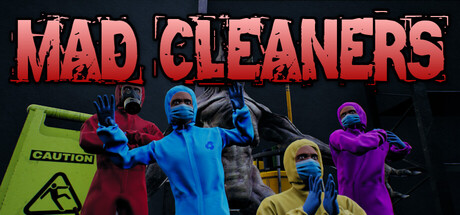
Mad Cleaners scored 72/100 on Steam Analyzer — Good for a Early Access capsule. Top priority fix: [composition] Shift character group slightly left to increase safe margin on right edge and reduce Steam cropping risk, then add a foreground detail like scattered cleaning supplies to strengthen depth layering.

Capsule scores by dimension

  • Genre Clarity: 7/10 — Co-op action horror game clearly communicated. The colorful suited characters in dynamic poses against an industrial/laboratory backdrop immediately signal cooperative multiplayer action with horror undertones. The neon-colored hazmat suits and caution signage reinforce the cleaning/industrial setting. At TINY size the group silhouettes and bright color coding remain readable, though the specific horror-comedy tone is less apparent without the full context.
  • Title Readability: 8/10 — Bold title with strong legibility across sizes. The 'MAD CLEANERS' title uses thick, high-contrast red letterforms with a black outline/shadow effect that holds up well at SMALL and TINY sizes. The all-caps treatment and sans-serif font ensure each letter remains distinct even at thumbnail scale. The title sits on a controlled dark background region that prevents text-to-background noise interference.
  • Contrast & Color: 8/10 — Vibrant palette pops against dark background. The neon pink/red title, electric blue and magenta character suits, and lime green caution sign create strong value separation against the dark navy background. The saturated hues and lighting on the characters' suits maintain clear silhouettes and readability in grayscale test due to distinct brightness levels. At TINY size the color blocking still communicates distinct elements without muddiness.
  • Uniqueness & Polish: 7/10 — Distinctive co-op horror aesthetic with craft. The bright, almost comedic hazmat suit color scheme contrasts intentionally with the dark industrial setting, suggesting the game's horror-entertainment blend. The character poses suggest action and personality rather than static standing. However, the overall composition and visual treatment feel somewhat familiar to other co-op indie titles, lacking a truly singular signature visual hook or memorable motif that would elevate it to premium territory.
  • Brand Consistency: 6/10 — Consistent visual style, limited signature identity. The neon suit colors, industrial laboratory setting, and caution signage appear cohesive within this single image and likely represent the game's established art direction. The color palette and character costuming suggest recognizable branding for future marketing. However, there are no iconic character, symbol, or visual motif that stands out as immediately memorable or distinctive compared to the benchmark titles.
  • Composition: 7/10 — Clear hierarchy with centered group focal point. The group of suited characters occupies the center and middle-ground with the title anchored securely at top, creating a clear two-part hierarchy. The lime green caution sign on the left adds compositional balance and reinforces the cleaning/danger theme without competing for attention. At SMALL size the composition remains stable, though at TINY the individual character details blur together slightly, and the right edge characters approach margin limits where Steam cropping could clip them.

What works

  • Title legibility at all sizes. Bold red letterforms with black outline maintain crisp readability from full header down to tiny thumbnail without collapse or blur.
  • Color contrast against dark background. Saturated neon suit colors and pink title create strong visual separation that reads clearly in both color and grayscale evaluation.
  • Clear cooperative multiplayer signal. Multiple characters in distinct colored suits and dynamic poses immediately communicate the 4-player co-op gameplay loop.
  • Thematic consistency with setting. Hazmat suits, caution signage, and industrial backdrop reinforce the cleaning agency premise and establish appropriate visual tone.

What hurts the capsule

  • Limited signature visual identity. The composition lacks an iconic character, symbol, or memorable motif that would distinguish this from other indie co-op titles in the market.
  • Generic horror-comedy execution. While the bright suits contrast the dark setting effectively, the overall aesthetic feels somewhat familiar rather than uniquely fresh compared to top-performing benchmarks.
  • Right edge character cropping risk. Characters on the far right approach the safe margin boundary, risking clipping or awkward framing depending on Steam's display and cropping behavior.
  • Limited depth layering. Characters occupy mostly a single depth plane without strong foreground-midground-background separation that would add visual sophistication.

Priority fixes

  1. [composition] Shift character group slightly left to increase safe margin on right edge and reduce Steam cropping risk, then add a foreground detail like scattered cleaning supplies to strengthen depth layering.
  2. [uniqueness_polish] Introduce a distinctive visual hook such as an iconic protagonist character design or signature environmental element that creates memorable brand recognition beyond generic co-op aesthetic.
  3. [brand_consistency] Establish and highlight a core visual motif or color accent that appears consistently across all future marketing materials to build stronger brand recall.

Store copy priority fixes

  1. [hook_strength] Rewrite the short description to open with a specific, emotionally resonant verb—e.g., 'Sneak through horror labs, dodge deadly experiments, and rake in cash as a team of extreme cleaners' instead of leading with 'An online cooperative game.'
  2. [feature_communication] Add 2–3 concrete sentences explaining the core mission loop: What do players do in a single contract? Do they fight, stealth, solve puzzles, or manage resources? Include at least one example.
  3. [uniqueness] Insert a single sentence that articulates what separates Mad Cleaners from other co-op horror games—e.g., 'The only game where cleaning safety protocols clash with uncontrollable chaos' or 'Combines absurdist humor with genuine horror tension.'

Related guides

Steam app ID: 3960160 · Tags: Early Access, Robots, Demons, Realistic, Survival