Scoring genre clarity...

The Kindling capsule

The Kindling

A short, poetic puzzle experience. Guide a fading soul through strange places, where every object you burn keeps the shadows away. What seems simple may turn into a trial. Choose carefully… and don’t let the light fade.

$5.99Positive(20)
PuzzleIndieCasual
2 WeirdDec 9, 2025

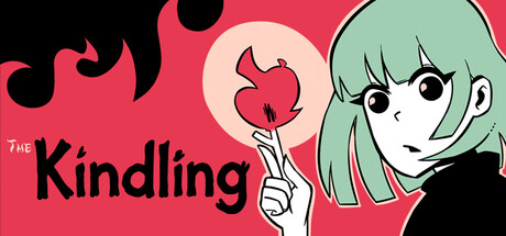
The Kindling scores 75/100 — better than 70% of Puzzle capsules (n=4,408).

Positive (20 reviews) · $5.99 · Released Dec 9, 2025 · By 2 Weird

Quick text summary

The Kindling scored 75/100 on Steam Analyzer — Good for a Puzzle capsule. Top priority fix: [genre_clarity] Incorporate subtle environmental or shadow elements into the background to hint at the 'strange places' setting and fading-light mechanic without compromising readability.

Capsule scores by dimension

  • Genre Clarity: 7/10 — Anime puzzle-adventure, readable theme. The capsule communicates a narrative-driven, character-focused indie experience through the prominent anime girl illustration and stylized aesthetic. The glowing red object (apple/flame) in her hand hints at the burning/fire mechanic central to gameplay, though the puzzle or strategy elements are not immediately obvious at tiny size. At TINY size, the character silhouette and warm color palette register as indie/casual adventure, but the core puzzle mechanic remains implied rather than explicit.
  • Title Readability: 8/10 — Bold, clear, well-placed typography. The title 'The Kindling' uses thick, black sans-serif letterforms positioned in the lower-left quadrant against the solid red background, ensuring excellent contrast and legibility at all sizes. The word 'THE' is smaller but readable, and the overall placement avoids competition with the character art. At TINY size, the letters remain distinct and scannable without collapse, making this a strong typographic choice.
  • Contrast & Color: 8/10 — Strong warm tones, clear silhouettes. The hot pink-red background (#FF5674 approximate) provides strong value separation from the Steam dark background (#1b2838), with the character's pale skin, mint-green hair, and black outlines reading cleanly in silhouette. The glowing red object adds focal warmth without muddying the composition. In grayscale, the character's features and the title maintain clear separation, ensuring no blending issues at small sizes.
  • Uniqueness & Polish: 7/10 — Distinctive anime style, competent execution. The clean anime character illustration with expressive eyes and carefully rendered proportions reflects intentional art direction distinct from generic indie capsules, and the minimalist composition with thematic fire element shows purposeful design. However, the overall presentation feels more reminiscent of visual novel or story-driven game covers than a puzzle-strategy experience, which creates slight genre messaging ambiguity. The craft is solid and recognizable but not groundbreaking compared to top-tier indie capsules like DREDGE or Slay the Princess.
  • Brand Consistency: 7/10 — Cohesive anime aesthetic, recognizable character. The character design, color palette (warm red, soft pastels), and line art style suggest strong internal consistency and the character would likely be recognizable across marketing materials. The minimalist approach with negative space avoids clutter and reinforces a premium indie identity. Without reference to the 7 store screenshots, the visual identity reads as intentional and branded, though the anime style alone may not be uniquely tied to this specific game's narrative or mechanic.
  • Composition: 8/10 — Clean hierarchy, focused character focal point. The right-side character placement creates strong focal hierarchy with the title anchoring the lower-left, leaving breathing room and avoiding dead center voids. The character's large face and direct gaze command attention without scattered elements competing for focus. At SMALL and TINY sizes, the composition remains readable with no critical elements at hard edges, and the overall balance feels intentional and premium.

What works

  • Bold, legible title treatment. Thick black sans-serif 'The Kindling' with excellent contrast against red background remains readable and scannable at tiny thumbnail size.
  • Strong color separation from Steam background. Warm red-pink palette pops distinctly against the dark Steam interface (#1b2838) with clear silhouette definition throughout scaling.
  • Focused character-driven composition. Single clear focal point (anime character's face and gaze) avoids scattered attention and creates premium indie identity at all sizes.
  • Thematic fire element integration. The glowing red object in character's hand subtly communicates the burning/flame mechanic without cluttering the clean aesthetic.

What hurts the capsule

  • Puzzle-strategy genre signals unclear. The capsule emphasizes visual novel aesthetic and character appeal over puzzle, strategy, or adventure gameplay mechanics, creating potential genre expectation mismatch.
  • Limited environmental storytelling. The solid color background lacks the 'strange places' and atmospheric context promised in the game description, reducing narrative intrigue.
  • Mechanic clarity at tiny size weak. At thumbnail scale, viewers cannot identify the fire-burning puzzle core or understand what makes this experience mechanically distinct from other character-driven narratives.

Priority fixes

  1. [genre_clarity] Incorporate subtle environmental or shadow elements into the background to hint at the 'strange places' setting and fading-light mechanic without compromising readability.
  2. [uniqueness_polish] Add a secondary visual detail (e.g., faint flame aura, shadow silhouette, or glowing light effect) that emphasizes the burning/fuel resource mechanic as the core hook.
  3. [composition] Consider placing a secondary thematic element (flickering light, shadow outline) in the background to deepen storytelling depth while maintaining the clean, focused character hierarchy.

Store copy priority fixes

  1. [feature_communication] Replace the vague 'what seems simple may turn into a trial' line with a specific mechanic example: 'Solve 50+ logic puzzles by burning objects strategically, but each choice has irreversible consequences that alter the story path ahead.'
  2. [audience_targeting] Add a sentence clarifying the intended player type: 'Perfect for solo players who love contemplative puzzle adventures' or 'Co-op mode lets two players solve puzzles together in real-time,' depending on actual focus.
  3. [uniqueness] Rewrite the 'Combining burning minds' section to articulate differentiation: 'Unlike standard puzzlers, every object you burn is permanent—no undo, no second chances. Your decisions ripple through the narrative, making no two playthroughs identical.'
  4. [genre_clarity] Remove or reframe 'psychological horror' tag prominence in marketing if the game is casual-focused, or add a sentence explaining how horror elements manifest mechanically (e.g., 'Darkness advancing forces time pressure' vs. jump scares).

Related guides

Steam app ID: 3960940 · Tags: Puzzle, Indie, Casual, Multiplayer, Co-op