Quick text summary
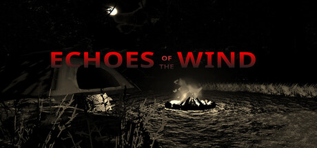
Echoes of the Wind scored 72/100 on Steam Analyzer — Good for a Simulation capsule. Top priority fix: [genre_clarity] Add a subtle but readable supernatural or character element (e.g., a shadow, silhouette, or anomaly) to signal the specific threat beyond generic dread and strengthen tiny-size genre recognition.
Capsule scores by dimension
- Genre Clarity: 7/10 — Atmospheric horror-adventure clear. The dark forest setting with a distant campfire, abandoned tent, and ominous atmosphere clearly signal a supernatural or psychological horror adventure. At tiny size, the silhouette of the wilderness and fire creates recognizable dread, though the specific 'sinister' threat remains vague rather than genre-definitively clear like a creature would be.
- Title Readability: 8/10 — Bold red title holds at small sizes. The red serif-style lettering 'ECHOES OF THE WIND' is positioned prominently in the upper third with strong contrast against the dark background. At small and tiny sizes, the title remains readable due to high saturation and value separation, though the serif details begin to soften slightly at thumbnail scale.
- Contrast & Color: 8/10 — Strong warm-cold value separation. The red title pops sharply against the dark tones, and the warm orange campfire glow contrasts well with the cool dark forest. The silhouettes of tent and landscape maintain clarity in grayscale, with the fire providing a clear focal light source that separates the scene into readable layers even at tiny sizes.
- Uniqueness & Polish: 7/10 — Atmospheric but familiar indie horror. The composition evokes a moody, introspective adventure with strong atmospheric craft—the warm campfire against cold darkness is cinematic and deliberate. However, the visual approach sits within well-trodden indie horror territory (compare to Dredge, Slay the Princess); it is polished but not visually distinctive enough to stand alone without context.
- Brand Consistency: 6/10 — Cohesive mood, minimal identity signals. The capsule establishes a consistent visual tone—monochromatic naturalism with warm firelight accents that align with the game's psychological horror themes. However, without access to clear recurring motifs, character design, or color signature that spans the store screenshots, the internal branding feels more like a genre mood than a memorable franchise identity.
- Composition: 7/10 — Clear focal point, safe margins. The campfire in the center-right acts as the primary focal point, drawing the eye through warm light against darkness, with the tent and landscape providing depth layers. Title placement in the upper region avoids edge-cutting and works well across scales, though the large empty sky above could be tighter; the composition is functional and readable at all sizes but not exceptionally dynamic.
What works
- High-contrast title legibility. The red serif text maintains readability and pop even at tiny thumbnail size due to strong saturation and value separation against dark background.
- Atmospheric focal depth. The warm campfire glow creates a clear visual hierarchy and draws immediate attention, with tent and landscape supporting the sense of isolation and unease.
- Safe typography placement. Title sits in a protected upper region with adequate breathing room, ensuring no critical text is cropped at any Steam display size.
What hurts the capsule
- Generic horror-adventure aesthetic. The moody campfire-in-dark-woods composition is familiar across indie horror titles and lacks a distinctive visual hook that signals 'Echoes of the Wind' specifically.
- Vague threat clarity. The scene communicates loneliness and dread but not the specific nature of the threat—no character, creature, or supernatural element is visible to anchor the sinister promise.
- Underutilized sky space. Large empty dark sky in the upper portion takes prime real estate without contributing visual interest or narrative clarity at small sizes.
Priority fixes
- [genre_clarity] Add a subtle but readable supernatural or character element (e.g., a shadow, silhouette, or anomaly) to signal the specific threat beyond generic dread and strengthen tiny-size genre recognition.
- [uniqueness_polish] Introduce a distinctive visual motif or color accent (beyond warm campfire) that becomes a signature of the game's identity and differentiates it from comparable horror-adventure peers.
- [composition] Tighten the sky or introduce a secondary focal element (e.g., moonlit figure, strange light in distance) to eliminate dead space and add narrative intrigue at all scales.
Store copy priority fixes
- [feature_communication] Replace the loose feature list with concrete gameplay descriptions: 'Build camp, manage supplies, fish for food, and navigate wildlife encounters as night brings psychological threats that escalate based on your choices.' This clarifies the minute-to-minute loop.
- [uniqueness] Add a specific differentiator after 'psychological horror': 'where camping survival systems directly impact your character's mental state and story outcomes' or equivalent—something that explains why this game's approach is distinct.
- [genre_clarity] Restructure the opening of the detailed description to lead with the primary mode: either 'A first-person camping simulation that becomes a psychological thriller as darkness falls' or 'A psychological horror game disguised as a peaceful camping experience'—pick one and commit to it.
- [audience_targeting] Add a sentence signaling intended player type: 'For players seeking atmospheric, slow-burn horror over action, or survival simulation fans drawn to narrative-driven tension' to filter expectations early.
Related guides
Steam app ID: 3961600 · Tags: Simulation, Psychological, Thriller, Horror, Dark