Scoring genre clarity...

The Soul Collector 2 - Idle Game capsule

The Soul Collector 2 - Idle Game

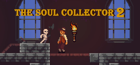
Time killer idle game. Execute humans and conquest villages to gather more souls than ever before! Summon dark creatures, unlock new upgrades, and expand your underworld power in this enhanced sequel with all-new gameplay features.

$4.953 user reviews
IncrementalIdlerAuto Battler
Olento ProductionsDec 16, 2025

The Soul Collector 2 - Idle Game scores 70/100 — better than 25% of Incremental capsules (n=1,339).

3 user reviews · $4.95 · Released Dec 16, 2025 · By Olento Productions

Quick text summary

The Soul Collector 2 - Idle Game scored 70/100 on Steam Analyzer — Good for a Incremental capsule. Top priority fix: [uniqueness_polish] Introduce a distinctive UI element or character silhouette unique to The Soul Collector 2 that signals the idle/collection mechanic more explicitly, such as a soul counter, UI frame, or iconic underworld creature.

Capsule scores by dimension

  • Genre Clarity: 7/10 — Dark casual idle game clear. The pixelated art style, dungeon interior setting with stone architecture, and the central character in robes with torch-wielding figures clearly communicate a dark fantasy idle/simulation game. At tiny size, the pixel art style and indoor dungeon setting remain readable, though the specific idle game mechanic is not immediately obvious from visuals alone—it reads more as a dark action-adventure at thumbnail scale. The torch and underworld atmosphere strongly support the 'dark collection' theme described.
  • Title Readability: 8/10 — Bold gold title readable throughout. The title 'THE SOUL COLLECTOR 2' is rendered in large, bright gold/yellow capital letters with clear spacing and strong contrast against the dark purplish background. At full size it is crisp and legible; at small and tiny sizes the letterforms hold up well due to bold weight and high value contrast. The '2' is clearly visible and maintains hierarchy, making the sequel numbering unmissable.
  • Contrast & Color: 8/10 — Strong value separation dark palette. Gold title pops sharply against the dark purple-brown background; the lit torch in the center provides warm orange-yellow focal contrast; blue window highlights on the right create secondary contrast layers. In grayscale, the title and torch remain clearly separated from the mid-tone stone and background. At tiny size the gold and orange still read distinctly, and the silhouette of the figure and architecture maintain definition without muddiness.
  • Uniqueness & Polish: 6/10 — Competent pixel art generic dark theme. The retro pixel art style is well-executed with clean tile work and recognizable character poses, but the dungeon interior scene with robed figures and torches is a familiar trope in dark fantasy games. The art demonstrates solid craft and thematic consistency, yet lacks a distinctive hook or memorable visual that separates it from other indie dark simulation games. The overall composition feels competent but does not stand out as notably unique compared to the top-performing casual game capsules.
  • Brand Consistency: 6/10 — Cohesive pixel art no iconic motif. The pixel art rendering style, color palette (dark purples, gold accents, warm torch light), and gothic dungeon setting are internally consistent throughout the visible capsule. However, there is no immediately recognizable brand icon, signature character silhouette, or unique color motif that would make this capsule memorable on repeat exposure. The dark fantasy aesthetic is appropriate but does not establish a distinctive brand identity that would stand out in a scrolling store list.
  • Composition: 7/10 — Balanced layout clear focal point. The composition uses a strong horizontal rule—stone platform at the base creates grounding; the robed central figure with torch is the clear focal point; blue windows frame the upper sides symmetrically; the gold title sits securely in the upper portion with safe margin. At small size the center figure and torch remain the primary draw, though at tiny size the composition reads more as a dark interior scene than an idle game specifically. The layout avoids dead space and maintains visual hierarchy, though the large windows on the right could be seen as slightly distracting from core focus.

What works

  • Gold title contrast and readability. The large, bold gold capital letters provide exceptional contrast against the dark background and remain legible at all sizes from full down to tiny thumbnails.
  • Cohesive dark fantasy aesthetic. The pixel art style, dungeon setting, stone architecture, and torch lighting create a unified and thematically appropriate visual identity for a dark idle game.
  • Clear focal point hierarchy. The central robed figure with torch naturally draws the eye and serves as the primary subject, while framing elements guide attention without competing for focus.

What hurts the capsule

  • Generic dark dungeon trope. The interior stone dungeon with robed figures and torches is a familiar visual cliche that does not differentiate this game from other dark fantasy titles.
  • Idle game mechanic unclear at tiny size. At thumbnail scale, the capsule reads as a dark action-adventure rather than specifically communicating the idle/simulation gameplay loop or core mechanics.
  • No distinctive brand icon or motif. The capsule lacks a memorable character silhouette, symbol, or signature visual element that would make the game instantly recognizable on repeat exposure.

Priority fixes

  1. [uniqueness_polish] Introduce a distinctive UI element or character silhouette unique to The Soul Collector 2 that signals the idle/collection mechanic more explicitly, such as a soul counter, UI frame, or iconic underworld creature.
  2. [genre_clarity] Add a subtle gameplay affordance visual—such as a simplified idle game interface element or soul collection indicator—to clarify the simulation/idle game loop beyond the dungeon setting alone.
  3. [brand_consistency] Develop a recognizable signature color accent or character motif that could serve as a brand identifier across all marketing materials, making future capsules instantly familiar.

Store copy priority fixes

  1. [hook_strength] Replace 'Time killer idle game' with a verb-forward opening that leads with the darkly comedic premise, e.g., 'Harvest human souls and rule your underworld in this dark idle game where the dead do your work for you.'
  2. [uniqueness] Add 1-2 sentences detailing specific 'all-new gameplay features' mentioned in the short description—what is new in this sequel that justifies a purchase from players unfamiliar with the original?
  3. [feature_communication] Clarify how village conquest, creature summons, and the pit mechanic work mechanically—what do players gain from conquering a village, which creatures are strongest, and how does a full pit affect progression?
  4. [audience_targeting] Add an explicit audience signal, such as 'Perfect for players who love incremental progression with dark humor' or 'Designed for idle game fans who want something grittier than the usual casual fare.'

Related guides

Steam app ID: 3962200 · Tags: Incremental, Idler, Auto Battler, City Builder, Building