Scoring genre clarity...
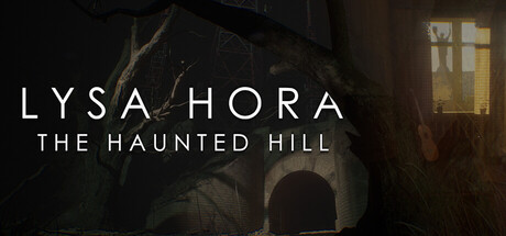
A dark sci-fi horror where ancient rituals intertwine with secret Soviet experiments. Explore atmospheric tunnels, hidden laboratories, and abandoned shrines inspired by real locations—and survive by solving intricate, mind-bending puzzles.
$4.99Very Positive(16)
DarkHorrorAtmospheric
DENYS RUDYI GAMESApr 23, 2026