Space way: Echo of the Galaxy scores 70/100 — better than 26% of Shoot 'Em Up capsules (n=814).

Quick text summary

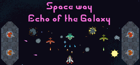
Space way: Echo of the Galaxy scored 70/100 on Steam Analyzer — Good for a Shoot 'Em Up capsule. Top priority fix: [title_readability] Replace decorative magenta font with a bolder, more geometric typeface that maintains legibility at 120px width, or reduce to single-line title.

Capsule scores by dimension

  • Genre Clarity: 8/10 — Clear retro space shooter identity. The pixel art aesthetic, centered player ship, symmetrical enemy waves, and vertical scroll composition immediately signal a classic arcade space shooter. At tiny size, the silhouettes of varied enemy types and the player craft at center bottom remain distinct enough to identify the genre without ambiguity.
  • Title Readability: 7/10 — Readable but decorative font strain. The magenta title text 'Space way' and 'Echo of the Galaxy' has clear contrast against the dark space background at full size, but the rounded, chunky letterforms show slight legibility stress at tiny size, particularly on the secondary line. The two-line split is functional but the subtitle becomes harder to parse below 100 pixels width.
  • Contrast & Color: 8/10 — Strong magenta pop on dark void. The bright magenta title and vibrant colored enemies (orange, cyan, yellow, red) create excellent value separation against the deep space background #1b2838. The gray stone towers on left and right frame the composition with solid mid-tone contrast, and even at tiny size the enemy sprites maintain distinct silhouettes against the black void.
  • Uniqueness & Polish: 6/10 — Competent retro aesthetic, generic execution. The pixel art style and symmetrical enemy formation layout follow established retro shooter conventions without a distinctive visual hook that sets it apart from hundreds of similar indie space shooters. The craft is clean but the composition and enemy variety feel like standard assets for the genre rather than a unique artistic direction or memorable selling point.
  • Brand Consistency: 6/10 — Consistent pixel style, no iconic identity. The sprite work is uniformly rendered in crisp pixel art with cohesive proportions and lighting, creating internal consistency across the visible enemies and environment. However, there are no signature character designs, color motifs, or visual symbols that would allow recognition of this game later—it relies on genre conventions rather than distinctive branding.
  • Composition: 7/10 — Clear hierarchy, balanced but static. The centered player ship at bottom provides a strong focal point, with symmetrical enemy waves and towers creating balanced frame composition that reads well at all sizes. The top-heavy title placement leaves adequate safe margins, though the bottom-centered ship and symmetrical layout feel slightly static and don't create strong visual depth layering between foreground, midground, and background.

What works

  • Immediate genre recognition. The vertical shooter layout with centered player, ascending enemy waves, and arcade silhouettes communicate the genre instantly at any size.
  • Strong color contrast against dark background. Magenta title and vibrant enemy sprites (cyan, orange, yellow) pop cleanly against the deep space void, maintaining readability at small sizes.
  • Clean pixel art execution. Uniform sprite rendering with crisp edges and consistent proportions across all game elements creates a polished, cohesive visual style.

What hurts the capsule

  • Generic retro shooter formula. The composition, enemy types, and visual presentation follow standard arcade space shooter conventions without a distinctive hook that differentiates it from competitors.
  • Decorative title font loses legibility at small sizes. The rounded, chunky magenta typeface becomes harder to parse at tiny thumbnail size, particularly the secondary 'Echo of the Galaxy' line.
  • Static, symmetrical composition. The perfectly balanced left-right symmetry and centered focal point, while clear, lack dynamic visual tension or depth layering that would create visual excitement.
  • No memorable brand identity. The capsule uses generic pixel art conventions with no iconic character, signature symbol, or distinctive palette that would stick in memory.

Priority fixes

  1. [title_readability] Replace decorative magenta font with a bolder, more geometric typeface that maintains legibility at 120px width, or reduce to single-line title.
  2. [uniqueness_polish] Add a distinctive visual hook such as a unique enemy design, signature color accent, or stylized ship variant that signals this specific game rather than the genre.
  3. [composition] Introduce asymmetrical elements or a dynamic secondary focal point to break the static symmetry and create visual momentum toward the player ship.
  4. [brand_consistency] Establish a signature color or icon motif visible in this capsule that can anchor brand recognition across store screenshots and future promotional materials.

Store copy priority fixes

  1. [hook_strength] Rewrite the short description to lead with a specific action or challenge: e.g., 'Pilot a fighter through endless waves of enemies, upgrading your ship to survive the onslaught' instead of 'you will have the opportunity.'
  2. [uniqueness] Explicitly state what makes the magnet mechanic and non-linear positioning system different from other bullet-hell games; explain concrete gameplay advantage.
  3. [tone_match] Revise the difficulty explanation to be clearer and more conversational; consolidate the bulleted feature list into flowing paragraphs that match the opening tone.
  4. [audience_targeting] Add a sentence clarifying whether this is designed for casual arcade fans or hardcore bullet-hell veterans, given the 'playable without timed input' category.

Related guides

Steam app ID: 3964160 · Tags: Shoot 'Em Up, Action, Bullet Hell, Flight, Shooter