Scoring genre clarity...
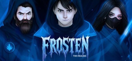
Frosten: Two Realms — An immersive story about a young man named Ivan, who possesses the extraordinary ability to freeze objects. His life takes a dramatic turn when he finds himself in a mysterious world brimming with magic and peril.
Free to PlayPositive(14)
AdventureIndieVisual Novel
KRIOGAMESSep 10, 2025