Scoring genre clarity...
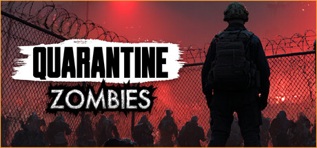
A first-person shooter meets quarantine inspection in post-apocalyptic Chicago. You’ve got 30 days until the army arrives. Hold out, fix your car, and fight your way through Chicago to the main checkpoint to save your little brother.
$9.99Mixed(52)
Outbreak SimFPSSurvival
Stones GamesJan 20, 2026