Scoring genre clarity...
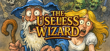
An alcoholic wizard with no spells, only rocks, must save his village from depraved monster hordes. Tactical action, chaotic weapon combos, and dark humor collide in this unique twist on the Vampire Survivors formula!
$3.99Positive(17)
ActionAction RoguelikeBullet Hell
The Useless DevOct 24, 2025