Quick text summary
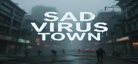
Sad Virus Town scored 63/100 on Steam Analyzer — Solid for a 3D Platformer capsule. Top priority fix: [genre_clarity] Feature the virus character more prominently with a recognizable visual silhouette or design element that signals the dark comedy tone and walking simulation focus, differentiating it from post-apocalyptic survival games.
Capsule scores by dimension
- Genre Clarity: 5/10 — Ambiguous genre signals mixed. The urban decay setting with silhouetted figures suggests survival or horror, but the title 'Sad Virus Town' and description of a virus character searching for beer bottles creates tonal confusion. At tiny size, it reads as post-apocalyptic or dark adventure, but the actual walking simulation + dark comedy premise is not visually apparent, making genre intent unclear.
- Title Readability: 7/10 — Clear at full, holds at small. The white sans-serif 'SAD VIRUS TOWN' has strong contrast against the dark atmospheric background and reads clearly at full size and small size. At tiny size it remains legible due to bold letterforms and adequate spacing, though the dripping effect on 'VIRUS' adds character without compromising readability.
- Contrast & Color: 8/10 — Strong value separation throughout. Bright white title text pops decisively against the dark teal-gray atmospheric background, creating excellent silhouette clarity. The grayscale test shows distinct separation between foreground figures, wet street reflections, and building silhouettes in the background, maintaining visual hierarchy even at tiny size.
- Uniqueness & Polish: 6/10 — Competent but conceptually generic. The atmospheric urban decay aesthetic is well-executed with moody lighting and wet street reflections, but visually aligns with common post-apocalyptic or survival game templates seen in the genre. The premise (virus character seeking beer) is quirky but not communicated through visual elements alone, missing an opportunity to signal the dark comedy tone that would differentiate it from similar atmospheric indie titles.
- Brand Consistency: 5/10 — No distinctive identity markers. The capsule establishes a consistent dark, moody atmosphere but lacks iconic visual elements, character silhouettes, or color motifs that would create brand recognition across multiple touchpoints. Without seeing the main character clearly or recognizable branding cues specific to Sad Virus Town, the capsule could apply to many atmospheric indie games, reducing memorability.
- Composition: 7/10 — Balanced layout with clear hierarchy. The title sits in the upper-middle section with good breathing room, while the atmospheric street scene fills the lower half with depth layers: distant buildings, mid-ground figures, and foreground street reflection. Composition remains readable at small size and avoids edge-hugging or dangerous crop zones, though the scattered silhouettes lack a single magnetic focal point.
What works
- Title contrast excellence. White 'SAD VIRUS TOWN' text provides exceptional value separation against the dark background and remains legible at all viewing sizes including tiny.
- Atmospheric mood consistency. The cohesive moody lighting, wet surfaces, and urban decay environment create a unified visual tone that feels intentional and polished.
- Safe composition margins. Title and key elements avoid dangerous crop zones, and the layout remains compositionally balanced across full, small, and tiny sizes.
What hurts the capsule
- Genre intent unclear. The visual style suggests horror or survival rather than walking simulation or dark comedy, creating a mismatch between what players expect and the actual game experience.
- No character visibility. The virus protagonist is not distinctly visible or recognizable as a unique entity, missing an opportunity to establish character-driven brand identity.
- Generic atmospheric template. The urban decay aesthetic overlaps heavily with established indie games like DREDGE and Pacific Drive, lacking a distinctive visual hook that signals unique mechanical or tonal identity.
Priority fixes
- [genre_clarity] Feature the virus character more prominently with a recognizable visual silhouette or design element that signals the dark comedy tone and walking simulation focus, differentiating it from post-apocalyptic survival games.
- [uniqueness_polish] Add a distinctive color accent, environmental detail, or visual motif (beer bottle iconography, infected neon signs, etc.) that communicates the game's unique premise and tone rather than relying on generic atmospheric tropes.
- [brand_consistency] Establish a clear character design or signature visual element (virus appearance, color palette motif, or UI styling) that could be consistently recognized across store pages and marketing materials.
Store copy priority fixes
- [hook_strength] Rewrite the short description to drop the 'again back' phrase and lead with a specific, compelling reason to play, e.g., 'Explore a sprawling open city to uncover hidden beer bottles as a sad virus seeking happiness' to establish both premise and emotional hook for new players.
- [feature_communication] Add 3–4 concrete gameplay details explaining how bottles are discovered (search mechanics, puzzle solving, exploration rewards) and what interaction players will perform beyond walking.
- [genre_clarity] Resolve the contradiction between 'walking simulation' and '3D Platformer/Puzzle Platformer' tags by either removing misleading tags or clarifying in copy how platforming and puzzle-solving elements integrate into the walking sim structure.
- [uniqueness] Add a specific detail that differentiates this game—e.g., a unique mechanic tied to the Virus character, environmental storytelling, or a narrative reason why bottles matter, rather than generic collectathon language.
Related guides
Steam app ID: 3966080 · Tags: 3D Platformer, Puzzle Platformer, Hidden Object, Collectathon, Sandbox