Type Drivers scores 70/100 — better than 28% of Racing capsules (n=762).

Quick text summary

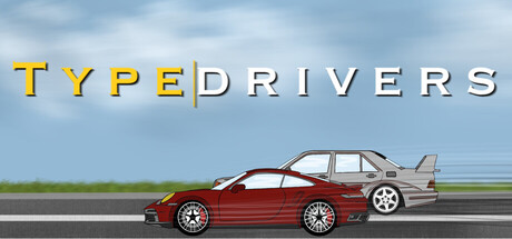
Type Drivers scored 70/100 on Steam Analyzer — Good for a Racing capsule. Top priority fix: [genre_clarity] Integrate a visual representation of typing or keyboard into the composition—such as a steering wheel that suggests keyboard input or a subtle keyboard element in the foreground—to communicate the unique typing mechanic that defines the game.

Capsule scores by dimension

  • Genre Clarity: 7/10 — Racing game with typing mechanic. The capsule clearly communicates a racing game through the side-profile red sports car on an asphalt track with a second vehicle visible in the background. The sky and road environment establish the racing context immediately at full size. At tiny size, the car silhouette and horizontal track composition still read as racing, though the typing mechanic is not visually apparent without the title.
  • Title Readability: 8/10 — Clear bold title with strong contrast. TYPEDRIVERS uses a bold, all-caps sans-serif font with yellow-gold letters against a light sky background, creating excellent legibility at full and small sizes. The letterforms remain distinct and readable even at tiny size due to the uniform weight and high contrast with the background. The title placement in the upper third follows strong design conventions and avoids cluttered elements.
  • Contrast & Color: 8/10 — Strong value separation and clarity. The yellow-gold title pops distinctly against the light blue sky, and the red car silhouette contrasts well against the green grass and gray asphalt. In grayscale, the composition maintains clear separation between the car (mid-tone), background sky (light), and road (medium tone). This strong value hierarchy ensures readability even at tiny size and maintains visual pop against the Steam dark background.
  • Uniqueness & Polish: 6/10 — Competent racing scene, functional design. The capsule features a clean, illustrated 2D car and track that feel professional but align with conventional racing game visual language rather than establishing a distinctive identity. The concept of typing-based racing is unique to the game, but the visual does not communicate this core mechanic or differentiate from standard racing titles. The polish is solid with clean lines and good rendering, but lacks a memorable visual hook that signals this game's distinctive selling point.
  • Brand Consistency: 6/10 — Readable but generic racing identity. The capsule uses a cohesive palette of yellow-gold, red, and blue with consistent flat illustration style that appears professional and uniform. However, there are no distinctive motifs, character elements, or visual cues that would make this game recognizable as Type Drivers specifically rather than any casual racing title. The brand identity relies on functional clarity rather than iconic visual markers.
  • Composition: 7/10 — Clear focal point with balanced layout. The red car in the center-right of the frame serves as the primary focal point, with the second vehicle providing secondary interest without competing for attention. The horizontal composition leverages the track perspective and creates clear depth from foreground (car) to background (sky and distant vehicle). Title placement in the top third follows safe margin conventions, though at tiny size the lower vehicle edge approaches the frame boundary slightly.

What works

  • Bold, legible title treatment. Yellow-gold sans-serif lettering against light sky creates excellent readability at all sizes and pops effectively on Steam dark background.
  • Clear racing game genre communication. The illustrated car, track, and environment immediately establish the racing context through familiar visual language and composition.
  • Strong value contrast and silhouette clarity. Red car and green grass maintain distinct visual separation that reads clearly even at tiny size and in grayscale.

What hurts the capsule

  • Typing mechanic not visually communicated. The capsule shows a standard racing scene with no visual indicators of the unique typing-based gameplay that differentiates this title.
  • Generic racing visual identity. The illustrated car and track lack distinctive style elements, character assets, or thematic cues that would make this recognizable as Type Drivers specifically.
  • No brand identity markers or icons. The capsule contains no recognizable motifs, symbols, or signature visual elements that create memorable brand recall beyond the title text.

Priority fixes

  1. [genre_clarity] Integrate a visual representation of typing or keyboard into the composition—such as a steering wheel that suggests keyboard input or a subtle keyboard element in the foreground—to communicate the unique typing mechanic that defines the game.
  2. [uniqueness_polish] Add a distinctive visual element such as a stylized character, iconic car livery, or branded motif that creates immediate recognition and differentiates Type Drivers from generic racing titles.
  3. [brand_consistency] Establish a recognizable color or design signature across the capsule that could function as a brand identity marker and appear consistently in store screenshots and promotional materials.

Store copy priority fixes

  1. [audience_targeting] Add a sentence after the features list that explicitly welcomes both competitive and casual players, e.g., 'Whether you're a typing speedster chasing leaderboards or just looking for a fun way to practice, Type Drivers has a race for you.'
  2. [feature_communication] Include one sentence about difficulty progression or accessibility (e.g., beginner-friendly starter cars, adjustable AI difficulty, or accessibility controls) to reassure players of all skill levels.

Related guides

Steam app ID: 3966170 · Tags: Racing, Typing, Casual, Sports, Word Game