Liminal Explorer scores 68/100 — better than 18% of Casual capsules (n=10,153).

Quick text summary

Liminal Explorer scored 68/100 on Steam Analyzer — Solid for a Casual capsule. Top priority fix: [uniqueness_polish] Introduce a distinctive visual element or character silhouette in the corridor (figure, object, or detail) that creates a memorable brand hook beyond generic liminal space aesthetics.

Capsule scores by dimension

  • Genre Clarity: 7/10 — Liminal space exploration puzzle game. The capsule effectively communicates the liminal space aesthetic through the eerie, empty corridor with yellowish institutional walls and fluorescent ceiling lights. The minimalist, unsettling environment clearly signals an exploration-based game with an uncanny atmosphere. At tiny size, the corridor geometry and institutional color palette remain readable as a unique genre cue, though puzzle elements are not visually evident.
  • Title Readability: 8/10 — Clear, well-positioned sans-serif title. The title 'Liminal Explorer' uses a clean white sans-serif font centered in the upper-middle portion of the image with good contrast against the darker foreground. The letterforms remain legible at small and tiny sizes without decorative obstructions. At tiny size the text holds up well, though slight anti-aliasing blur becomes apparent, but the core message stays readable.
  • Contrast & Color: 7/10 — Good value separation with institutional palette. The white title text contrasts strongly against the muted yellow-green corridor walls and dark gray flooring. The lighting creates clear depth with bright ceiling panels and shadowed foreground, enhancing silhouette separation. In grayscale, the image maintains solid mid-to-light tones in the walls against darker floor and ceiling, though the overall palette is intentionally desaturated and muted, which reads as atmospheric but not vibrant.
  • Uniqueness & Polish: 6/10 — Competent but visually generic liminal space. The capsule presents a recognizable liminal space aesthetic—an empty corridor with institutional texturing—that conveys the game's core concept effectively. However, the visual execution feels relatively standard for the liminal genre; it lacks distinctive art direction, memorable character presence, or a unique mechanical hook that sets it apart from similar exploration games. The craftsmanship is clean but the design doesn't establish a memorable identity beyond the liminal theme itself.
  • Brand Consistency: 6/10 — Consistent liminal atmosphere, limited identity cues. The capsule establishes internal visual cohesion through consistent institutional color grading, uniform lighting treatment, and coherent architectural perspective. However, there are no signature visual motifs, iconic characters, or distinctive brand symbols visible that would allow recognition of Liminal Explorer specifically versus other liminal games. The identity is thematically consistent but lacks memorable brand markers beyond the genre aesthetic.
  • Composition: 7/10 — Clear focal point with good depth layering. The composition uses linear perspective to draw the viewer's eye down the corridor, creating a strong sense of depth with foreground (dark floor), midground (walls and perspective lines), and background (lit ceiling). The title placement in the upper area preserves the corridor's visual hierarchy without cluttering the scene. At small and tiny sizes, the perspective lines and lighting remain the primary focal point, and the title stays readable without competing for attention.

What works

  • Strong atmospheric communication. The eerie institutional corridor immediately signals the game's unique liminal space exploration theme and helps it stand out in the casual/indie category.
  • Legible typography at all sizes. The white sans-serif title maintains clarity from full resolution down to tiny thumbnail size with good background separation.
  • Effective depth and perspective. Linear corridor perspective creates visual interest and guides the eye naturally, enhancing the sense of exploration.

What hurts the capsule

  • Generic liminal aesthetic. While thematically appropriate, the standard empty corridor with institutional walls lacks distinctive visual elements or memorable brand hooks compared to top-performing indie games.
  • No character or unique visual motif. The absence of recognizable characters, icons, or signature visual elements makes the game harder to recall versus competitors with strong visual identity.
  • Muted color palette limits eye-catching appeal. The desaturated yellow-green and gray tones read as atmospheric but don't pop against the Steam dark background as vibrantly as top-performing capsules.

Priority fixes

  1. [uniqueness_polish] Introduce a distinctive visual element or character silhouette in the corridor (figure, object, or detail) that creates a memorable brand hook beyond generic liminal space aesthetics.
  2. [contrast_color] Increase saturation or add a contrasting accent color (subtle glow, neon sign, or environmental detail) to make the capsule pop more against the #1b2838 Steam background.
  3. [brand_consistency] Establish and repeat a recognizable visual motif or color signature across future marketing materials to build stronger brand recall.

Store copy priority fixes

  1. [uniqueness] Add a paragraph explaining what specific design, mechanic, or artistic choice differentiates Liminal Explorer from other backrooms/liminal space games (e.g., 'Unlike other liminal games, each space reacts to your exploration' or 'Features hand-crafted puzzles that emerge naturally from environmental storytelling').
  2. [feature_communication] Expand the puzzle description with 1-2 concrete examples of puzzle types or mechanics (e.g., 'Arrange furniture to unlock doors,' 'Decode retro computer terminals,' 'Reconstruct fragmented spaces') to help players understand the actual gameplay.
  3. [audience_targeting] Add a sentence for newcomers explaining the appeal of liminal spaces without assuming prior knowledge (e.g., 'Experience the eerie beauty of familiar-yet-wrong environments inspired by abandoned buildings and forgotten corners of the internet').
  4. [hook_strength] Rewrite the opening to lead with emotional impact or specificity rather than generic setting description (e.g., 'Step into unsettling, abandoned spaces that feel almost right—but something is deeply wrong' instead of '
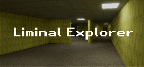
Wander through a variety of eerie liminal spaces').

Related guides

Steam app ID: 3966870 · Tags: Casual, Puzzle, Walking Simulator, Collectathon, Exploration