Scoring genre clarity...

Spookie Dookie capsule

Spookie Dookie

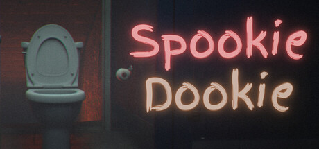
Spookie Dookie is a horror bathroom simulator where a simple pit stop goes wrong. Explore a decaying gas station restroom, uncover hidden tapes, survive encounters with what lurks within, and unlock multiple endings. Sometimes… holding it is the smarter choice.

$3.99Positive(23)
Strategy3DFirst-Person
Silly StudiozOct 10, 2025

Spookie Dookie scores 72/100 — better than 44% of Strategy capsules (n=5,103).

Positive (23 reviews) · $3.99 · Released Oct 10, 2025 · By Silly Studioz

Quick text summary

Spookie Dookie scored 72/100 on Steam Analyzer — Good for a Strategy capsule. Top priority fix: [composition] Shift title slightly left or add subtle supporting visual element on right to improve edge safety and balance.

Capsule scores by dimension

  • Genre Clarity: 7/10 — Horror comedy bathroom premise clear. The toilet imagery on the left immediately signals bathroom/toilet humor, and the neon text style suggests indie horror-comedy rather than pure terror. At TINY size, the toilet shape remains recognizable and the neon aesthetic communicates a quirky, tongue-in-cheek tone that aligns with the game's premise. However, the genre sits at comedy-horror rather than pure strategy or simulation, which may create slight confusion about core gameplay loop.
  • Title Readability: 8/10 — Neon text readable at all sizes. The neon glow effect on 'Spookie' (pink) and 'Dookie' (beige) maintains strong legibility even at TINY thumbnail size due to high contrast against dark background and clear letterforms. The word splitting across two lines is intentional and aids parsing. At FULL size, the neon effect is crisp and the serif/stylized font remains clear throughout the size range without collapse.
  • Contrast & Color: 8/10 — Strong neon pop against dark base. The bright pink and warm beige neon glows create excellent value separation and saturation against the dark #1b2838 background, with the toilet model in muted blue-gray providing secondary mid-tone interest. The neon highlights maintain silhouette clarity at TINY size and survive squinting; in grayscale the light values of the text still pop clearly. The warm color palette contrasts well and signals indie horror-comedy tone.
  • Uniqueness & Polish: 7/10 — Polished neon aesthetic, familiar hook. The neon style is well-executed and fits the indie horror-comedy zeitgeist seen in successful titles like Buckshot Roulette and Content Warning. The toilet bathroom simulator premise is novel and the visual presentation feels intentional and crafted. However, the neon text + dark room motif is a recognizable indie trope, preventing this from feeling completely distinctive; the hook is strong but not visually unprecedented.
  • Brand Consistency: 6/10 — Coherent but limited identity signals. The neon color palette (pink/beige), bathroom setting, and retro gas station aesthetic are consistent across what can be inferred from the capsule. However, without reference to the 8 available screenshots, it is unclear if a distinctive character, icon, or signature motif emerges that would be recognizable in isolation. The toilet and neon establish a mood but not yet a strong recurring brand symbol.
  • Composition: 7/10 — Clear focal point, good balance. The toilet on the left serves as a visual anchor while the neon title on the right dominates attention—creating a left-right read that works well at SMALL and TINY sizes. The composition avoids clutter and the dark middle ground cleanly separates the two elements. Safe margins appear adequate, though the title sits relatively close to the right edge and could be vulnerable to Steam cropping at extreme thumb sizes.

What works

  • Neon readability at tiny sizes. The bright pink and beige glow maintains sharp legibility even at 120×45 thumbnail scale due to high luminance contrast and clear letterforms.
  • Strong thematic visual hook. The toilet + neon aesthetic immediately communicates the bathroom simulator premise and indie horror-comedy tone without ambiguity.
  • Balanced two-element composition. The toilet and text are spatially separated on a clean dark background, avoiding clutter and creating clear focal hierarchy.

What hurts the capsule

  • Limited brand identity symbols. No distinctive character, mascot, or signature motif is evident that would make this recognizable in future marketing or sequel contexts.
  • Generic indie neon aesthetic. The neon-on-dark design is a well-established indie trope (seen in Buckshot Roulette, Content Warning, etc.), reducing visual distinctiveness.
  • Title proximity to right edge. The text sits relatively close to the right margin and may suffer truncation or awkward framing under Steam's aggressive crop settings at extreme sizes.

Priority fixes

  1. [composition] Shift title slightly left or add subtle supporting visual element on right to improve edge safety and balance.
  2. [brand_consistency] Introduce a recurring character, mascot, or iconic symbol (e.g., a specific creature silhouette or sign detail) that can anchor future brand identity.
  3. [uniqueness_polish] Consider adding a subtle background environment cue (graffiti, decay, signage) that hints at the 'decaying gas station' setting and differentiates from generic neon templates.

Store copy priority fixes

  1. [feature_communication] Add a sentence explaining the 'Spookie' meter mechanic: what triggers it, what happens when it maxes out, and how it forces player decisions or consequences.
  2. [genre_clarity] Clarify the strategic or evasion elements: specify whether encounters involve stealth, puzzle-solving, resource management, or pure avoidance to set player expectations.
  3. [feature_communication] Expand on 'hidden tapes'—explain how they function in gameplay (collect-all for lore, required for progression, optional for endings) and their role in story discovery.

Related guides

  • Steam page optimisationCapsule, copy, screenshots, tags — the full Steam page conversion stack.
  • Steam tags guideTag selection, ordering, and how it shapes Steam's recommendation rails.

Steam app ID: 3967950 · Tags: Strategy, 3D, First-Person, Realistic, Funny