LINK Penguins scores 73/100 — better than 50% of Online Co-Op capsules (n=1,298).

Quick text summary

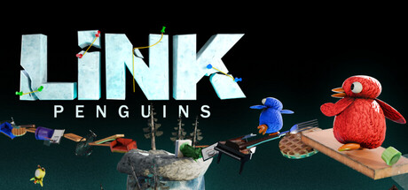
LINK Penguins scored 73/100 on Steam Analyzer — Good for a Online Co-Op capsule. Top priority fix: [uniqueness_polish] Simplify or redesign the background to reduce clutter and emphasize the two penguin characters as the sole focal point, increasing visual impact at tiny size.

Capsule scores by dimension

  • Genre Clarity: 7/10 — Casual co-op building game clear. The capsule clearly communicates a cooperative, whimsical building/puzzle game through the penguin characters, construction materials (wooden plank visible), and playful art style. At tiny size, the colorful penguin silhouettes and stacked objects still register as a creative construction game, though the specific bridge-building mechanic is not immediately obvious without text.
  • Title Readability: 8/10 — Bold title readable at all sizes. LINK in large, light blue-white ice textured letters sits prominently at top-left with clean separation from background. PENGUINS subtitle below is white and clearly legible. At tiny size the title holds strong due to high contrast and bold letterforms, though fine texture detail in the letters becomes imperceptible but does not harm readability.
  • Contrast & Color: 8/10 — Strong value separation and pop. Bright red penguin figure, vibrant blue penguin, and pale icy title create excellent contrast against the dark teal-green background. The light title stands out sharply, and the warm red penguin pops forward clearly. At tiny size, the red and blue penguin silhouettes remain distinctly visible and the composition does not collapse into muddy mid-tones.
  • Uniqueness & Polish: 7/10 — Charming art direction, somewhat familiar. The whimsical penguin characters and playful construction-themed visuals have a distinctive charm and hand-crafted feel that aligns well with indie adventure games. However, penguin characters and casual co-op building are moderately common themes; the capsule executes the concept cleanly but does not introduce a bold unique visual hook that separates it from similar casual titles.
  • Brand Consistency: 7/10 — Cohesive character and color identity. Red and blue penguin characters appear to be signature icons with consistent, appealing design. The soft, rounded art style and warm-cool color palette are coherent throughout the composition. Without access to store screenshots, internal consistency is strong—the visual language feels unified—though the capsule alone does not yet establish a distinctly iconic brand signature beyond 'cute penguin co-op game.'
  • Composition: 7/10 — Clear focal points, minor balance issue. The red penguin on the right serves as primary focus with the blue penguin and construction materials supporting the narrative. Composition reads well at small and tiny sizes with clear depth layering: foreground penguins, midground objects, background environment. The right-side weight of the red penguin is offset somewhat awkwardly by the left-heavy title, and the background environment feels slightly busy, but overall layout remains legible and does not suffer significant crop risk.

What works

  • Vibrant character silhouettes. Red and blue penguin figures pop clearly against the teal background and remain immediately recognizable even at tiny thumbnail size.
  • High-contrast title placement. The icy-textured LINK title with PENGUINS subtitle command attention through strong value contrast and clean positioning in the upper-left safe zone.
  • Playful art style matches genre. Soft, rounded character design and whimsical construction elements reinforce the casual, lighthearted co-op adventure tone effectively.

What hurts the capsule

  • Generic casual co-op visual theme. While well-executed, cute penguins building things is a familiar indie game archetype that does not strongly differentiate from competitors in the casual adventure space.
  • Busy background environment. The mid-to-background details (plants, structures, scattered objects) create moderate visual clutter that slightly competes with the main character focus, especially at small sizes.
  • Mechanic not immediately obvious. Without text, the core bridge-building gameplay is not clearly communicated; viewers may read it as general co-op fun rather than understanding the specific construction puzzle hook.

Priority fixes

  1. [uniqueness_polish] Simplify or redesign the background to reduce clutter and emphasize the two penguin characters as the sole focal point, increasing visual impact at tiny size.
  2. [genre_clarity] Consider adding a subtle visual cue of a completed bridge or stack of mismatched objects (piano, desk, wood) in the composition to clarify the unique build-and-bridge mechanic.
  3. [composition] Rebalance title and character placement to create more intentional symmetry or clear visual hierarchy rather than right-heavy penguin offset by left-heavy text.

Store copy priority fixes

  1. [audience_targeting] Rewrite the solo mode mention to lead a dedicated paragraph: 'Playing solo? Tackle Treasure Island at your own pace—the storm still chases, but co-op adds strategic depth to overcome obstacles.'
  2. [feature_communication] Add a sentence explaining what happens after reaching Treasure Island and what progression or new content unlocks with each stage completion.
  3. [uniqueness] Insert a sentence highlighting what makes the bridge-building mechanic distinct: e.g., 'The physics-based stacking system means every player's approach to materials matters—your pianos might topple your desk bridge.'
  4. [hook_strength] Move the strongest visual hook (pianos, desks, absurd materials) higher in the short description to replace '[Up to 8 Players]' as the opening note.

Related guides

Steam app ID: 3969510 · Tags: Online Co-Op, First-Person, Exploration, 3D Platformer, PvE