Scoring genre clarity...
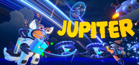
Jupiter capsule

Jupiter

Stranded on a mysterious alien planet, you must survive, explore and ascend a colossal planetary fault line in search of a signal that could lead you home. Use advanced alien technology, overcome hostile ecosystems, and choose whether to cooperate with your teammates, or leave them behind!

ActionAdventure3D
DarkNight studioQ3 2026

Jupiter scores 70/100 — better than 28% of Action capsules (n=8,871).

Released Q3 2026 · By DarkNight studio

Quick text summary

Jupiter scored 70/100 on Steam Analyzer — Good for a Action capsule. Top priority fix: [genre_clarity] Emphasize the alien planet survival hook by adding a signature landscape element—a colossal fault line or distinctive planetary terrain—as a distinctive background anchor that sets Jupiter apart from generic alien action.

Capsule scores by dimension

  • Genre Clarity: 7/10 — Sci-fi action adventure clear. The capsule communicates action and sci-fi themes through neon-lit aliens, glowing technology, dynamic poses, and bright particle effects. At TINY size, the bright yellow text and glowing blue/orange elements read as energetic sci-fi action, though the specific survival/exploration hook is not visually distinct from generic action adventure. The alien technology and hostile environment suggestions work, but genre specificity could be sharper.
  • Title Readability: 8/10 — Bold yellow title excellent contrast. JUPITER is rendered in large, thick yellow sans-serif lettering with strong value contrast against the dark blue background, maintaining excellent readability across FULL, SMALL, and TINY sizes. The letter spacing and weight ensure it does not collapse when scaled down. The title placement in the upper-middle area avoids clashing with the chaotic action below, though at TINY size the supporting visual noise around it slightly competes for attention.
  • Contrast & Color: 8/10 — Strong neon pop on dark bg. The capsule uses saturated cyan, bright yellow, and warm orange accents against a dark deep-blue background, creating excellent silhouette separation and visual pop suitable for quick Steam scrolling. The glowing neon effects and bright alien elements stand out cleanly even at small scale. In grayscale, the value range between the dark space background and bright UI/character highlights remains strong, ensuring legibility without relying solely on hue.
  • Uniqueness & Polish: 6/10 — Competent sci-fi tech, generic action. The capsule features clean neon VFX and well-lit alien character designs with a polished visual style consistent with modern sci-fi action games. However, the composition—multiple aliens in dynamic poses with glowing particles—feels like a standard sci-fi action template rather than communicating the core mechanic of survival/exploration on a hostile alien planet with cooperative choice elements. The premium craft is evident, but the visual hook does not clearly differentiate Jupiter from other alien action games.
  • Brand Consistency: 6/10 — Neon alien aesthetic internally sound. The capsule maintains consistent neon-lit sci-fi rendering, coherent color palette of cyan/blue/orange/yellow, and recognizable alien character silhouettes that likely repeat across store assets. However, there are no strong iconic motifs, signature symbols, or unique visual markers that make Jupiter distinctly memorable beyond the general neon alien theme. The internal art direction is solid and cohesive, but the identity could anchor to a more specific visual signature.
  • Composition: 7/10 — Clear hierarchy, busy midground. The composition uses a clear three-layer structure: dark space background, bright neon alien characters and tech in the midground, and the prominent yellow title anchoring the upper third. At SMALL and TINY sizes, the title remains the primary focal point, with the glowing aliens supporting the visual hierarchy. The main weakness is slight overcrowding in the midground—multiple aliens and particle effects create visual noise that, when squinted at or viewed at TINY scale, slightly dilutes the single focal point and could benefit from more breathing room.

What works

  • Excellent title legibility across scales. Large, thick yellow sans-serif JUPITER maintains perfect readability at FULL, SMALL, and TINY sizes with clean contrast against the dark background.
  • Strong neon color pop on dark Steam bg. Saturated cyan, bright yellow, and warm orange accents create immediate visual separation and stand out effectively during quick scrolling without muddy mid-tones.
  • Polished craft and clean rendering. The glowing VFX, character models, and lighting effects are well-executed with professional quality that signals premium production value.
  • Clear visual hierarchy at thumbnail scale. The title dominates, alien subjects draw secondary attention, and the composition remains parseable even at TINY size without collapsing.

What hurts the capsule

  • Overcrowded midground action. Multiple glowing aliens and particle effects compete for attention at TINY size, creating visual noise that dilutes a single clear focal point.
  • Generic sci-fi action template feel. The composition of dynamic aliens with neon effects reads as standard action-adventure sci-fi without clearly communicating the unique survival-exploration-choice mechanic.
  • No signature iconic symbol or motif. The capsule lacks a memorable visual anchor—a unique logo, character pose, or design pattern—that would make Jupiter instantly recognizable beyond generic neon aliens.
  • Survival and exploration themes not visible. The alien planet setting and core exploration mechanic are not clearly implied; the capsule reads as combat/action rather than survival-driven exploration.

Priority fixes

  1. [genre_clarity] Emphasize the alien planet survival hook by adding a signature landscape element—a colossal fault line or distinctive planetary terrain—as a distinctive background anchor that sets Jupiter apart from generic alien action.
  2. [uniqueness_polish] Create or highlight an iconic visual motif unique to Jupiter—such as a distinctive alien technology symbol, creature silhouette, or corrupt planet aesthetic—that becomes a recognizable brand identity across store assets.
  3. [composition] Reduce midground visual clutter by removing 1-2 peripheral aliens or toning down particle density, allowing the primary character or central tech element to command clearer focal attention at TINY scale.
  4. [brand_consistency] Design a signature color accent or visual pattern (e.g., a recurring fault-line crack motif or planet core glow) that reinforces Jupiter's identity consistently across all promotional art.

Related guides

Steam app ID: 3970800 · Tags: Action, Adventure, 3D, Atmospheric, Physics