Scoring genre clarity...
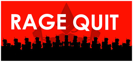
Rage Quit is a first-person melee game where the player uses only the sledgehammer for combat, traversal, and defense against hordes of office-bots. Use a fluid variety of light, heavy, dash-based, and reflective attacks to smash your way through your foes and enact revenge!
Free to PlayVery Positive(249)
Spectacle fighterHack and SlashAction
Vancouver Film SchoolSep 15, 2025