Scoring genre clarity...

Cat Vs Slime 猫咪大战史莱姆 capsule

Cat Vs Slime 猫咪大战史莱姆

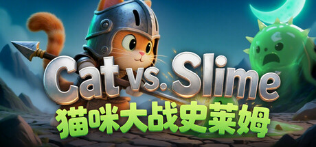
Cat Vs Slime Innovative gravity stack tower defense! Cats stack upward to attack flying enemies. Slimes come from the ground and portals, attacking from both sides. 18 cats, 36 levels. Build your best defense and protect the cat home!

$2.99
Tower DefenseCasualStrategy
Happy FishMay 28, 2026

Cat Vs Slime 猫咪大战史莱姆 scores 73/100 — better than 65% of Tower Defense capsules (n=685).

$2.99 · Released May 28, 2026 · By Happy Fish

Quick text summary

Cat Vs Slime 猫咪大战史莱姆 scored 73/100 on Steam Analyzer — Good for a Tower Defense capsule. Top priority fix: [title_readability] Remove or redesign the green Chinese tagline with stronger contrast (lighter or darker color) or increase font size to ensure readability at small capsule size.

Capsule scores by dimension

  • Genre Clarity: 8/10 — Tower defense with playful cat theme. The capsule clearly communicates a casual tower defense or strategy game through the stacked cat character in armor at center-left, contrasted with a menacing green slime enemy on the right. At tiny size, the vertical stack composition and opposing character silhouettes still read as a conflict scenario, though the tower defense mechanic is implied rather than explicit. The whimsical art style and cute protagonist immediately signal indie casual rather than hardcore strategy.
  • Title Readability: 7/10 — Clear primary title, secondary text struggles. The English title 'Cat vs. Slime' in bold white letterforms with metallic shadow is highly readable at full and small sizes, with strong contrast against the blue sky background. However, the green Chinese tagline below becomes illegible at tiny size due to small font weight and color proximity to background elements. At tiny size, only 'Cat vs. Slime' remains clearly parseable, which is sufficient for recognition but loses the complete messaging.
  • Contrast & Color: 8/10 — Strong value separation and vibrant accents. The composition uses excellent dark teal-blue sky as a controlled background with high-contrast white title text and bright neon-green slime that pops distinctly. The orange-armored cat and cool blue helmet provide warm-cool color separation that maintains readability even when squinted. In grayscale, the white title and bright green slime retain clear edges and silhouettes against the mid-tone sky, ensuring legibility at all sizes.
  • Uniqueness & Polish: 7/10 — Polished presentation with charming character focus. The capsule demonstrates solid craft with clean character rendering, intentional color grading, and a cohesive lighting model that feels premium for an indie title. The stacked cat mechanic is visually represented through the armored protagonist design, which communicates the core tower defense hook effectively. However, the overall composition follows familiar casual game conventions without a truly distinctive visual hook that sets it apart from comparable indie titles like Moonstone Island or Little Kitty, Big City.
  • Brand Consistency: 6/10 — Competent character focus, limited identity cues. The armored cat protagonist is consistently rendered and could serve as a recognizable brand icon with repeated exposure, featuring a distinctive helmet and warm color palette. The neon-green slime provides strong visual contrast and potential for brand recognition through color alone. However, without additional store screenshots visible in this analysis, the capsule lacks obvious recurring motifs, signature effects, or palette consistency signals that would anchor a strong internal brand identity.
  • Composition: 8/10 — Clear focal point with balanced adversarial setup. The centered composition with the armored cat on the left-center and threatening green slime on the right creates natural visual balance and immediately communicates conflict. The title sits comfortably above the subjects with adequate breathing room, and no critical elements are positioned dangerously close to edges that would suffer from Steam cropping. At small and tiny sizes, the opposing character silhouettes remain the clear primary focal point, while the layered background provides depth without clutter.

What works

  • Strong contrast and legibility. White title text and neon-green slime pop sharply against the teal sky background, maintaining clarity even at tiny thumbnail size.
  • Clear visual conflict hierarchy. The opposing character placement (armored cat vs. slime) immediately communicates the core game premise of defense against enemies.
  • Polished character rendering. The armored cat protagonist features clean design, intentional lighting, and color choices that feel premium and inviting to casual players.
  • Safe composition margins. Title and focal subjects are positioned well within safe margins, with no critical elements at risk from Steam UI cropping.

What hurts the capsule

  • Chinese tagline illegibility at small sizes. The green Chinese subtitle becomes unreadable at small and tiny sizes due to insufficient contrast and font weight.
  • Generic tower defense visual language. While competent, the capsule relies on familiar casual game aesthetics without a strongly distinctive visual hook that differentiates from peers.
  • Limited brand identity reinforcement. No visible signature motifs, recurring symbols, or distinctive effects that would create long-term brand recognition beyond the character alone.

Priority fixes

  1. [title_readability] Remove or redesign the green Chinese tagline with stronger contrast (lighter or darker color) or increase font size to ensure readability at small capsule size.
  2. [uniqueness_polish] Introduce a signature visual element or effect unique to Cat vs. Slime (particle effects, distinctive UI style, or environmental detail) to increase polish and differentiation from similar casual indie titles.
  3. [brand_consistency] Develop and apply a consistent visual language across all marketing assets using the armored cat's color palette (warm orange, cool blues) and neon-green accent to establish stronger brand recall.

Store copy priority fixes

  1. [feature_communication] Replace 'build an impenetrable defense or a powerful attack squad, your way' with a specific mechanic example: 'Position cats vertically to reach flying slimes or arrange them horizontally to block ground rushes—each level demands a new strategy.'
  2. [audience_targeting] Add one sentence clarifying intended difficulty level or pacing: 'Perfect for relaxing sessions and puzzle enthusiasts' or 'A challenging test of timing and placement for strategy veterans.'
  3. [genre_clarity] In the detailed description, explicitly label the dual-threat system: 'Slimes attack from two sides—ground rushes and portal spawns—forcing you to balance vertical and horizontal defenses.'

Related guides

Steam app ID: 3972160 · Tags: Tower Defense, Casual, Strategy, Cats, Choices Matter