Clay Puzzle scores 68/100 — better than 17% of Action capsules (n=8,534).

Quick text summary

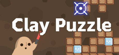
Clay Puzzle scored 68/100 on Steam Analyzer — Solid for a Action capsule. Top priority fix: [contrast_color] Increase value contrast between character silhouette and background by adding darker shadow or lighter highlight rim to the clay figure.

Capsule scores by dimension

  • Genre Clarity: 7/10 — Puzzle block mechanic readable. The capsule clearly communicates a casual puzzle game through the falling clay blocks grid, the character aiming mechanic with the red projectile, and the block-matching layout. At TINY size, the grid pattern and shooting pose are still recognizable as puzzle-action gameplay, though the specific 'clay' material theme is less obvious at diminished scale.
  • Title Readability: 8/10 — Bold white sans-serif legible. The title 'Clay Puzzle' uses clean, bold white sans-serif text with excellent contrast against the brown background. At SMALL and TINY sizes, the letterforms remain clear and readable without collapse, and the placement in the upper-middle region avoids noisy texture interference.
  • Contrast & Color: 7/10 — Warm earth tones readable. The warm brown background provides moderate separation from the tan character and white text, with blue crosshair and light blue blocks adding accent color. The overall palette reads acceptably at small sizes, though the brown-to-tan transition lacks strong value separation, and grayscale contrast between character and background is moderate rather than striking.
  • Uniqueness & Polish: 6/10 — Competent but generic theme. The capsule presents a functional, recognizable puzzle-action scene with clay aesthetic and aiming mechanic, but the execution feels template-like compared to top-tier casual game capsules. The pixel-art style and simple composition lack a distinctive visual hook or memorable art direction that would set it apart in the casual puzzle space.
  • Brand Consistency: 6/10 — Consistent but unmemorable identity. The clay theme, warm earth palette, and character design are internally cohesive and match the game description, but there are no iconic visual motifs or signature design elements that would enable later recognition. The pixel-art treatment is consistent across elements, but the overall aesthetic is not distinctive enough to form a strong brand signature.
  • Composition: 7/10 — Clear hierarchy, balanced layout. The composition features a clear focal point with the character and aiming action on the left-center, the title anchored above, and the falling blocks grid on the right as supporting context. The layout balances elements well across the canvas and maintains readable hierarchy at SMALL size, though the right-side block grid could feel slightly cramped when the header is cropped to smaller aspect ratios.

What works

  • Strong title contrast and readability. White bold sans-serif on brown background remains legible at all sizes without decorative collapse.
  • Clear gameplay communication. The aiming character, falling blocks, and crosshair immediately convey puzzle-action mechanics and intent.
  • Warm, cohesive color palette. Earthy browns and clay tones create internal consistency that matches the game's tactile theme.

What hurts the capsule

  • Generic puzzle game template feel. The scene lacks distinctive visual hooks or memorable design elements that differentiate it from standard casual puzzle capsules.
  • Moderate value separation. Character and background use similar warm tones, reducing silhouette clarity and impact at TINY sizes.
  • No iconic brand signature. The capsule lacks a recognizable motif, character personality, or visual cue that would enable brand recall on future viewings.

Priority fixes

  1. [contrast_color] Increase value contrast between character silhouette and background by adding darker shadow or lighter highlight rim to the clay figure.
  2. [uniqueness_polish] Refine character design or add a distinctive visual element (e.g., expression, accessory, or pose variation) that signals personality and memorability.
  3. [genre_clarity] Ensure the blue crosshair and block grid remain visually dominant at TINY size by increasing their saturation or size proportion slightly.

Store copy priority fixes

  1. [hook_strength] Rewrite the short description to lead with a specific emotion or outcome: e.g., 'Relax and solve adorable clay puzzles in this zen falling-block game—clear rows, reach 100%, and unlock secrets.' This replaces generic action verbs with a mood and reward.
  2. [uniqueness] Add a 1–2 sentence statement differentiating Clay Puzzle: e.g., 'Unlike traditional falling blocks, special gun power-ups change how you interact with each piece, blending strategy with soothing casual play.' This clearly articulates what makes it stand out.
  3. [feature_communication] Expand the special guns section with concrete strategic examples: e.g., 'Special guns let you freeze blocks, shoot sideways, or skip pieces—each reshapes your puzzle-solving approach and unlocks new challenge tiers.' This explains the value and gameplay depth.
  4. [bad] Fix the typo 'Cray Puzzle' to 'Clay Puzzle' in the detailed description to preserve trust and professionalism.

Related guides

Steam app ID: 3972880 · Tags: Action, Casual, Puzzle, Solitaire, 2D