Scoring genre clarity...
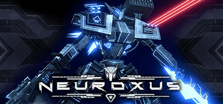
NEUROXUS is a high-intensity sci-fi action shooter where overwhelming firepower, brutal boss battles, and precise movement decide survival. Awaken as Earth’s last war machine and fight through deadly defenses to destroy Nexis, the AI that wiped out humanity.
$12.99Mostly Positive(10)
ActionThird-Person ShooterMechs
Empyreum StudioJan 23, 2026