Scoring genre clarity...
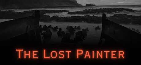
Welcome to The Lost Painter, A single player, first person, atmospheric walking simulator exploring liminal spaces. Enter your Paintings and explore a world full of mystery and Horror. Storm the beaches of Normandy, Get lost in the Backroooms and Survive the Devils Labyrinth.
$2.99Positive(18)
AdventureSimulationWalking Simulator
Ravenhome StudiosSep 10, 2025