Scoring genre clarity...
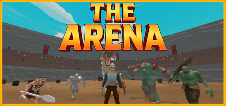
Enter a deadly tournament in this fast-paced roguelite arena brawler. Fight waves of enemies, trigger chaotic events, and upgrade your build — solo or in co-op — as you battle to become the ultimate arena champion!
$7.994 user reviews
IndieAction RoguelikeSpectacle fighter
Big W GamesJan 29, 2026