Scoring genre clarity...

Cucina Stellata capsule

Cucina Stellata

Cook traditional 19th-century Italian recipes in a kitchen haunted by hunger. A short psychological horror where gastronomy, ritual and cosmic appetite share the same table.

CookingPsychological HorrorPsychological
Filthy Eden2026

Cucina Stellata scores 77/100 — better than 62% of Cooking capsules (n=452).

Released 2026 · By Filthy Eden

Quick text summary

Cucina Stellata scored 77/100 on Steam Analyzer — Good for a Cooking capsule. Top priority fix: [genre_clarity] Add subtle cooking implements or kitchen elements (knife, pot, flame) to the figure's hands or midground to visually anchor the culinary theme and reduce ambiguity at tiny size

Capsule scores by dimension

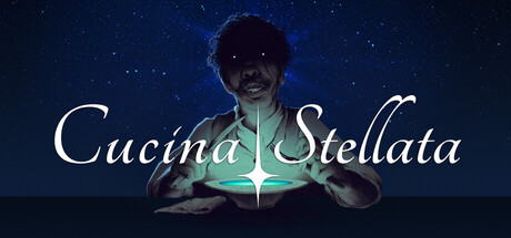
  • Genre Clarity: 7/10 — Atmospheric horror with culinary theme. The centered figure with glowing green ethereal light and starry night background clearly communicates psychological horror and supernatural elements. The cooking context is less immediately obvious at tiny size, though the hands-forward pose suggests agency or ritual. At TINY size, viewers recognize this as dark supernatural fiction but may not parse the cooking/gastronomy specificity without the title.
  • Title Readability: 8/10 — Elegant script, strong legibility maintained. The white cursive 'Cucina Stellata' title has excellent contrast against the dark starry background and maintains readability at small and tiny sizes due to large scale and clean letterforms. The vertical green line through the middle provides strategic visual anchor. At TINY size, the title remains recognizable as readable text, though individual letter clarity reduces slightly.
  • Contrast & Color: 8/10 — Strong value separation, glowing accent pop. White title and bright green ethereal glow create excellent contrast against the deep navy-black starfield background. The figure's silhouette reads clearly in grayscale due to rim lighting, and the centered green glow provides a memorable color accent that draws the eye. At SMALL and TINY sizes, the luminous green core and white text remain highly legible and striking.
  • Uniqueness & Polish: 8/10 — Premium atmospheric design, distinctive visual hook. The combination of 19th-century culinary setting implied through hands-forward cooking pose, cosmic horror atmosphere with starfield and ethereal green light, and elegant cursive typography creates a distinctive and cohesive visual identity. This moves beyond generic supernatural fare by suggesting a specific thematic fusion of gastronomy and cosmic dread. The craft is clean and intentional throughout.
  • Brand Consistency: 7/10 — Coherent art direction, limited identity signals. The starfield, ethereal green glow, shadowed human figure, and elegant white script create an internally consistent aesthetic that feels premium and unified. However, without access to the broader brand identity from store screenshots, the iconic elements feel more atmospheric than actively distinctive—the green glow and starfield could potentially map to multiple games. The design promises psychological horror with supernatural elements convincingly.
  • Composition: 8/10 — Clear focal point, balanced depth layering. The centered figure with glowing hands and starfield background creates strong three-layer depth: stars (background), figure silhouette (midground), and glowing green energy (foreground focus). The title sits in controlled white space at top, avoiding edge collision and maintaining safe margins. At TINY size, the composition remains readable with the glowing center holding attention and the title clearly separated above.

What works

  • Title remains legible at all sizes. Large white cursive script with sufficient contrast and strategic placement above the figure ensures 'Cucina Stellata' reads clearly from full header down to tiny thumbnail without loss of recognition.
  • Atmospheric visual hook stands out. The combination of ethereal green glowing hands, starry background, and shadowed figure creates a memorable and distinctive supernatural mood that differentiates from generic horror capsules.
  • Strong color contrast and silhouette clarity. The white title and bright green glow separate excellently from the deep navy background, maintaining visual pop and readability even when squinted or viewed at thumbnail scale.
  • Coherent art direction throughout. Starfield, lighting design, typography, and figure treatment align stylistically to create a premium, unified presentation with no jarring visual conflicts.

What hurts the capsule

  • Cooking context not immediately evident. While hands are positioned forward suggestively, the culinary specificity of the game is not visually clear at tiny size without the title; viewers may assume pure supernatural horror instead of the gastronomy-focused narrative.
  • Figure identity and pose ambiguous. The silhouetted, shadowed figure lacks distinguishing features or characteristic pose that would immediately signal a chef or cooking protagonist, reducing specificity of genre subgenre communication.
  • Limited brand identity iconography. The design relies on atmospheric mood rather than memorable symbolic elements, icons, or character traits that would allow brand recognition in future promotions or sequel marketing.

Priority fixes

  1. [genre_clarity] Add subtle cooking implements or kitchen elements (knife, pot, flame) to the figure's hands or midground to visually anchor the culinary theme and reduce ambiguity at tiny size
  2. [uniqueness_polish] Introduce a signature visual motif or color treatment unique to Cucina Stellata that can become an iconic brand identifier across future materials and store pages
  3. [brand_consistency] Ensure the ethereal green glow and starfield aesthetic translates consistently across store screenshots and promotional materials to build visual brand recognition

Store copy priority fixes

  1. [feature_communication] Add one sentence explicitly stating the core gameplay mechanic: e.g., 'Make choices throughout preparation and consumption that determine your character's descent' or 'Follow interactive recipes where each decision tightens the horror.'
  2. [audience_targeting] Include estimated playtime (e.g., '2–3 hours') and clarify if this is linear narrative or choice-driven to help players self-select.
  3. [feature_communication] Add a sentence confirming this is interactive fiction or visual novel format to remove ambiguity about what 'playing' entails.
  4. [uniqueness] Add a sentence that explicitly contrasts this with other Lovecraftian horror games, e.g., 'Unlike cosmic horror shooters, Cucina Stellata puts you at the table as a willing (then unwilling) participant in ritual transgression.'

Related guides

Steam app ID: 3976340 · Tags: Cooking, Psychological Horror, Psychological, Horror, Story Rich