Scoring genre clarity...

Astranded capsule

Astranded

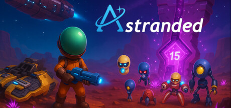
Shot down and stranded, Skywalker and his drone Wolly must fight to survive on a hostile alien world. Scavenge, craft, and defend against relentless robotic sentinels while uncovering the secrets of the Astra Portal and the mysterious force that brought them down.

$14.992 user reviews
ActionAdventureAction-Adventure
Tim S.Nov 2, 2025

Astranded scores 72/100 — better than 46% of Action capsules (n=8,534).

2 user reviews · $14.99 · Released Nov 2, 2025 · By Tim S.

Quick text summary

Astranded scored 72/100 on Steam Analyzer — Good for a Action capsule. Top priority fix: [composition] Shift the right-side robot cluster 10-15 pixels left to increase edge safety margin and improve overall balance without losing the threat composition.

Capsule scores by dimension

  • Genre Clarity: 7/10 — Action sci-fi survival clear. The capsule effectively communicates action-adventure through the armed orange protagonist in the foreground, hostile alien robots arrayed across the right, and glowing purple sci-fi environment with tech structures. At tiny size, the silhouette of the main character with weapon and the cluster of enemies is readable, though the survival/scavenging aspect is not immediately obvious from visuals alone. Genre reads as action-shooter with alien combat focus rather than craft-survival emphasis.
  • Title Readability: 8/10 — Logo readable at all sizes. The 'Astranded' logo with cyan orbital symbol is positioned in the upper right with strong cyan-to-white contrast against the dark purple sky background. The letterforms remain legible at small and tiny sizes due to clean sans-serif styling and the distinctive orbital icon that anchors brand recognition. Tagline or secondary text is not present, keeping focus sharp on the title itself.
  • Contrast & Color: 8/10 — Strong value separation throughout. The orange protagonist and golden robot chassis create warm bright islands against the cool blue-purple background, establishing excellent light-dark separation that persists at tiny size. The magenta energy core and glowing cyan details add accent contrast that guides the eye, and the grayscale squint test shows clear silhouette definition between all character forms and background. No muddy midtones; the color palette uses high saturation strategically without crushing readability.
  • Uniqueness & Polish: 7/10 — Solid craft, familiar asset style. The capsule demonstrates polished 3D rendering with clean lighting, well-modeled character proportions, and intentional staging that communicates the core premise of human versus robotic threat. The scene composition and color harmony feel intentional, but the overall aesthetic—orange suited protagonist, stylized robots, sci-fi wasteland—aligns closely with established indie action-adventure templates seen in comparable titles. Not generic, but not distinctly memorable in isolation; execution is professional without a signature hook.
  • Brand Consistency: 6/10 — Coherent scene, limited recognition. The capsule maintains internal visual consistency with a unified lighting model, coherent character design language across protagonist and drones, and a recognizable color palette of orange-gold and cyan-magenta. However, without reference to other store materials, the capsule lacks distinctive identity cues—the protagonist outfit, drone designs, and environment motifs feel functional but not uniquely iconic. The cyan logo is the strongest brand anchor, but character silhouettes are not immediately memorable across multiple viewings.
  • Composition: 7/10 — Clear hierarchy, slight edge tension. The main character occupies the strong left-center focal point with clear foreground depth, while the robot enemy array creates secondary emphasis on the right, establishing a readable action narrative at all sizes. The logo is anchored top-right in a safe margin, and the background architecture frames the scene without clutter. At tiny size, the composition reads clearly, though the robots on the right edge approach Steam's crop threshold and slight margin could improve safety; the center-left mass leaves some upper-right void but this supports the directional tension of left-to-right threat.

What works

  • Strong color contrast and silhouette definition. The warm orange protagonist and golden robots pop distinctly against the cool blue-purple background, maintaining clear separation and readability even at tiny size through high saturation and value differentiation.
  • Readable logo with recognizable icon. The cyan 'Astranded' logo with orbital symbol is positioned in a safe upper-right margin and remains legible at all scales due to clean typography and distinctive orbital motif that anchors brand identity.
  • Clear action-adventure genre communication. The armed protagonist, arrayed hostile robots, and sci-fi environment immediately convey action-shooter gameplay with alien combat focus, supported by strong silhouettes that read at small size without confusion.

What hurts the capsule

  • Generic asset style lacks distinctive identity. While professionally executed, the orange suit, drone designs, and wasteland setting align closely with established indie action templates, making the capsule feel functional but not uniquely memorable without reliance on the logo.
  • Robots approach right edge safety margin. The enemy cluster on the right side sits close to the horizontal edge and may suffer minor crop loss on smaller Steam display formats, reducing visual balance and threatening composition clarity.
  • Survival and craft mechanics not visually implied. The capsule emphasizes combat and hostile environment but does not communicate the scavenging and crafting elements mentioned in the game description, potentially misleading players about core gameplay loops.

Priority fixes

  1. [composition] Shift the right-side robot cluster 10-15 pixels left to increase edge safety margin and improve overall balance without losing the threat composition.
  2. [uniqueness_polish] Add a subtle environmental detail such as wreckage, scrap piles, or craft benches to the background that signals survival and crafting gameplay beyond pure combat.
  3. [brand_consistency] Introduce a signature visual motif or color accent unique to Astranded across the environment (e.g., distinctive energy residue, alien flora, or tech signature) to increase post-view recognition.

Store copy priority fixes

  1. [uniqueness] Add one sentence explaining what makes Astranded's base-defense or bullet-hell mechanics distinct—e.g., 'defend your base against alien patterns that demand split-second dodging and positioning' or 'the Astra Portal evolves with each wave, introducing new enemy types and environmental hazards.'
  2. [hook_strength] Replace or enhance the short description to lead with the core gameplay verb and unique hook—consider 'Survive waves of relentless aliens, scavenge a hostile world, and defend your base on an uncharted planet' or emphasize bullet-hell intensity if that is a primary draw.
  3. [feature_communication] Rewrite the 'Additional Details' section into prose or better-structured bullets that explain *how* features connect—e.g., 'Use your hover craft to explore the alien landscape and scavenge rare materials for crafting upgrades that sustain your base through escalating nightly attacks.'
  4. [genre_clarity] If bullet-hell is a core identity, add explicit mention of dodge mechanics, pattern-based combat, or fast-paced enemy waves in the detailed description to match the tag classification.

Related guides

Steam app ID: 3977940 · Tags: Action, Adventure, Action-Adventure, Shooter, Bullet Hell