Scoring genre clarity...

INNBC STARFIGHTER capsule

INNBC STARFIGHTER

A free-to-play 90s-style bullet-hell shooter with high-res graphics, unlocked 60+ FPS, single-player campaign, and online co-op multiplayer!

Free to Play8 user reviews
Side ScrollerShoot 'Em UpAction
Jonathan Fior Mar 21, 2026

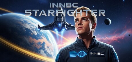
INNBC STARFIGHTER scores 68/100 — better than 20% of Side Scroller capsules (n=1,065).

8 user reviews · Free to Play · Released Mar 21, 2026 · By Jonathan Fior

Quick text summary

INNBC STARFIGHTER scored 68/100 on Steam Analyzer — Solid for a Side Scroller capsule. Top priority fix: [title_readability] Increase font weight and letter spacing of STARFIGHTER to maintain baseline legibility below 120px; test render at 80px to confirm tiny size survival.

Capsule scores by dimension

  • Genre Clarity: 7/10 — Space shooter clear at full, soft at tiny. The futuristic spaceship, planet, and sci-fi character styling immediately signal action space shooter. At full size, the spacecraft and cosmic setting are unmistakable; at tiny size, the silhouette of the protagonist and ship remain readable but the specific bullet-hell subgenre is not obvious from visuals alone. The DNA helix logo on the character's suit hints at a sci-fi theme but doesn't reinforce the shooter mechanic.
  • Title Readability: 6/10 — Title readable full size, collapses tiny. INNBC STARFIGHTER uses a clean sans-serif font with good letter spacing at full header size and reads confidently. At tiny thumbnail size (120×45), the letterforms compress and spacing becomes ambiguous; STARFIGHTER remains partially recognizable but INNBC fades into a blur. The title placement centered in the upper portion is strategic but the font weight is not heavy enough to survive extreme downscaling without aliasing loss.
  • Contrast & Color: 8/10 — Strong value separation, crisp silhouettes. The capsule excels with bright cyan-blue DNA strand and character lighting against a deep space background featuring warm orange nebula swirls and cool blue planet. The protagonist's face and suit pop with high mid-tone separation from the dark void, and the glowing spacecraft provides additional bright accent contrast. At small size, the light-dark split remains clear and the warm-cool color push enhances readability even during quick scroll.
  • Uniqueness & Polish: 7/10 — Polished sci-fi aesthetic, lacks innovation hook. The image demonstrates solid production craft—professional lighting, clean compositing, cinematic depth with layered nebula effects, and coherent character design. However, the visual presentation is thematically competent but visually generic for modern space action games; it does not communicate a distinctive gameplay hook or memorable selling point beyond 'sci-fi shooter.' The DNA helix motif suggests a unique mechanic but is underdeveloped and not visually dominant enough to stand out in a crowded action genre lineup.
  • Brand Consistency: 6/10 — Coherent rendering, minimal identity signals. The capsule maintains internal visual cohesion—consistent realistic character rendering, unified sci-fi color palette, and professional post-processing. However, there are no iconic character traits, signature symbols, or distinctive motifs that would allow recognition of INNBC STARFIGHTER in isolation without the title. The DNA helix logo is present but underdeveloped as a recognizable brand anchor; the overall presentation is generic professional space-action without memorable identity cues.
  • Composition: 7/10 — Clear focal point, well-balanced depth layers. The protagonist's face and upper torso anchor the right-center foreground with clear visual hierarchy; the spacecraft sits mid-ground left, and the planet with nebula fill the background, creating readable depth separation. Title placement top-center is safe and non-intrusive. At small and tiny sizes, the character face remains the primary focal point and the composition does not scatter attention. The composition is balanced but edges approach frame boundaries; left-side spacecraft and right edge character sit close to potential Steam crop zones.

What works

  • Excellent contrast and color separation. Bright cyan suits and character lighting create strong value separation against deep space, with warm-cool color push that enhances readability at all sizes including tiny thumbnail.
  • Professional layered depth composition. Clear foreground character, midground spacecraft, and background nebula with planet create visual hierarchy that reads well at small size without scattered attention.
  • Cinematic lighting and visual polish. High-quality character rendering, glowing effects, and atmospheric nebula treatment convey premium production craft and professional execution.

What hurts the capsule

  • Title loses legibility at tiny size. INNBC and STARFIGHTER compress into aliased blur below 120px width, reducing discoverability during quick Steam browsing where thumbnail dominates initial attention.
  • Generic sci-fi theme without gameplay clarity. The visual presentation does not communicate the unique 90s bullet-hell shooter or free-to-play value proposition; it reads as standard space-action rather than a distinctive indie experience.
  • Weak brand identity and recognition cues. The underdeveloped DNA helix motif and lack of iconic character or symbol means INNBC STARFIGHTER is not visually distinctive enough to be recognized outside the title text.
  • Elements positioned close to edge crop zones. The spacecraft on the left edge and character silhouette on the right edge risk partial clipping on Steam's variable display crop margins.

Priority fixes

  1. [title_readability] Increase font weight and letter spacing of STARFIGHTER to maintain baseline legibility below 120px; test render at 80px to confirm tiny size survival.
  2. [genre_clarity] Add a subtle bullet or energy projectile effect near the spacecraft or character to communicate bullet-hell shooter mechanic without cluttering the composition.
  3. [composition] Shift spacecraft and character 8–12% inward from edges to ensure no loss during Steam thumbnail crops and maintain focal point safety margins.
  4. [uniqueness_polish] Introduce a distinctive visual hook—glowing DNA helix pattern, neon grid, or retro-futuristic UI element—that signals the 90s-inspired aesthetic and differentiates from generic space-action capsules.

Store copy priority fixes

  1. [hook_strength] Lead with the ramming mechanic as the core hook rather than burying it in the feature list—rewrite the opening to emphasize the infected alien tech and power-up ramming as the defining gameplay innovation.
  2. [uniqueness] Expand the 'innovative power-up ramming mechanics' section to explain how this mechanic fundamentally changes the strategy and flow of the game compared to traditional bullet-hell shooters, with a concrete example.
  3. [feature_communication] Add a sentence explaining what 'DeSci' means and why scientist-designed achievements add value to the player experience.
  4. [tone_match] Move the dystopian Earth narrative higher in the copy to strengthen emotional investment and narrative context before diving into pure feature listing.

Related guides

Steam app ID: 3977960 · Tags: Side Scroller, Shoot 'Em Up, Action, Shooter, Adventure