Scoring genre clarity...

Spirit's Shadow Maze: The Path of Possession 灵影迷宫:附身之途 capsule

Spirit's Shadow Maze: The Path of Possession 灵影迷宫:附身之途

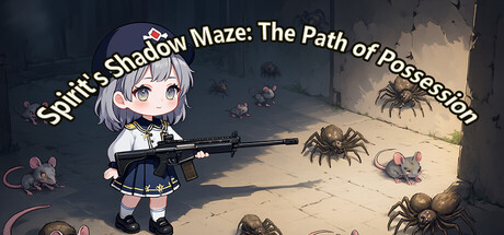
A 2D top-down maze exploration game blending exploration, combat, and strategy. Navigate randomly generated mazes with shifting paths that keep each run fresh. Face escalating challenges as you climb through floors, defeating monsters and seeking exits to progress further in the labyrinth.

$4.99
Exploration2D PlatformerAction
cg_gameOct 31, 2025

Spirit's Shadow Maze: The Path of Possession 灵影迷宫:附身之途 scores 62/100 — better than 3% of Exploration capsules (n=4,872).

$4.99 · Released Oct 31, 2025 · By cg_game

Quick text summary

Spirit's Shadow Maze: The Path of Possession 灵影迷宫:附身之途 scored 62/100 on Steam Analyzer — Solid for a Exploration capsule. Top priority fix: [genre_clarity] Add a visual element that explicitly communicates 'maze' or 'labyrinth'—such as a visible path fork, interconnected corridor layout, or dungeon-style doorways—to clarify the exploration-based progression mechanic.

Capsule scores by dimension

  • Genre Clarity: 7/10 — Anime action with maze exploration hints. The anime character wielding a rifle and the spider enemies clearly signal combat-action gameplay, though the maze/exploration mechanic is less obvious at tiny size. At TINY size, the silhouette reads as shooter action rather than maze-puzzle exploration, which is a secondary core mechanic that gets underrepresented visually.
  • Title Readability: 5/10 — English title readable, Chinese tagline illegible. The English title 'Spirit's Shadow Maze: The Path of Possession' is readable at full size with clear white text and outline, but at SMALL size the entire title becomes cramped and difficult to parse quickly. The Chinese subtitle 灵影迷宫:附身之途 is too small to read at any practical size and adds visual noise without supporting the English-speaking audience's ability to identify the game.
  • Contrast & Color: 7/10 — Strong character silhouette, muddled background. The white-haired anime character pops clearly against the darker maze environment with good value separation and cool/warm contrast between the character's light outfit and the brownish stone walls. However, at TINY size the spiders, rats, and background details become a muddy mid-tone mass that lacks clear silhouettes, reducing overall visual hierarchy and making the scene feel cluttered rather than focused.
  • Uniqueness & Polish: 6/10 — Competent anime aesthetic, generic maze scene. The anime character style is well-executed with clean cel-shading and good detail work, but the composition—character on left, monsters scattered in a stone hallway—follows a very familiar indie game template seen across dozens of action-adventure titles. The visual storytelling doesn't communicate a unique selling point; it reads as a competent but unremarkable genre entry without a distinctive hook that sets it apart from comparable maze-crawler titles.
  • Brand Consistency: 6/10 — Anime protagonist recognizable, limited identity markers. The white-haired anime girl with rifle is a memorable character design that could serve as a franchise icon, and the consistent cell-shaded art style across visible elements supports internal cohesion. However, without access to the 5 store screenshots for comparison, the capsule alone doesn't establish strong color palettes, UI consistency, or signature motifs that would be instantly recognizable as 'this game' in a crowded Steam list.
  • Composition: 6/10 — Clear focal point, weak depth layering. The character on the left serves as a strong primary focal point with good separation from the background maze environment, and the title placement above avoids obscuring gameplay elements. However, the spiders and rats are distributed evenly across the scene with equal visual weight rather than creating clear foreground-midground-background layering, and at SMALL size the composition collapses into a busy silhouette where the character and monsters blend into undifferentiated clutter.

What works

  • Character design standout. The anime protagonist is well-crafted with appealing proportions and clear visual readability even at small sizes, serving as an effective anchor and memorable focal point.
  • English title placement and outline. The white text with dark outline for the English title sits on a controlled background region and maintains reasonable legibility at full and medium sizes.
  • Combat-action clarity. The rifle, spider enemies, and character pose immediately signal action gameplay rather than pure puzzle or exploration, which aids genre communication.

What hurts the capsule

  • Maze mechanic underrepresented. The randomly-generated, shifting maze system—a core gameplay mechanic—is barely communicated visually; the scene reads as a linear action encounter rather than a labyrinth exploration experience.
  • Enemy silhouettes muddy at scale. The spider and rat enemies lack clear silhouette definition and blend into the brownish stone background, especially at SMALL and TINY sizes, creating visual noise rather than supporting the hierarchy.
  • Chinese subtitle adds clutter without value. The 灵影迷宫:附身之途 text is unreadable at any practical size and occupies prime real estate, creating visual weight that doesn't serve English-market visibility or cohesion.
  • Generic environmental composition. The scene follows a familiar indie template—character on left, scattered enemies in stone hallway—without distinctive art direction or environmental storytelling that would differentiate it from dozens of similar titles.

Priority fixes

  1. [genre_clarity] Add a visual element that explicitly communicates 'maze' or 'labyrinth'—such as a visible path fork, interconnected corridor layout, or dungeon-style doorways—to clarify the exploration-based progression mechanic.
  2. [contrast_color] Darken or desaturate the spider and rat enemies relative to the character, or reposition them to create clearer silhouette separation so the scene doesn't read as visual clutter at SMALL size.
  3. [title_readability] Remove or relocate the Chinese subtitle to a footnote or store page; prioritize the English title and increase font size so the full title remains legible at SMALL size without breaking lines.
  4. [composition] Introduce foreground-midground-background depth layering by placing one enemy closer to camera and one further away, creating clear spatial hierarchy that survives the squint test and TINY scaling.

Store copy priority fixes

  1. [hook_strength] Rewrite the short description opening to lead with the possession mechanic and its consequence: 'Possess and switch between characters to escape procedurally-generated mazes—each run demands new tactics' rather than listing mechanics generically.
  2. [feature_communication] Break the detailed description into a bulleted feature list (Possession System, Talent Tree, Teammate Recruitment, Escalating Difficulty) to improve scannability and reduce cognitive load for players skimming the page.
  3. [audience_targeting] Add a single sentence directly addressing the target player: e.g., 'If you love roguelikes that reward exploration and strategy over reflexes, this is for you' to create immediate audience resonance.
  4. [uniqueness] Include a comparative statement such as 'Unlike traditional roguelikes, your fallen character isn't the end—recruit teammates and possess them to keep your adventure alive' to reinforce the differentiation.

Related guides

Steam app ID: 3978020 · Tags: Exploration, 2D Platformer, Action, Top-Down Shooter, Adventure