Scoring genre clarity...

CHROMACORE capsule

CHROMACORE

CHROMACORE is a top-down arena shooter set in a futuristic super soldier training facility. Match your neon lights to the enemies in flow-inducing combat. Your task is simple: kill, adapt, survive, respawn.

$0.991 user reviews
Top-Down ShooterActionArena Shooter
3HPSep 18, 2025

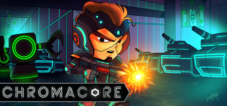
CHROMACORE scores 77/100 — better than 77% of Top-Down Shooter capsules (n=801).

1 user reviews · $0.99 · Released Sep 18, 2025 · By 3HP

Quick text summary

CHROMACORE scored 77/100 on Steam Analyzer — Good for a Top-Down Shooter capsule. Top priority fix: [uniqueness_polish] Integrate visual language that hints at the color-matching core mechanic—perhaps color auras or frequency indicators on the robot or HUD to differentiate from generic sci-fi shooters

Capsule scores by dimension

  • Genre Clarity: 8/10 — Clear action shooter with sci-fi setting. The top-down perspective, armed robot character, neon environment, and explosive effects immediately signal a futuristic action game. At tiny size, the glowing weapon discharge and tech-heavy UI grid in the background still read as sci-fi shooter combat. The orange/teal color palette and energy effects reinforce the arcade action genre effectively.
  • Title Readability: 8/10 — Clean, legible sans-serif title placement. CHROMACORE uses a bold, clean sans-serif font positioned in the lower left with adequate white-on-dark contrast. The title remains readable at small and tiny sizes with no decorative elements that would collapse. Spacing is generous and letterforms are distinct, though the title could benefit from slightly more visual hierarchy separation from the background grid lines.
  • Contrast & Color: 8/10 — Strong neon palette with high value separation. The orange robot character, cyan/teal environment, and bright yellow weapon discharge create excellent separation against the dark background. The neon glow effects provide luminous contrast that reads clearly even at tiny size. In grayscale, the character silhouette remains distinct from the mid-tone background grid, maintaining silhouette clarity at all viewing sizes.
  • Uniqueness & Polish: 7/10 — Polished sci-fi aesthetic with distinctive character. The armored robot protagonist has a memorable design with clear personality and unique proportions that distinguishes it from generic soldier archetypes. The neon color grading and particle effects show intentional art direction, though the overall execution is competent rather than exceptional. The visual language suggests a higher-quality indie title but doesn't reach the premium craftsmanship of AAA benchmarks like Helldivers 2 or Armored Core VI.
  • Brand Consistency: 7/10 — Cohesive neon sci-fi identity throughout. The orange/teal/green neon palette is consistent with the game's core visual identity, and the robot character design is distinctive enough to be recognizable across marketing. The tech grid background and energy effects reinforce the training facility theme described. However, without access to all five store screenshots, it's difficult to assess whether secondary characters or UI elements maintain this identity consistently across all promotional materials.
  • Composition: 8/10 — Strong focal point with balanced depth layering. The orange robot is positioned as the clear primary subject in left-center framing, with the explosive effect drawing secondary focus and the background grid providing supporting depth. At small and tiny sizes, the character remains dominant and the composition doesn't collapse due to clear value separation between layers. Safe margins are respected and the title placement doesn't interfere with the visual hierarchy.

What works

  • Memorable character silhouette. The orange armored robot has distinctive proportions and pose that stand out at tiny size and communicate personality without text.
  • Neon color palette clarity. The orange/teal/cyan contrast provides excellent pop against the dark background and maintains readability in grayscale at all viewing sizes.
  • Clear title legibility. The CHROMACORE sans-serif is well-positioned and maintains readability from full size down to thumbnail without decorative collapse.
  • Effective depth composition. Background grid, midground environment, and foreground character create clear layering that guides visual hierarchy at small sizes.

What hurts the capsule

  • Generic futuristic grid background. The tech grid pattern is functional but feels like a common sci-fi template; similar elements appear in multiple action game capsules without distinctive personality.
  • Busy particle field competes with subject. The yellow energy burst and surrounding glow effects, while visually impressive, create visual noise that slightly dilutes focus on the character at small sizes.
  • Limited storytelling about core mechanic. The capsule conveys 'sci-fi action' but doesn't visually communicate the unique 'color matching' mechanic that is core to gameplay identity.

Priority fixes

  1. [uniqueness_polish] Integrate visual language that hints at the color-matching core mechanic—perhaps color auras or frequency indicators on the robot or HUD to differentiate from generic sci-fi shooters
  2. [composition] Reduce particle effect saturation or glow intensity around the weapon discharge to strengthen primary focus on the character and increase contrast clarity at tiny size
  3. [brand_consistency] Verify the neon orange/teal palette is used consistently across all five store screenshots and consider adding a signature motif (icon or symbol) that becomes recognizable as CHROMACORE-specific

Store copy priority fixes

  1. [feature_communication] Expand the 'ADAPT' section with a concrete example: 'Defeat enemies in sequences to unlock abilities—e.g., destroy 3 red enemies to trigger a shield, or 5 blues to unleash a spread shot.' This transforms abstract progression into tangible player rewards.
  2. [audience_targeting] Add one sentence clarifying pacing and difficulty: 'Waves escalate rapidly with relentless enemy waves—perfect for arcade fans seeking reflexive, high-intensity challenge.' This immediately signals who should buy.
  3. [feature_communication] Specify 2–3 stat examples in the respawn section: 'Permanent upgrades like increased fire rate, larger bullet capacity, or color-match window—carry these forward to push further each run.' Concrete progression builds trust.
  4. [hook_strength] Consider moving or emphasizing the color-matching mechanic earlier in the short description or opening paragraph to lead with the unique twist, not just 'arena shooter.'

Related guides

Steam app ID: 3978410 · Tags: Top-Down Shooter, Action, Arena Shooter, Sci-fi, Shoot 'Em Up