Scoring genre clarity...

Your Friend Wiggles capsule

Your Friend Wiggles

In this terrifying walking simulator, you will meet those virtual pets you once forgot in a drawer, and who now seek revenge, in an atmosphere full of mystery and secrets waiting to be uncovered.

$2.99Positive(25)
AdventureHorrorSurvival Horror
BOC StudioOct 27, 2025

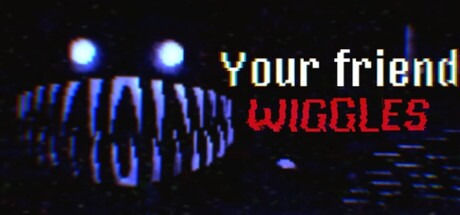
Your Friend Wiggles scores 65/100 — better than 12% of Adventure capsules (n=7,922).

Positive (25 reviews) · $2.99 · Released Oct 27, 2025 · By BOC Studio

Quick text summary

Your Friend Wiggles scored 65/100 on Steam Analyzer — Solid for a Adventure capsule. Top priority fix: [title_readability] Increase 'WIGGLES' contrast by expanding stroke width or adding a dark outline to match the white text legibility at tiny size

Capsule scores by dimension

  • Genre Clarity: 7/10 — Horror-tinged indie adventure clear. The glowing blue eyes, pixelated distorted face, and dark ominous atmosphere immediately signal psychological horror or creepy indie game rather than traditional adventure. At tiny size, the eerie facial silhouette and bright eye glow remain readable as 'unsettling creature' which correctly conveys the terrifying tone. The retro pixel aesthetic and neon glow effects align with indie horror-adventure expectations.
  • Title Readability: 6/10 — Title legible but uneven contrast. The white 'Your friend' reads clearly at all sizes due to strong contrast against dark background, but the red 'WIGGLES' subtitle has moderate contrast and begins to blur slightly at tiny size due to the thinner serif-like letterforms. At tiny size, both lines remain readable but require careful eye focus; the two-line split is functional but not optimally designed for quick recognition.
  • Contrast & Color: 7/10 — Strong separation via neon glow. The bright blue glowing eyes and mouth create excellent value separation against the near-black background, with clear silhouette definition even at tiny sizes. The pixelated face outline holds together well in grayscale due to strong light-to-dark edge definition. However, mid-tone detail in the facial structure compresses slightly at smallest sizes, reducing fine detail clarity but not breaking the primary read.
  • Uniqueness & Polish: 6/10 — Competent retro horror aesthetic. The pixelated art style and neon glow effects are executed cleanly and communicate the indie horror tone effectively, but the overall composition feels closer to a generic 'creepy digital entity' trope than a distinctive hook that signals this specific game's unique mechanic or story hook. The execution is polished but the concept leans on familiar retro-horror visual language rather than a standout selling point unique to Your Friend Wiggles.
  • Brand Consistency: 6/10 — Thematic consistency without signature. The capsule maintains internal cohesion with a consistent pixel art rendering style, unified dark palette, and cohesive neon glow effect throughout all visible elements. However, without reference to the 8 screenshots, there are no clear iconic motifs, character recognizability, or signature visual markers that would make this capsule immediately identifiable as Your Friend Wiggles versus other retro-horror indie games.
  • Composition: 7/10 — Clear focal point, safe layout. The distorted pixelated face with glowing eyes anchors the left-center composition as the primary focal point, while title text is cleanly positioned in the upper right with adequate margin spacing away from edges. The composition survives the small and tiny size transitions well with clear hierarchy between the face and text. The balance between subject and typography avoids clutter, though the empty right side below the text could have benefited from supporting visual elements.

What works

  • Eye-catching neon glow contrast. The bright blue glowing eyes read sharply against the near-black background at all sizes and immediately signal an eerie, unsettling tone.
  • Strong horizontal focal point. The distorted face positioned left-center creates a clear primary subject that holds attention even at tiny thumbnail size.
  • Clear white text hierarchy. The white 'Your friend' text maintains excellent legibility and contrast across all viewing sizes without baseline readability failure.
  • Thematic coherence. All visual elements—pixelated art, neon glow, dark palette, distorted geometry—reinforce the horror-tinged indie adventure tone consistently.

What hurts the capsule

  • Red subtitle contrast weakness. The red 'WIGGLES' text shows noticeably lower contrast than the white line above it and begins to soften at tiny sizes, risking legibility in quick scroll scenarios.
  • Generic horror visual language. The creepy pixelated face with glowing eyes relies on familiar retro-horror tropes without a distinctive visual hook that signals this specific game's unique mechanic or story.
  • Underutilized right side composition. The right half of the capsule below the title text sits largely empty, missing an opportunity for supporting visual storytelling or brand reinforcement.

Priority fixes

  1. [title_readability] Increase 'WIGGLES' contrast by expanding stroke width or adding a dark outline to match the white text legibility at tiny size
  2. [uniqueness_polish] Add a secondary visual element or motif (e.g., a forgotten toy silhouette, a digital artifact texture) to communicate the specific 'forgotten pet revenge' concept and differentiate from generic creepy entity imagery
  3. [composition] Balance the right side empty space by adding a supporting visual element or subtle background texture detail that reinforces the walking simulator atmosphere without competing with the face focal point

Store copy priority fixes

  1. [hook_strength] Move the core premise ('you will meet those virtual pets you once forgot in a drawer') to the opening of the detailed description before the abstract emotional language, to hook immediately on curiosity rather than mood alone.
  2. [feature_communication] Replace vague marketing terms ('immersive experience,' 'unique personality') with specific mechanical descriptions: clarify whether survival involves stealth, inventory management, resource scarcity, or pure narrative evasion.
  3. [audience_targeting] Add explicit signals about intended player type: specify approximate playtime, whether this appeals to players who dislike combat, and whether hardcore survival mechanics are present or minimal.

Related guides

Steam app ID: 3978710 · Tags: Adventure, Horror, Survival Horror, Singleplayer, Psychological Horror