Scoring genre clarity...

FIND KITTENS 6: After us capsule

FIND KITTENS 6: After us

Explore the continuation of this mysterious robotic world of another civilization, finding cute cats and paint black - white locations with colored paints.

Free to PlayVery Positive(13)
AdventureCasualIndie
Very Very LITTLE StudioNov 5, 2025

FIND KITTENS 6: After us scores 73/100 — better than 61% of Adventure capsules (n=7,922).

Very Positive (13 reviews) · Free to Play · Released Nov 5, 2025 · By Very Very LITTLE Studio

Quick text summary

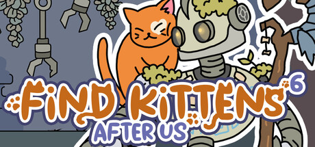
FIND KITTENS 6: After us scored 73/100 on Steam Analyzer — Good for a Adventure capsule. Top priority fix: [title_readability] Increase "AFTER US" subtitle contrast by using a lighter purple or white outline to maintain readability at TINY size.

Capsule scores by dimension

  • Genre Clarity: 8/10 — Clear casual adventure with puzzle appeal. The orange cat mascot, mechanical robot elements, and paint bucket iconography instantly signal a casual exploration game with a unique twist. At TINY size, the cat silhouette and colorful mechanical objects remain identifiable, though the paint mechanic is less obvious at that scale. Genre identity is strong and unambiguous across all viewing sizes.
  • Title Readability: 7/10 — Readable but tagline clarity varies. The main title "FIND KITTENS" in large white outline lettering reads clearly at all sizes, with good contrast against the gray-blue background and no collision with busy elements. The subtitle "AFTER US" is readable at full and small sizes but becomes fuzzy at TINY size due to its smaller scale and lighter purple color. The design avoids placing text over the busiest central robot area, which helps legibility.
  • Contrast & Color: 8/10 — Strong separation with warm-cool balance. The orange cat and white title text pop distinctly against the muted blue-gray background, creating clear silhouettes even in grayscale. Warm orange tones contrast effectively against cool background hues, and mechanical elements maintain readable edges. At TINY size, the overall composition still separates into distinct value zones, though fine detail in the machinery becomes less precise.
  • Uniqueness & Polish: 7/10 — Distinctive art style with cohesive vision. The hand-drawn, slightly retro aesthetic with bold outlines and a unique blend of cute cat character with industrial machinery sets this apart from generic casual game templates. The illustration quality is clean and intentional, showing strong craft in line work and color choices. However, the concept, while charming, follows a familiar casual indie formula that doesn't push boundaries compared to top-tier indie releases like Dredge or Harold Halibut.
  • Brand Consistency: 7/10 — Recognizable identity through cat and palette. The orange cat serves as a clear brand anchor and memorable mascot that could be recognized across marketing materials and subsequent entries in the series. The consistent use of orange, white outlines, and mechanical/steampunk visual language creates strong internal cohesion and a distinctive palette. The '3' in the upper right reinforces series identity, though this is a minor detail at smaller sizes.
  • Composition: 7/10 — Well-balanced layout with clear focal point. The orange cat positioned left-center serves as the primary focal point and draws the eye immediately, while mechanical elements frame and support without overwhelming. Title placement at bottom-left avoids the busiest center area where robot details cluster. At SMALL and TINY sizes, the composition remains readable with the cat and title clearly distinguished, though some mid-ground mechanical detail becomes indistinct at thumbnail scale.

What works

  • Strong mascot character. The orange cat is immediately identifiable and memorable, serving as an effective brand anchor that could carry the series.
  • Excellent title contrast and placement. White outlined text reads clearly at all sizes and avoids collision with busy background elements, prioritizing legibility.
  • Cohesive art style. Hand-drawn illustration with consistent bold outlines and warm-cool color palette creates a unified, premium appearance.

What hurts the capsule

  • Cluttered background detail. The central robot and mechanical elements create visual noise that competes for attention at larger sizes and loses clarity at TINY scale.
  • Subtitle legibility at tiny size. The purple "AFTER US" text is difficult to parse at thumbnail size due to reduced contrast and smaller letterforms.
  • Generic casual game formula. While well-executed, the cute character plus mechanical world concept follows established indie casual patterns without a truly distinctive hook that separates it from peer titles.

Priority fixes

  1. [title_readability] Increase "AFTER US" subtitle contrast by using a lighter purple or white outline to maintain readability at TINY size.
  2. [contrast_color] Reduce mechanical background detail density or push it further back in depth to create clearer separation between cat focal point and environment.
  3. [genre_clarity] Add a subtle visual cue (such as a highlighted paint bucket or paint splash) to better communicate the coloring/painting mechanic at all sizes.

Store copy priority fixes

  1. [hook_strength] Rewrite the short description to lead with an evocative verb and sensory detail: 'Uncover 100 hidden cats in a stunning hand-drawn robotic world—then paint each location with vibrant colors to watch the grayscale world come alive.' This creates curiosity and specificity.
  2. [feature_communication] Expand feature descriptions to explain how each mechanic serves the player: replace '2.5D effect' with 'Explore beautifully layered 2.5D hand-drawn environments that reward close attention' and 'Colorable map' with 'Bring color to previously gray locations as you discover each hidden cat.'
  3. [tone_match] Fix all punctuation and grammatical errors, especially the stray closing parentheses in the detailed description, to improve perceived quality and professionalism.
  4. [uniqueness] Add 1-2 sentences explaining what is new or improved in this entry compared to previous games in the series, or highlight a standout feature that distinguishes it from other hidden object games.

Related guides

Steam app ID: 3979310 · Tags: Adventure, Casual, Indie, Singleplayer, 2D