Scoring genre clarity...

Arrow Bingo capsule

Arrow Bingo

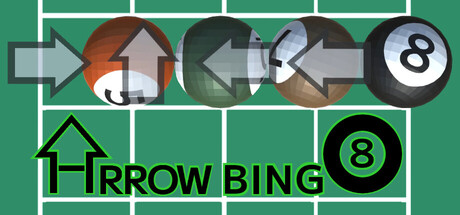
"Touch the arrow to slide the balls together, leading to One Away, then Bingo!" There are sheets on the floor marked with the same colors and numbers as the balls, and you move the balls to their matching sheets to reach the goal, line them up to get Bingo, and sink them.

$3.99
CasualPuzzleMinimalist
KiitoMaruMar 31, 2026

Arrow Bingo scores 70/100 — better than 29% of Casual capsules (n=10,153).

$3.99 · Released Mar 31, 2026 · By KiitoMaru

Quick text summary

Arrow Bingo scored 70/100 on Steam Analyzer — Good for a Casual capsule. Top priority fix: [uniqueness_polish] Introduce a distinctive visual hook or art style element—such as a character, mascot, or thematic color flourish—that differentiates this capsule from generic casual puzzle templates

Capsule scores by dimension

  • Genre Clarity: 7/10 — Puzzle mechanics clearly signaled. The arrow icon, billiard ball with number 8, and grid layout immediately communicate a puzzle or matching game with ball/number mechanics. At TINY size, the arrow and numbered ball remain recognizable, though the grid structure becomes less distinct. The green pool-table aesthetic supports casual puzzle positioning well.
  • Title Readability: 8/10 — Bold text holds up at all sizes. The title 'ARROW BING' uses a strong, black sans-serif font positioned directly on the green background with clear contrast. The text remains readable at SMALL and TINY sizes due to thick letterforms and adequate spacing. The ball icon reinforces the title visually without competing.
  • Contrast & Color: 8/10 — Strong value separation throughout. The bright Kelly green background provides excellent contrast against dark black text and the white/gray arrow elements, while the white-and-black ball creates a sharp focal point. The palette maintains clear silhouette definition even at TINY size and reads well in grayscale due to strong value differentiation between all major elements.
  • Uniqueness & Polish: 6/10 — Functional but familiar puzzle aesthetic. The design competently communicates a casual number-matching puzzle game using recognizable billiard and grid iconography, but the visual language is relatively generic for indie puzzle games. The execution is clean and the concept is clear, but there is no distinctive art style, memorable hook, or visual storytelling that sets it apart from other casual puzzle titles on the platform.
  • Brand Consistency: 6/10 — Colors and elements match gameplay. The green grid, numbered ball, and arrow match the game description of colored sheets and ball manipulation mechanics, creating internal coherence with the actual gameplay loop. However, there are no iconic character, motif, or signature visual elements that would make this capsule instantly recognizable on a storefront or in player memory compared to top-tier indie titles.
  • Composition: 7/10 — Clear focal point with good balance. The numbered ball is centered and commands immediate attention, while the arrow on the left provides directional context without cluttering. The grid structure provides rhythm and supports the focal point. At SMALL size the composition remains readable; at TINY size the grid becomes compressed but the ball and arrow maintain their hierarchical dominance.

What works

  • Title legibility at scale. Bold black sans-serif 'ARROW BING' text maintains excellent readability from full size down to TINY due to thick letterforms and strong contrast against green.
  • High contrast color palette. The combination of Kelly green, black, white, and gray creates strong silhouettes and value separation that works well in quick scrolling and grayscale evaluations.
  • Clear mechanic communication. The arrow icon and numbered ball immediately signal a puzzle game involving directional input and number matching aligned with the actual gameplay.

What hurts the capsule

  • Generic puzzle game aesthetic. The design relies on familiar casual-game iconography (billiard ball, grid, arrow) without a distinctive visual hook or art style that differentiates it from dozens of similar indie titles.
  • Limited visual storytelling. The capsule communicates what the game is mechanically but does not convey personality, tone, or a unique selling point that would create emotional engagement or recall.
  • Minimal memorable brand identity. There are no iconic characters, motifs, or signature visual elements that would allow players to recognize this game later or distinguish it from competitors in the casual puzzle space.

Priority fixes

  1. [uniqueness_polish] Introduce a distinctive visual hook or art style element—such as a character, mascot, or thematic color flourish—that differentiates this capsule from generic casual puzzle templates
  2. [brand_consistency] Develop an iconic motif or signature visual element from the game's core aesthetic that can serve as a recognizable brand marker across all marketing materials
  3. [composition] Consider adding subtle depth layering or a secondary visual element in the background that reinforces the game's theme without cluttering the focal point

Store copy priority fixes

  1. [hook_strength] Define or replace 'One Away' in the opening sentence with a clearer phrase like 'leading to One Away (when all balls are adjacent), then Bingo' or reframe the opening to lead with emotional appeal rather than jargon.
  2. [uniqueness] Add a differentiating statement after the short description, such as 'Combines grid-sliding puzzles with bingo mechanics—no timer, pure strategy' to explain why this blend is worth playing.
  3. [audience_targeting] Insert a sentence targeting the intended audience, such as 'Perfect for puzzle lovers who want strategy without time pressure' to clarify who will enjoy this game.
  4. [tone_match] Add one sentence of inviting, playful language (e.g., 'Watch the balls interact in surprising ways as you plan your moves') to warm up the instructional tone and create emotional appeal.

Related guides

Steam app ID: 3980490 · Tags: Casual, Puzzle, Minimalist, 3D, Singleplayer