Scoring genre clarity...

Dead 2 Rise capsule

Dead 2 Rise

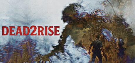
Dead2Rise is a survival horror game set in an abandoned old west village overrun by undead creatures, zombies, and ghosts. Scavenge supplies, manage hunger and stamina, and fight to survive 60 relentless days against a growing horde.

$24.994 user reviews
ActionAdventureAction RPG
Rahmat M, Sharifa TarakiNov 7, 2025

Dead 2 Rise scores 68/100 — better than 17% of Action capsules (n=8,534).

4 user reviews · $24.99 · Released Nov 7, 2025 · By Rahmat M

Quick text summary

Dead 2 Rise scored 68/100 on Steam Analyzer — Solid for a Action capsule. Top priority fix: [genre_clarity] Integrate a recognizable western iconography element (saloon sign, wanted poster, desert landscape detail) to establish the specific setting and differentiate from generic zombie horror.

Capsule scores by dimension

  • Genre Clarity: 7/10 — Survival horror with undead theme. The weathered, decaying figure with blue/purple spectral effects clearly signals horror and supernatural elements. At full size, the zombie silhouette and atmospheric palette communicate survival horror effectively, though at TINY size the specific genre reads more as dark action-adventure rather than distinctly survival-focused. The western setting is not immediately obvious at reduced sizes without additional context cues.
  • Title Readability: 8/10 — Bold red title with strong contrast. DEAD2RISE in large red caps sits in the upper left against lighter background, maintaining excellent legibility even at SMALL and TINY sizes due to high value contrast and sans-serif clarity. The title placement avoids the zombie figure and benefits from negative space, though at TINY size the number '2' could theoretically compress slightly depending on rendering.
  • Contrast & Color: 8/10 — Strong warm-cool value separation. Red title pops sharply against the cool blue-white atmosphere and muted decay browns of the central figure. The silhouette maintains clear separation from background at all sizes; grayscale test shows robust dark-to-light progression from figure to sky. Saturation is controlled and not oversaturated, preserving readability at thumbnail scales.
  • Uniqueness & Polish: 6/10 — Competent horror aesthetic, generic execution. The painterly zombie figure with particle dissolution effects shows craft and intentional visual treatment, but the overall composition feels like a standard survival horror presentation without a distinctive hook or memorable unique selling point. The atmospheric treatment is solid but aligns with many competing horror titles rather than standing out with a signature style or mechanic-specific visual.
  • Brand Consistency: 5/10 — Unclear identity without additional reference. The capsule lacks recognizable icon, motif, or signature color palette that would distinguish Dead2Rise from other zombie-horror games internally visible on this single image. Without access to the 23 store screenshots mentioned, internal cohesion appears functional but not reinforced by iconic visual markers that would build brand recall across multiple promotional touchpoints.
  • Composition: 7/10 — Title-led layout with clear focal point. The zombie figure anchors the center-right with title safely positioned in upper left, creating a readable hierarchy across all sizes. At SMALL and TINY, the large red text dominates and the blue-toned figure reads as supporting atmosphere without competing for attention. Composition is well-balanced though the lower third shows some empty space that could be optimized.

What works

  • Title contrast and legibility. Red DEAD2RISE maintains exceptional clarity at TINY size with strong value separation and strategic placement away from busy figure elements.
  • Silhouette clarity at small scales. The decaying zombie figure reads distinctly even at thumbnail size due to dark value mass and cool-toned background separation.
  • Atmospheric mood establishment. Particle effects and spectral blue-purple coloring effectively communicate supernatural horror tone at all viewing sizes.

What hurts the capsule

  • Generic horror presentation. The overall visual treatment lacks distinctive identity markers that would make Dead2Rise memorable compared to competing zombie-horror titles.
  • Western setting visibility. The old west village context from the game description is not visually communicated—could be any generic undead setting, limiting genre specificity.
  • Underutilized lower composition space. The bottom third of the capsule contains mostly empty neutral area when it could reinforce survival mechanics or environmental storytelling.

Priority fixes

  1. [genre_clarity] Integrate a recognizable western iconography element (saloon sign, wanted poster, desert landscape detail) to establish the specific setting and differentiate from generic zombie horror.
  2. [uniqueness_polish] Add a signature visual element or gameplay mechanic cue (survival UI hint, day counter, resource scarcity visual) that communicates the 60-day survival loop core mechanic.
  3. [brand_consistency] Establish a consistent color accent or motif across the lower composition space that could serve as a recognizable brand marker on future promotional materials.

Store copy priority fixes

  1. [hook_strength] Rewrite the short description opening to lead with a specific core gameplay conflict: e.g., 'Survive 60 days in a zombie-infested old west town where every decision—scavenge, fight, or hide—affects whether you see dawn' instead of the generic setup.
  2. [uniqueness] Add a sentence in the detailed description that explicitly states what makes Dead2Rise mechanically distinct, such as: 'The dynamic horde AI responds to your every action in ways no other survival game replicates' or identify a signature mechanic that sets it apart.
  3. [audience_targeting] Insert a brief sentence clarifying the intended player: 'Built for survival enthusiasts who value tactical decision-making and adaptive difficulty' or mention if accessibility options make it welcoming to newer players.
  4. [tone_match] Replace the final rhetorical question with a more grounded, urgent closing aligned with the tactical survival tone, such as: 'The outbreak is relentless. Your survival depends on every choice.'

Related guides

Steam app ID: 3983980 · Tags: Action, Adventure, Action RPG, Post-apocalyptic, Strategy