Scoring genre clarity...
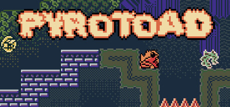
🔥🐸🔥 Pyrotoad is an action platformer where you leap, shoot, and puzzle your way through 35 challenging stages. Harness flame powers, unlock new moves, and battle through diverse biomes in your quest to reclaim Pyrotoad’s stolen sunglasses!
$7.993 user reviews
Precision PlatformerPlatformerIndie
WAV Games, Jonny ManjiroNov 3, 2025