City Hunter scores 77/100 — better than 79% of Action capsules (n=8,534).

Quick text summary

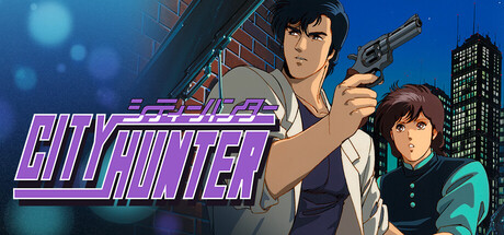
City Hunter scored 77/100 on Steam Analyzer — Good for a Action capsule. Top priority fix: [composition] Reduce secondary character visual weight by lowering saturation or contrast slightly to strengthen singular protagonist focus and reduce attention scatter.

Capsule scores by dimension

  • Genre Clarity: 7/10 — Action-adventure with detective elements clear. The protagonist's posed stance with a handgun, noir-inspired cityscape with red brick and modern architecture, and the anime-style character art immediately signal action-crime-detective gameplay. At TINY size, the gun silhouette and urban setting read clearly, though the specific detective angle softens into generic action-adventure territory without the context provided.
  • Title Readability: 8/10 — Legible title with strong neon branding. CITY HUNTER is rendered in bold purple-magenta neon lettering with cyan horizontal accent lines, positioned in the lower-left quadrant on a semi-clear background. The neon effect maintains letterform clarity even at TINY size, and the iconic all-caps treatment prevents collapse during rapid scrolling.
  • Contrast & Color: 8/10 — Strong blue-purple separation from dark background. The blue urban gradient background and neon purple title create clear value separation against Steam's #1b2838 dark overlay. The character's warm skin tones and light clothing contrast well with the cool blue sky, and the red brick structure adds mid-tone depth without muddiness; silhouettes remain readable in grayscale at all sizes.
  • Uniqueness & Polish: 7/10 — Polished anime aesthetic with licensed IP. The character illustration shows professional anime-style rendering with clean linework, clear color separation, and intentional lighting that conveys personality and approachability. While the composition and visual direction are distinctive to City Hunter's established art style, the execution feels more like authentic source-material leverage than original creative reinvention—polished but not groundbreaking.
  • Brand Consistency: 8/10 — Strong iconic character and palette recognition. The protagonist's distinctive design—dark hair, white shirt, blue vest, posed with revolver—is immediately recognizable to City Hunter franchise fans and reinforces brand identity. The neon purple-cyan color scheme with urban nightlife setting creates a cohesive visual signature that aligns with the series' detective-action noir tone and would remain consistent across marketing materials.
  • Composition: 8/10 — Clear focal point with balanced depth layering. The protagonist occupies the center-left with a confident, dynamic pose that draws immediate focus, the secondary character provides supporting visual interest, and the urban backdrop with buildings and bokeh creates atmospheric depth. At SMALL size the composition remains legible with clear foreground-midground-background separation; margins are safe and the title placement doesn't interfere with the character read.

What works

  • Neon typography with immediate brand recall. Purple-cyan neon CITY HUNTER lettering is iconic, legible at all sizes, and instantly communicates the series' noir-detective aesthetic without any collapse or clarity loss at TINY size.
  • Professional character illustration and rendering. Clean anime-style linework, intentional lighting on skin tones, and expressive pose convey personality and polish, elevating the capsule above generic action-game templates.
  • Effective depth and atmospheric layering. Foreground characters, midground urban setting, and background bokeh bokeh create visual dimension that prevents flatness and maintains interest even when reduced to small thumbnail size.

What hurts the capsule

  • Secondary character creates visual ambiguity. The young girl in the lower right competes with the protagonist for attention and introduces unclear narrative context that may confuse players unfamiliar with the franchise.
  • Limited gameplay type clarity from visuals alone. While the action-crime elements register clearly, the game's specific mechanics (investigation, melee, puzzle-solving vs. pure shooter) remain vague without the detective-game context.
  • Relies on franchise recognition over universal appeal. The design assumes players know City Hunter IP; newcomers see stylish anime-action but lack a clear unique selling point or gameplay hook specific to the revival game itself.

Priority fixes

  1. [composition] Reduce secondary character visual weight by lowering saturation or contrast slightly to strengthen singular protagonist focus and reduce attention scatter.
  2. [genre_clarity] Add a subtle UI element or prop (detective badge, case file corner, investigation interface hint) to clarify the investigation-action hybrid mechanic beyond pure combat readability.
  3. [uniqueness_polish] Consider overlaying a brief contextual tag or design element that signals '35-year franchise revival' or core gameplay loop to justify the distinct revived positioning in competitive action category.

Store copy priority fixes

  1. [hook_strength] Replace the opening line with a gameplay-forward hook: 'Take on dangerous jobs as Ryo Saeba, a legendary city sweeper—use parkour, combat, and cunning to survive a neon-lit metropolis.' This immediately communicates action and player agency.
  2. [feature_communication] Add a dedicated 'Gameplay' section (2-3 sentences) explaining core mechanics: level progression, combat style, boss encounters, or narrative branches. Answer 'What will I actually do?'
  3. [genre_clarity] Explicitly state the genre in the short description or opening: 'A 2D action-platformer revived after 35 years' clarifies genre immediately without ambiguity.
  4. [uniqueness] Specify what is new or enhanced in this version: new levels, rebalanced difficulty, restored original content, modern graphics, or expanded story moments to justify the 2024 release.

Related guides

Steam app ID: 3984650 · Tags: Action, 1990's, 2D, Action-Adventure, 2D Platformer