Scoring genre clarity...
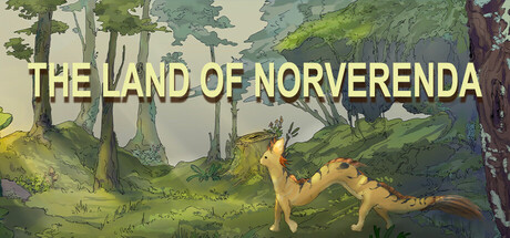
Ravy embarks on a heartfelt journey to Norveranda, a land only spoken of in legends. Guided by blessings and cherished memories, he must face trials, gather precious fragments of his past, and restore hope to his fading hometown.
Free to Play5 user reviews
AdventureCasual2D
LinqiHeOct 20, 2025