Scoring genre clarity...
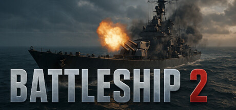
The naval war rages on in this sequel to Dualbooted’s classic! Battle in Classic Mode, defend allies in Ship Defence, or rush to aid damaged vessels in Mayday. Upgrade or buy new ships and face ever-changing seas and weather.
$8.99
ActionRPGSimulation
Priyam Jain, Matthew LalandeOct 2, 2025