Scoring genre clarity...

The Legend of the Valkyrie - ᛁᚢᛊᛟᛏᛜᚾᛞᛊᛏᛋ capsule

The Legend of the Valkyrie - ᛁᚢᛊᛟᛏᛜᚾᛞᛊᛏᛋ

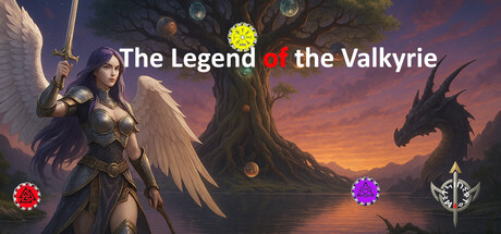
Journey through Yggdrasil in VR: Discover weapons and mystical sources of power, aid allies and face your trials. Two possible endings await, beginning in Helheim. Soar with Huginn, ride Sleipnir, and fight alongside Freki.

$10.99
Action-AdventureGun CustomizationChoose Your Own Adventure
Maets2011Oct 22, 2025

The Legend of the Valkyrie - ᛁᚢᛊᛟᛏᛜᚾᛞᛊᛏᛋ scores 73/100 — better than 63% of Action-Adventure capsules (n=3,294).

$10.99 · Released Oct 22, 2025 · By Maets2011

Quick text summary

The Legend of the Valkyrie - ᛁᚢᛊᛟᛏᛜᚾᛞᛊᛏᛋ scored 73/100 on Steam Analyzer — Good for a Action-Adventure capsule. Top priority fix: [title_readability] Remove or replace the Runic subtitle with a single readable tagline that remains legible at small size, or eliminate it entirely to reduce visual noise.

Capsule scores by dimension

  • Genre Clarity: 8/10 — Norse mythology action-adventure clear. The winged warrior in armor, mythological tree setting, dragon silhouette, and Nordic aesthetic immediately signal Norse-themed action-adventure gameplay. At tiny size, the character's wings and armor pose remain recognizable as fantasy combat, though specific subgenre detail (VR, strategy elements) is not visually apparent. The Valkyrie iconography and epic landscape effectively communicate the genre intent.
  • Title Readability: 7/10 — Title readable but secondary text weak. The main title 'The Legend of the Valkyrie' in white serif font reads clearly at full and small sizes with good contrast against the purple-orange gradient background. However, the Runic subtitle text is entirely illegible at small and tiny sizes, appearing as decorative blur rather than readable content. At tiny size the main title collapses slightly but remains functional due to strategic center placement.
  • Contrast & Color: 8/10 — Strong warm-cool separation striking. The warm golden-orange sunset gradient contrasts sharply against cool purples and blues in the sky and character armor, creating excellent value separation against the dark Steam background. The character's pale skin and white title text pop distinctly, and the dragon silhouette reads cleanly in grayscale. At tiny size, the light-dark split maintains clarity with the warrior clearly separated from background elements.
  • Uniqueness & Polish: 7/10 — Polished mythic scene, somewhat familiar. The composition features professional-quality rendering with a cohesive fantasy art style, layered depth, and atmospheric lighting that feels premium. The specific Valkyrie and Norse mythology angle provides cultural distinctiveness, though the epic fantasy landscape-with-character formula is common among action-adventure titles. Colored orbs (yellow, red, purple) add visual interest but feel decorative rather than communicating unique mechanics.
  • Brand Consistency: 6/10 — Coherent Norse theme, limited identity cues. The visual style maintains internal consistency with matching warm lighting, unified color palette, and cohesive character and environment rendering. Norse iconography (Valkyrie, dragon, runes, mythological tree) creates thematic coherence, but there are no distinctive character traits, signature symbols, or color motifs that would make this capsule uniquely recognizable versus other Norse fantasy titles. The brand feels authentic but generically so.
  • Composition: 8/10 — Strong focal hierarchy, balanced layout. The Valkyrie character anchors the left-center foreground with clear primary focus, while the ancient tree and dragon create meaningful background depth and secondary interest points. The title sits cleanly in the safe upper-middle region with good breathing room, and the three colored orbs guide the eye without overwhelming the scene. At small and tiny sizes, the character silhouette and title remain the clear focal points despite the scenic background.

What works

  • Mythological iconography strong. Winged Valkyrie warrior, dragon, and Yggdrasil tree immediately communicate Norse fantasy action without ambiguity.
  • Contrast and color control excellent. Warm-cool gradient separation and light character against dark background ensure visibility at all viewing scales including tiny thumbnail.
  • Professional rendering quality. Layered depth, atmospheric lighting, and polished character model convey premium production values and suggest high-quality gameplay experience.
  • Composition guides eye effectively. Clear focal hierarchy with character anchor, secondary background elements, and title placement that maintains clarity down to tiny size.

What hurts the capsule

  • Runic subtitle unreadable. The decorative Runic text below the main title becomes illegible blur at small and tiny sizes, adding visual clutter rather than information.
  • Ornamental orbs feel disconnected. The three colored circular elements (yellow, red, purple) read as generic visual decoration rather than communicating gameplay mechanics or unique identity.
  • Generic fantasy landscape formula. The epic character-in-mythical-landscape composition, while well-executed, closely mirrors common action-adventure and AAA game capsule templates.

Priority fixes

  1. [title_readability] Remove or replace the Runic subtitle with a single readable tagline that remains legible at small size, or eliminate it entirely to reduce visual noise.
  2. [uniqueness_polish] Replace the generic colored orbs with gameplay-specific visual elements (weapon icons, ability symbols, or environmental objects) that communicate core mechanics or unique selling points.
  3. [brand_consistency] Introduce a distinctive character design detail, signature color motif, or visual symbol that creates stronger brand recognition separate from generic Norse fantasy tropes.

Store copy priority fixes

  1. [hook_strength] Rewrite the short description to open with a core gameplay verb: 'Fight your way through Yggdrasil's trials in VR' or 'Master swords, bows, and ancient magic to defy—or bring about—Ragnarök.' This shifts focus from travel to agency and struggle.
  2. [uniqueness] Add a specific differentiator in the detailed description: explain what makes the choice system or two-ending structure unique (e.g., 'Your choices determine not just the ending, but how allies respond mid-journey' or 'Branching paths reshape NPC relationships and available weapons').
  3. [feature_communication] Clarify the choice mechanic with concrete examples: 'Will you aid the wolf Freki or defy Odin? Your decision unlocks new paths and weapons' or similar, so players understand *when* and *how* choices matter.
  4. [audience_targeting] Resolve the Casual vs. difficulty tone conflict by explicitly stating expected audience: 'For VR action fans seeking challenge' or 'Approachable for newcomers, rewarding for veterans' to set correct expectations.

Related guides

Steam app ID: 3994440 · Tags: Action-Adventure, Gun Customization, Choose Your Own Adventure, Exploration, Swordplay